

Home Work About Resume Contact

Selected work

I’m Mahsa Rad, a Vancouver-based brand and digital experience designer. I’m happiest when one good idea starts growing into something bigger. Give me the spark, and I’ll help build the world around it.

Know a little more about me

Systems that stay recognizably themselves.

Browse all case studies ↗

A connected practice

One system, adapted across every context.

Strategy, expression, and experience stay connected. The form changes; the recognition remains.

Brand systems

Identity logic, color behavior, pattern built from logo geometry, bilingual type systems, and rules that survive daily use, not just a launch day.

Product & digital experience

Information architecture, booking and checkout logic, design systems, and interfaces that carry the brand through every state and screen.

Spatial & experiential

Interiors, wayfinding, environmental identity, and immersive storytelling that make a system inhabitable, from café counters to virtual worlds.

Vancouver · Local studio time

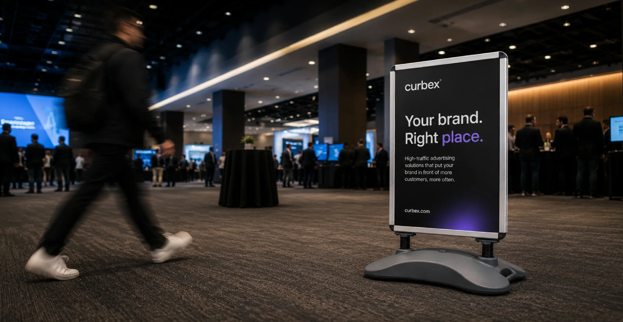
Curbex event advertising sign in a busy conference space
Brand Identity · Product Design · 2024-Present

Curbex

A digital brand and product experience redesign for a B2B advertising and signage company.

Project overview

A brand-to-product redesign for renting and buying outdoor advertising.

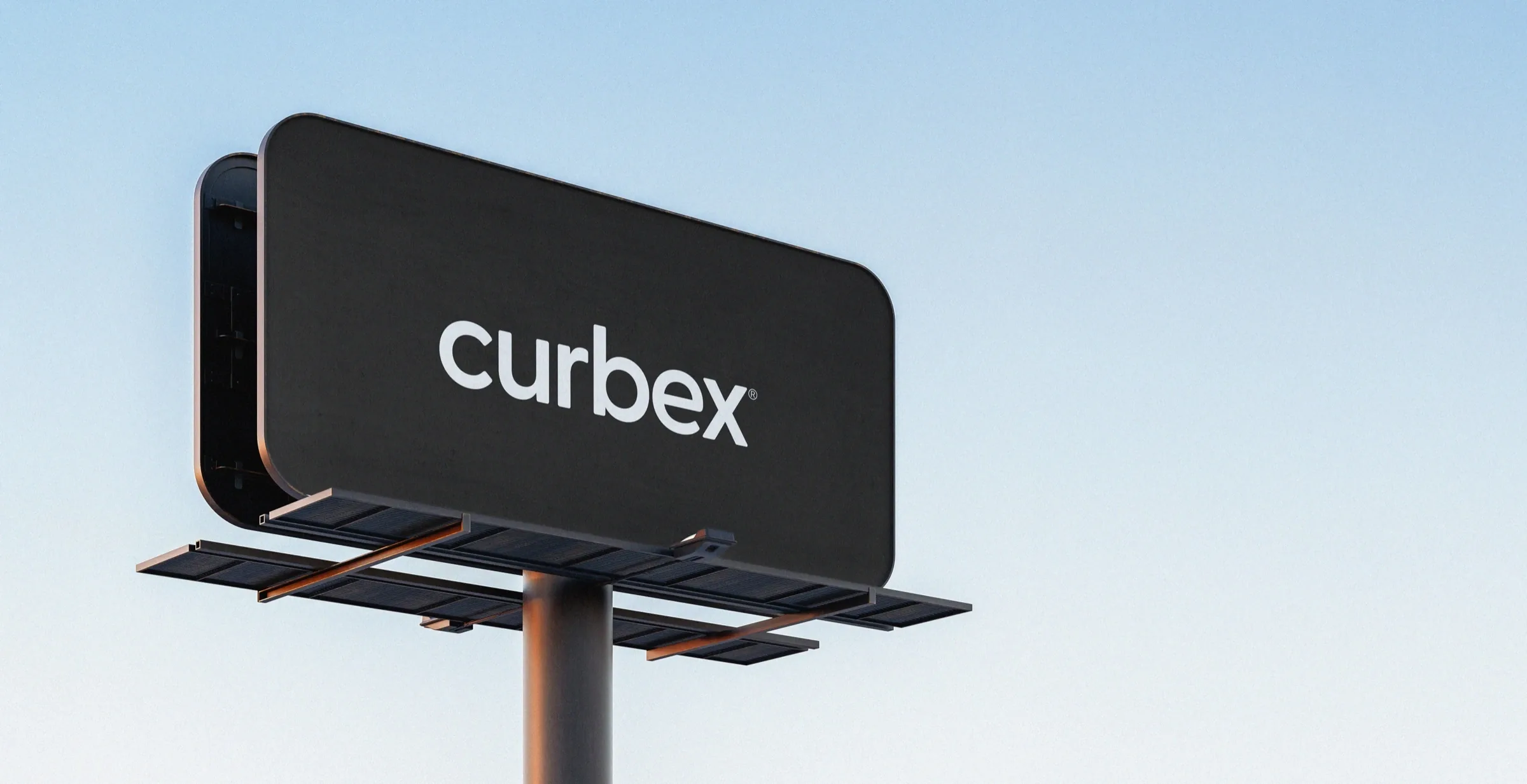
Curbex branded outdoor advertising billboard against a pale blue sky

Curbex already had loyal customers who knew the team and trusted the service, but the old website made newer customers work too hard to understand what to do next. The offer was broad, the visual language felt inconsistent, and many booking decisions still depended on account managers to explain products, check availability, and move customers forward.

The redesign needed to support both behaviors. Existing customers still needed a visible support path, while independent customers needed clearer ways to browse products, buy retail items, or start a location-based rental booking without waiting for the whole process to be explained.
GoalHelp customers move from interest to purchase, rental booking, or support.
ConstraintCreate a more self-serve rental flow without removing the account-manager relationship.
OutputA clearer product model, multi-entry IA, address-first booking, retail paths, checkout logic, and reusable states.
Design system

The design system connected brand foundation to product behavior.

I treated the brand system as something customers would meet in the product, not just in the logo. Every form, card, filter, checkout step, and support moment needed to feel like it came from the same company.

Foundations

I tightened the colors, type, spacing, radii, and grid so the interface felt direct, practical, and unmistakably Curbex.

Components

Core pieces like forms, cards, filters, CTAs, summaries, and accordions were built to repeat across browsing, buying, and booking.

State logic

I mapped the moments where customers need reassurance: available, selected, verified, in review, paid, uploaded, confirmed, or blocked.

Handoff

Each screen included behavior notes so product, data, and engineering could see what had to happen behind the visual layer.

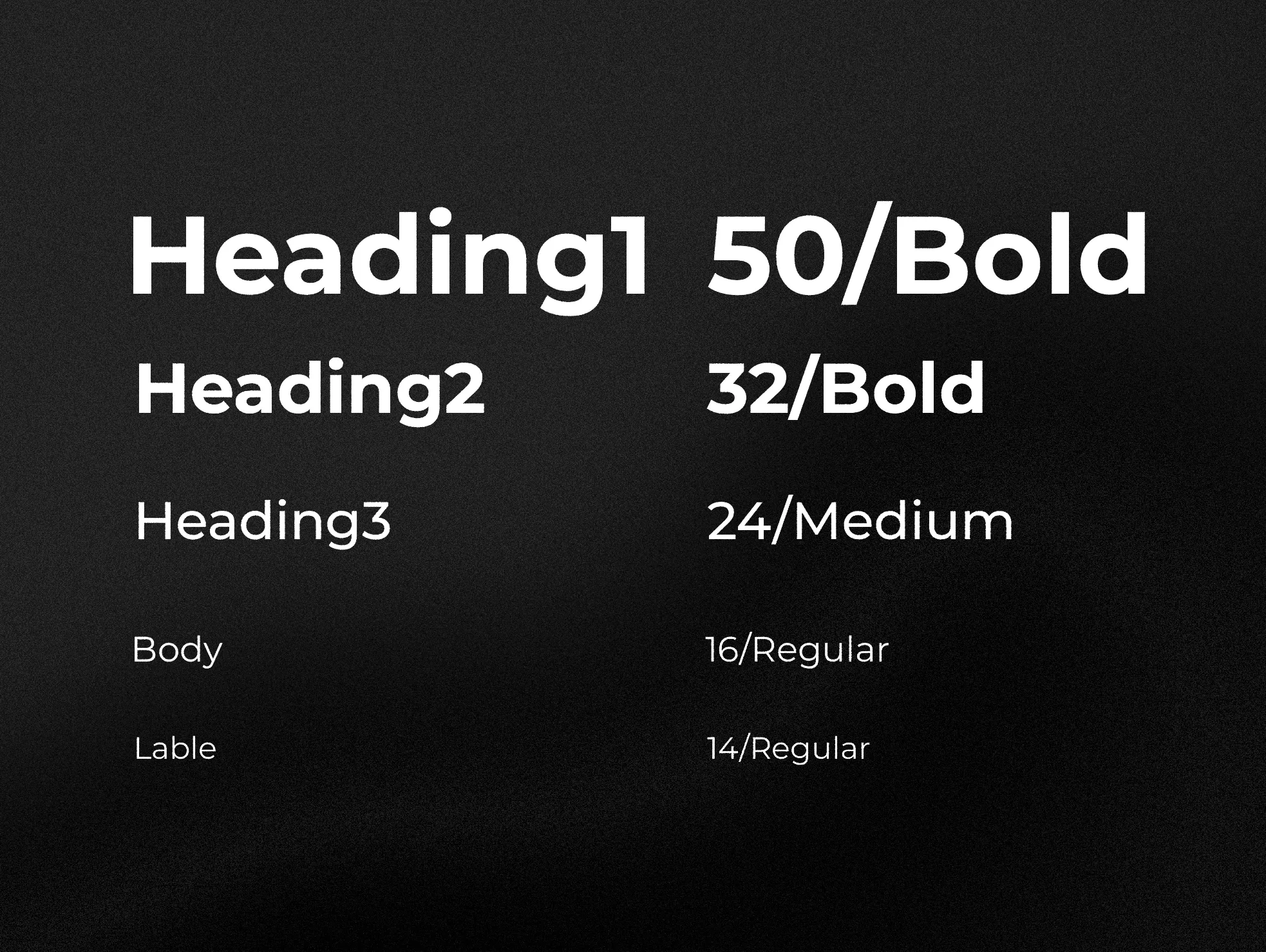
Curbex typography scale artboard
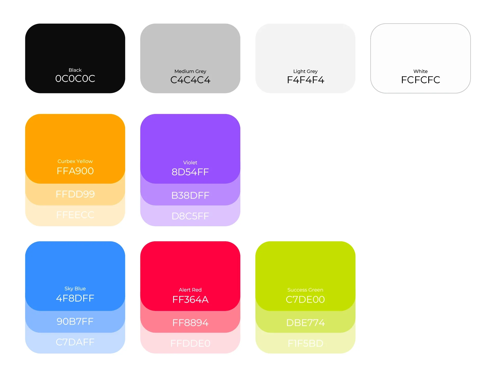
Curbex color palette artboard
Problem

The old website made customers work too hard to choose the right next step.

The website felt outdated and inconsistent, while the purchase and booking paths were difficult to follow. Loyal customers could still rely on account managers and support, but newer or more independent customers had to piece together the offer before understanding whether to browse, buy, book, or ask for help.

The business wanted to increase focus on rentals without weakening the retail path. The challenge was to design a clearer automated booking experience, preserve the high-touch relationship where it mattered, and make product purchasing feel direct rather than hidden inside a rental journey.

User pain point

Customers needed a more legible path.

People had to understand the products, compare options, and decide whether they were buying retail, booking a rental, or asking for support before committing to details.

Business challenge

Rental growth could not erase support.

Curbex needed a stronger rental flow while keeping account-manager guidance visible and making direct product purchases easier to complete.

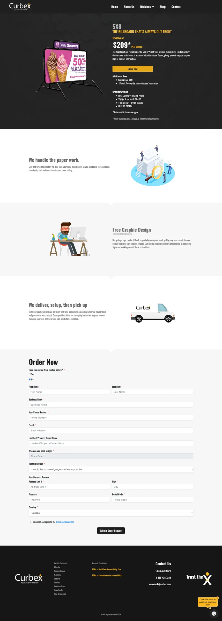
Old homepage
Old Curbex homepage screenshot
Old product page
Old Curbex Mini B product page screenshot
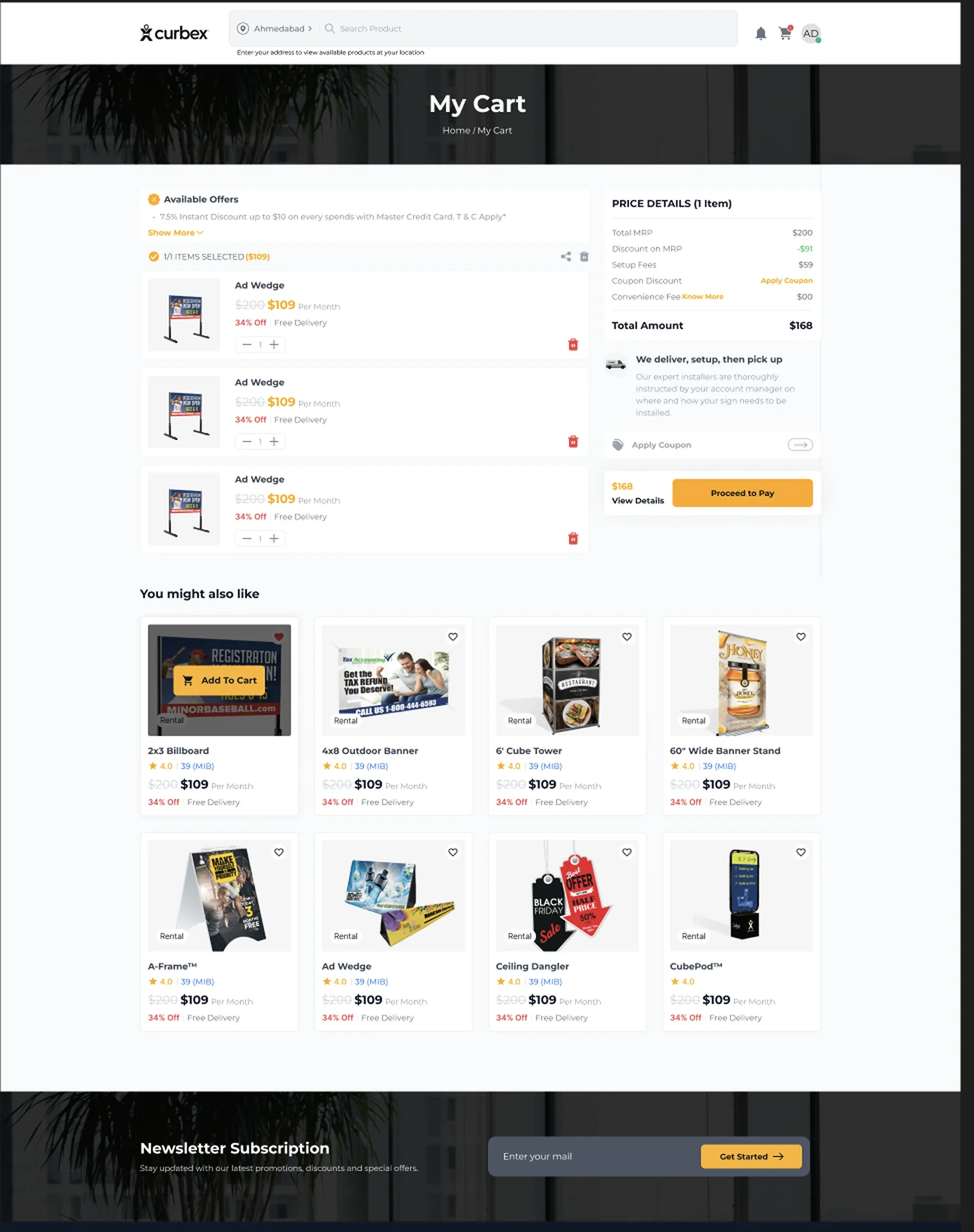
Old cart page
Old Curbex cart page screenshot
My role

I connected the brand foundation to product strategy, interface logic, and handoff.

As the in-house senior product and digital designer, I worked across brand application, UX strategy, IA, UI design, state logic, and implementation support. My role was to turn a complex service model into a system customers could understand and the internal team could maintain.

Owned

Brand-to-product direction

Carried the identity’s confident, direct tone into the website, product hierarchy, booking language, and sales-facing materials.

Designed

Core product journeys

Designed simplified product categories, product pages, direct retail purchase paths, address-based rental booking, checkout, and dashboard touchpoints.

Aligned

Operational rules

Worked with client services, marketing, sales, operations, data, and engineering to turn product rules into clear states, components, and handoff notes.

Solution strategy

Four entry points gave customers a path that matched their intent.

Curbex customers do not arrive with the same confidence, timeline, or buying intent. The redesigned structure gives each route a clear purpose before asking for detailed booking information.

Need guidance

Homepage form

Customers can ask for help without starting a booking flow. The team follows up with the right recommendation.

Guided lead
Ready to rent

Book Now

Customers enter a business address and campaign dates to see rental products near their location.

Rental booking
Still learning

Product education

Simplified series content helps customers understand the offer before choosing a specific product type.

Learn first
Product-first

Products page

A filterable catalogue supports product comparison and direct retail purchase without entering rental booking.

Browse + buy
Design process

The process translated real business rules into a clearer product experience.

The work moved from brand foundation into product behavior: old-site review, offer audit, stakeholder feedback, IA mapping, prototype iteration, state documentation, and design system handoff. The goal was not to make a decorative case study, but to show how decisions became usable screens.

01

Brand foundation

Set the identity direction first so the product experience had a recognizable tone, hierarchy, and visual system.

02

Old-site and offer audit

Reviewed the existing website, product structure, purchase path, and stakeholder feedback to identify where customers got stuck.

03

IA and flow mapping

Mapped customer intent across guided inquiry, product education, retail purchase, rental booking, checkout, dashboard, and support.

04

Prototype iteration

Refined wireframes and high-fidelity screens through business, sales, product, and implementation reviews.

05

State documentation

Defined what users see before, during, and after each flow, including availability, review, payment, upload, and confirmation states.

06

Design system handoff

Documented reusable components, responsive behavior, and product rules that needed engineering or data confirmation.

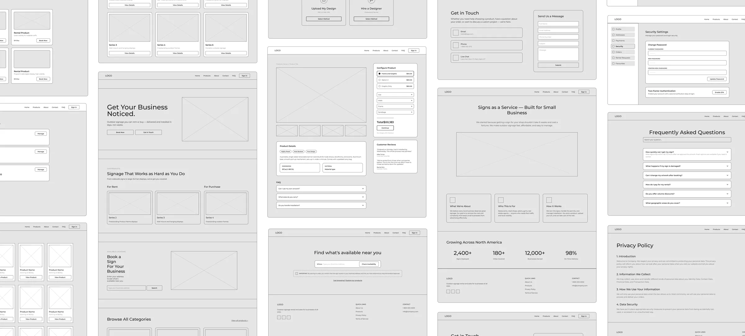
What changed through the process

From one broad website to clearer customer paths.

The experience moved toward distinct routes for guided inquiry, product browsing, retail purchase, rental booking, checkout, and post-purchase tracking.

Curbex wireframe exploration frame showing product, booking, support, dashboard, FAQ, and policy screens
Information architecture

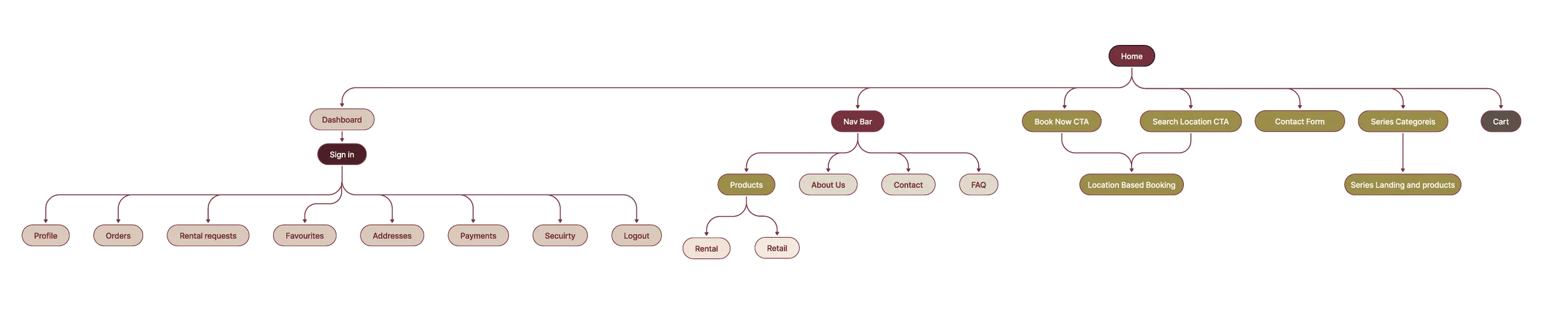
The IA separated browsing, buying, booking, support, and tracking.

I structured the experience so customers could choose a path that matched their comfort level: submit a guided inquiry, browse product education, compare products with filters, purchase retail products, start Book Now for location-based rentals, reach support, or track active orders in the dashboard.

Each route needed its own copy, states, handoff rules, and follow-up expectations. A retail purchase, a rental booking, a booking request, an artwork upload, and a support handoff all ask different things from the customer and from the internal team.

Key decisions

The strongest decisions were about keeping each path responsible for one intent.

The risk was creating so many routes that the website became confusing again. I kept the core model simple: help people choose how they want to move forward, then make the next step explicit.

Decision 01

Keep the account-manager path, but make it intentional.

The homepage form preserved the familiar way of working for loyal customers and anyone who wanted Curbex to recommend the right product.

Decision 02

Make rental booking address-first.

Rental availability becomes useful only after a business address and campaign dates are known, so Book Now starts there before showing nearby products.

Decision 03

Keep retail purchase separate from rental booking.

Retail customers can browse products, choose options, and purchase directly without being pushed into a location-based rental flow.

Decision 04

Use the same completion model after product selection.

Whether buying or renting, customers move through design method, artwork upload or design support, preview, review, cart, payment, and confirmation.

Product selection

The rental path begins when a customer is ready to check availability.

Book Now uses the customer’s business address and campaign dates to make the product results meaningful. Instead of asking customers to decode the whole catalogue first, the interface shows nearby options with location, product, price, availability, and Sign ID context.

This gave the team a more automated rental path while still keeping support available when a location needs review or a customer wants guidance.

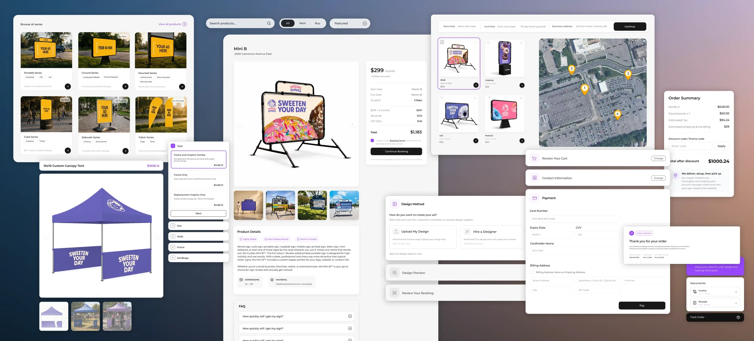
Final solution

The final structure lets customers choose the path that fits their intent.

The redesigned experience separates learning, browsing, buying, booking, and post-purchase tracking into clearer routes. Customers can start with guidance, compare products first, buy retail items directly, or move into an address-based rental flow without losing context along the way.

Curbex final product experience screens across browsing, product details, map availability, checkout, payment, order summary, and tracking
Retail product path

Retail customers can browse, choose, and purchase without entering the rental flow.

Retail products needed their own direct path. Customers can compare product types, review options, and move into purchase without being asked for rental availability details that do not apply to them.

Browse

Filtered product discovery

Products are organized so customers can compare categories and understand what each item is for.

Choose

Options and variations

Product pages support variations, details, and decisions before the customer commits to checkout.

Purchase

Direct retail checkout

Retail customers can buy directly through the purchase path without starting address-based rental booking.

Checkout and handoff

The same completion model supports products after selection.

After a product is selected to buy or rent, the flow keeps the customer in one structured sequence when possible. The active step expands, completed steps collapse but remain editable, and a sticky order summary tracks the customer’s choices without forcing them through repeated tabs or page changes.

The sequence covers design method, artwork upload or design support, design preview, review, contact information, payment, and confirmation. This made checkout feel like a guided handoff instead of a disconnected form.

User dashboard

The dashboard closed the loop after purchase or booking.

After payment, customers can track order status, artwork, support, documents, and follow-up in one shared dashboard, so the handoff stays visible after purchase or booking.

What the new experience enables

A clearer product model for customers and the Curbex team.

The redesign organizes the experience around customer intent: guided inquiry, product education, retail purchase, rental booking, checkout, and post-purchase tracking. It gives customers clearer paths while giving the internal team a more consistent system to explain, support, and maintain.

Lower decision pressure

Customers can choose guidance, browsing, retail purchase, rental booking, or support based on what they need.

Clearer product model

Product education, filters, and dedicated purchase paths make the catalogue easier to understand.

Stronger handoff logic

The flow separates retail purchase, rental checkout, review states, support, and account-manager follow-up.

Better post-purchase visibility

The dashboard gives customers and the team one place to track orders, artwork, documents, campaign details, and next steps.

This case study documents the strategy and design of Curbex’s upcoming digital experience. As the platform has not yet launched, the outcomes described here reflect design objectives rather than post-launch performance data.

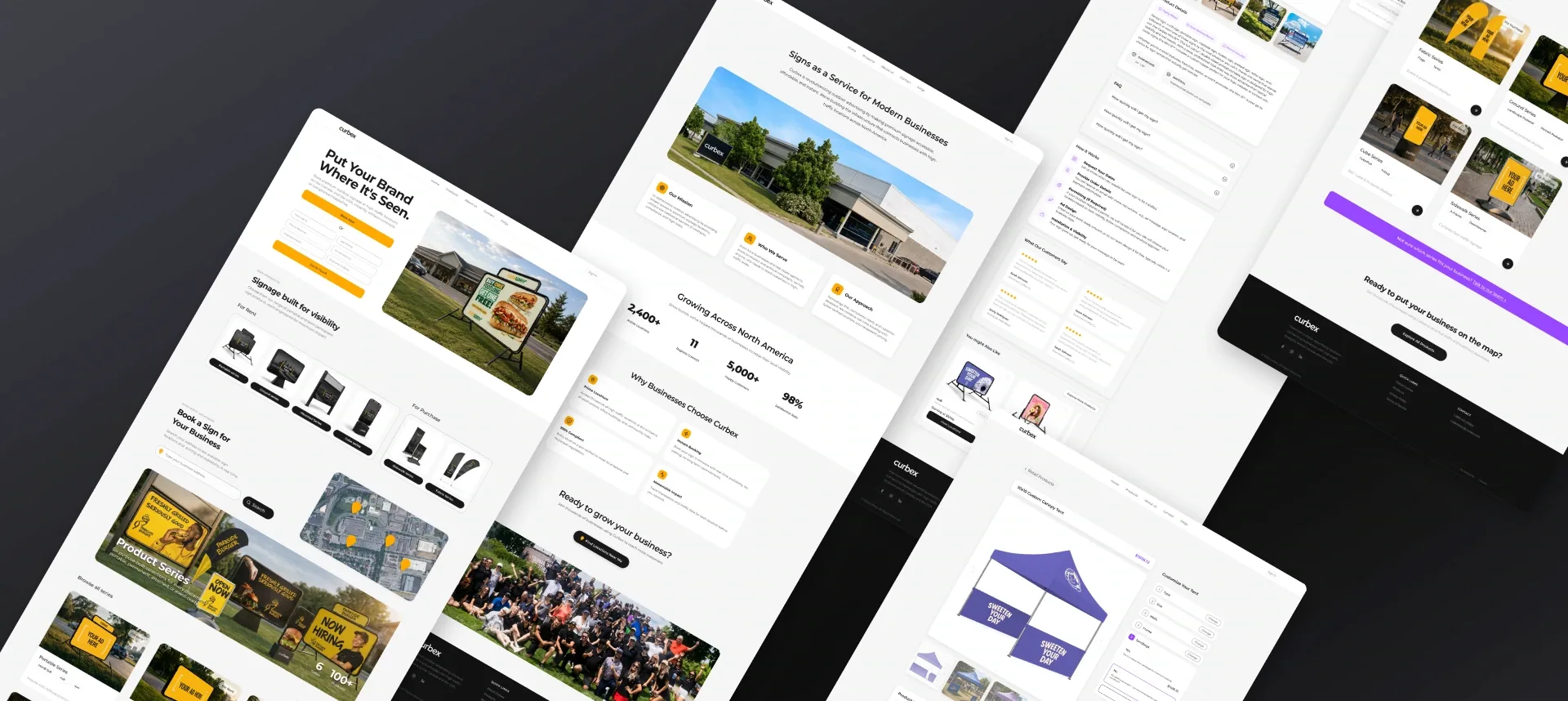
Angled overview of Curbex redesigned website screens showing homepage, service page, product configuration, checkout, and catalogue flows
Reflection

The strongest product decision was not making every customer behave like a self-serve customer.

The redesign works because it respects how Curbex already sells. Existing customers can still ask for help, rental customers can book by location, retail customers can purchase directly, and product-first customers can browse before choosing a path. The value is not one perfect funnel. It is a connected system that lets different customers move with confidence.

Work Archive

Selected work across brand, digital, and experience design.

A focused archive of brand systems, UX, and visual design projects shaped through strategy, structure, and refined detail.

Brand · Digital · UX/UI2024–Present
Curbex brand and digital experience project cover

Curbex

Product DesignUX/UIBrand Systems
24-hour UX Challenge2024
RemoteFit project cover with logo on a light blue background

RemoteFit

UX/UIProduct Strategy
Thesis · PHI Studio Partnership2026
BLUR immersive identity project cover

BLUR

Spatial NarrationDigital ExperienceAR/VR
Digital Branding Project2023-2025
Rabex blue logo project cover art

Rabex

Brand IdentityBrand SystemsCampaign Design
Agency Identity2021

PILBAN

Brand IdentityVisual SystemsIllustrationCampaign Design
Digital Branding2022
Druket red logo project cover art

Druket

Brand IdentityUX/UICampaign Design
Brand · Spatial Experience2022
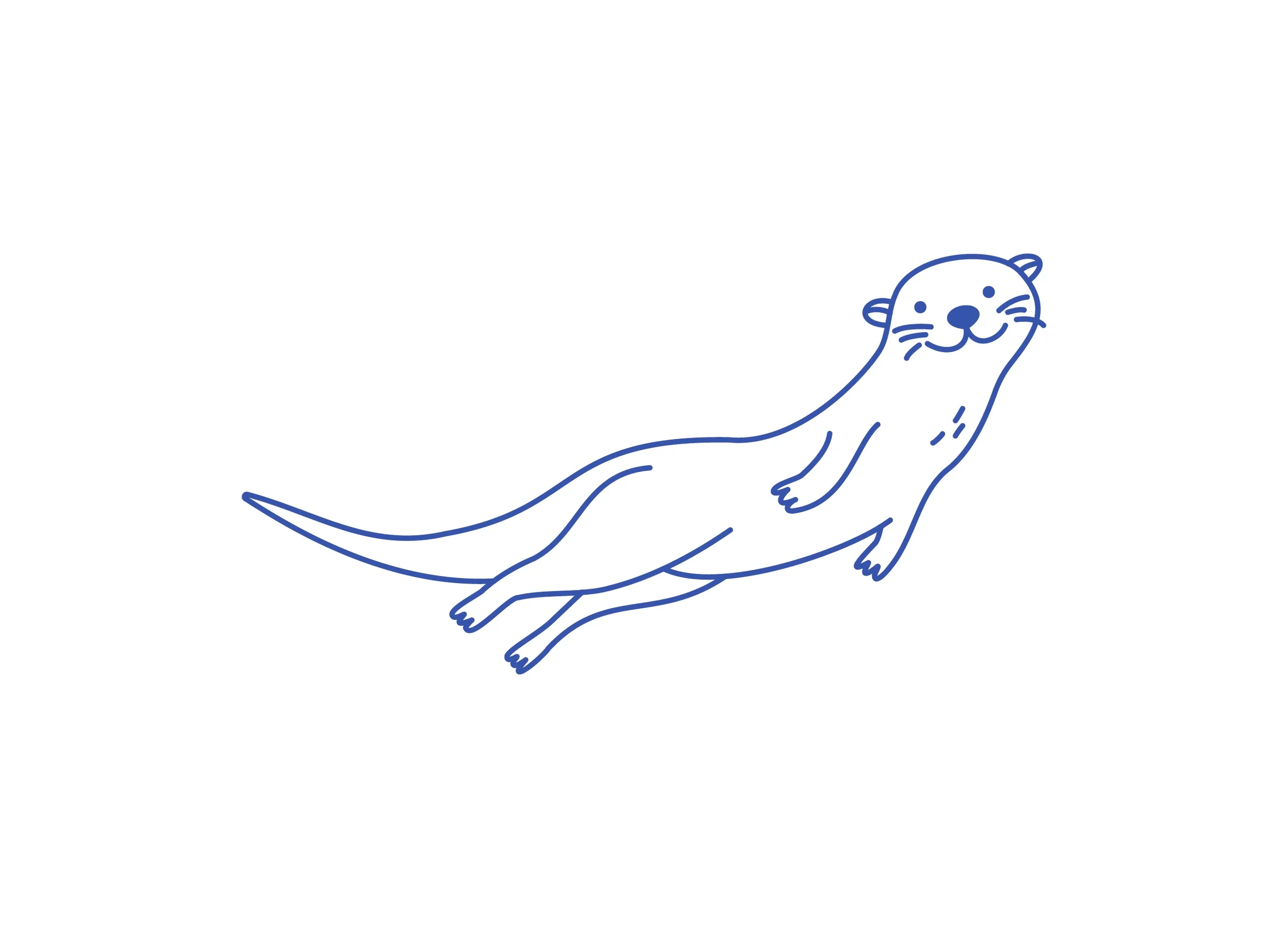
Biroon playful otter project cover

Biroon

Brand IdentitySpatial ExperienceIllustration
Brand Expansion · Marketplace2023
Bazare brand symbol in white on a green field

Bazare

Brand SystemsDigital ExperienceUI/UXCampaign Design
Branding2023
Kloud project hero

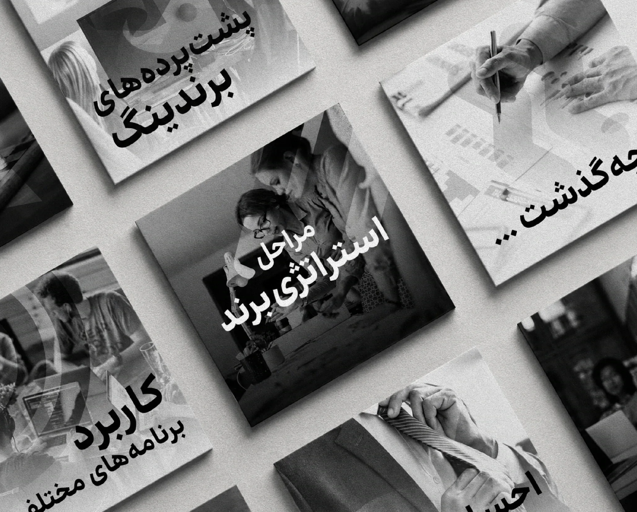
Kloud

Brand IdentityVisual SystemsCampaign Design
Digital Branding2022
Mamana blue flower project cover

Mamana

Brand IdentityIllustrationVisual Systems
Ongoing personal practiceOngoing
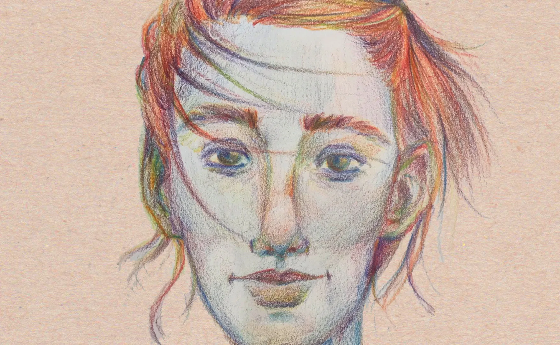
Colored pencil portrait sketch for Studio project cover

Studio

DrawingIllustration
No projects in this category yet.
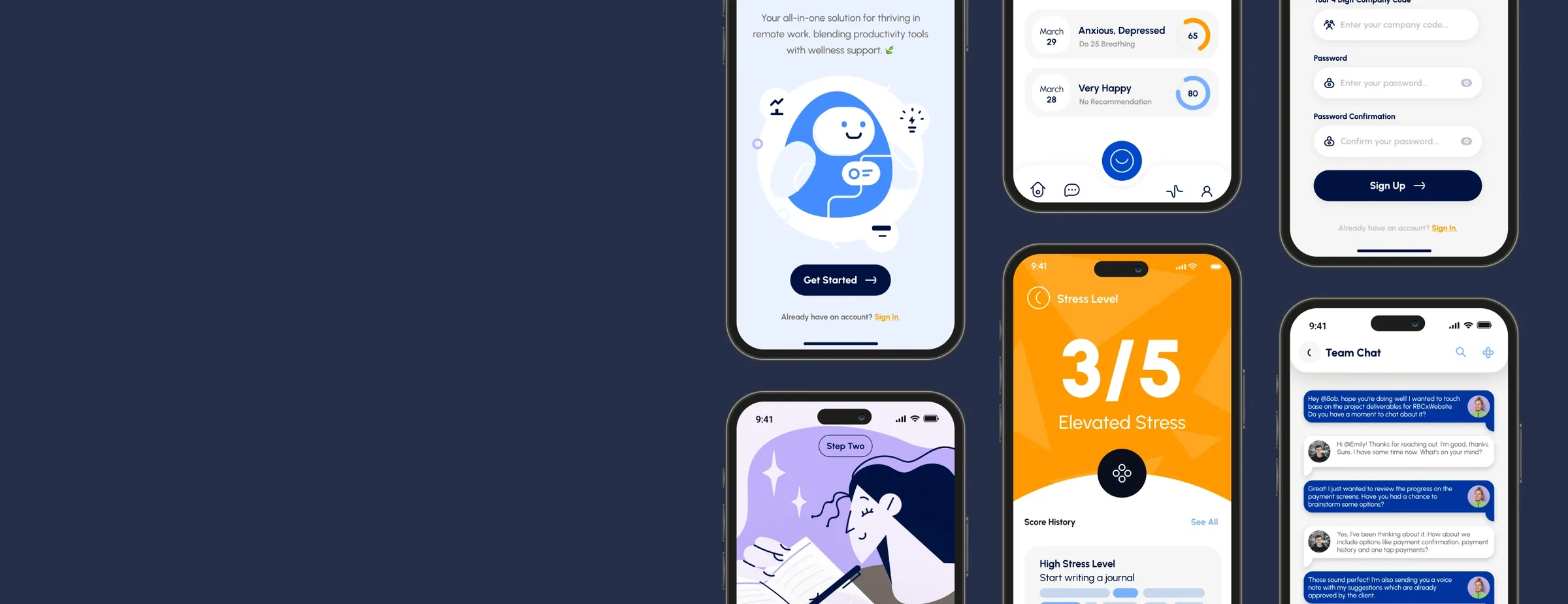
RemoteFit mobile app screens arranged on a dark blue background
TMU UX Designathon · 2024

RemoteFit

A first-prize 24-hour UX challenge focused on optimizing remote work through clearer routines, healthier check-ins, and stronger team connection.

Project overview

A focused product story for a broad remote-work problem.

RemoteFit was created for the TMU UX Designathon, where our team had 24 hours to turn a broad remote-work prompt into a clear product direction. We narrowed the problem to a quieter moment: people working from home often miss the small cues that tell them they are stressed, tired, or drifting out of balance.

The concept became a lightweight remote-work support companion. It does not try to replace therapy, medical care, or a productivity system. It creates a small loop: pause, check in, understand the result, receive one supportive recommendation, and build healthier awareness over time.

The constraint shaped the work. Every decision had to help us communicate a believable product story quickly, without turning the idea into an overbuilt app.

Design challenge

How might we help remote workers recognize stress earlier and take small, supportive actions during the workday?

Research signals & prioritization

Research narrowed a broad remote-work prompt into a focused support system.

Before moving into screens, we organized the early observations into cards so the team could see what mattered most. The first pass was broad: communication, work management, and trust. From there, we narrowed the product toward the moments where remote work affects focus, health, and team connection.

Early insight categories

01

Communication

Remote teams depend on quick digital communication, but important updates and emotional cues can get lost across tools and channels.

02

Work Management

Tasks, priorities, and progress are often visible, but the personal state behind that work is much harder to notice.

03

Trust & Security

Because wellbeing data can feel sensitive, the product needed to feel private, respectful, and careful with how it presented information.

Focused RemoteFit themes

Isolation

Isolation and Mental Health

Remote work can make emotional cues easier to miss, especially when face-to-face interaction is limited.

Work-life

Work-Life Balance

When work and home blur together, people can keep working past the point where they need a pause.

Social Interaction

Social Interaction Deficit

Less everyday interaction can weaken team connection, making supportive check-ins more important.

Impact Feasibility Map

Feature directions considered

  1. Onboarding Experience: Introduce the concept quickly, set expectations, and help first-time users understand why the product exists.
  2. Work-Life Balance Tools: Help users set boundaries between work and personal life through work-hour preferences, break reminders, and gentle routine cues.
  3. Mental Health Metrics: Track and visualize stress signals in a careful, non-clinical way, then connect those insights to relaxation techniques or mindfulness exercises.
  4. Physical Well-being Support: Offer prompts for movement breaks, simple exercises, or home-friendly reset moments that fit into the workday.
  5. Productivity Enhancements: Explore task management, prioritization, and goal-setting tools only where they support wellbeing, not as the main product promise.
  6. Internal Communication: Create a lightweight chat layer for team connection and support among remote colleagues.
Product logic

The core loop had to feel calm, fast, and repeatable.

We designed RemoteFit around a short daily habit rather than a complex dashboard. Every feature needed to support one of three things: noticing a state, understanding what it means, or taking a next step.

01

Pause

Create a small break in the workday.

02

Check in

Make the current stress level visible.

03

Understand

Translate the score into plain language.

04

Act

Offer one supportive prompt or exercise.

05

Reflect

Help users notice patterns over time.

Wireframes & ideation

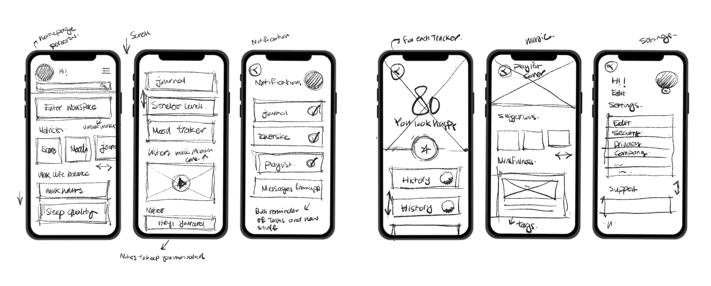
The wireframes helped us keep the idea focused.

Because the challenge was only 24 hours, the early ideation work was less about adding features and more about deciding what not to build. We sketched the experience as a short path: enter the app, check in, understand the result, and receive one useful next step. The wireframes made that loop visible quickly, so the team could test whether each screen was helping the user notice stress without making the product feel heavy or clinical.

RemoteFit early mobile wireframe sketches showing dashboard, journal, notification, tracker, music, and settings concepts
User need

The issue was not only productivity. It was self-awareness.

Remote-work tools often focus on meetings, tasks, calendars, and output. RemoteFit looks at the emotional layer underneath that output: the moments when someone keeps working, but their stress is already shaping the day.

Design principle

Support should feel gentle, not clinical.

The interface uses soft language, rounded modules, and warm visual cues so the app feels easy to approach. The product gives feedback without making the user feel judged or diagnosed.

Information architecture

A simple structure for a short remote-work support habit.

OnboardingIntroduce the value quickly and set the tone.
Check-inCapture the current stress state without friction.
ResultShow the score and explain it in human language.
RecommendationSuggest journaling, breathing, or a small reset.
HistoryLet users see patterns across days and weeks.
Prototype moments

The final screens told the story without overexplaining it.

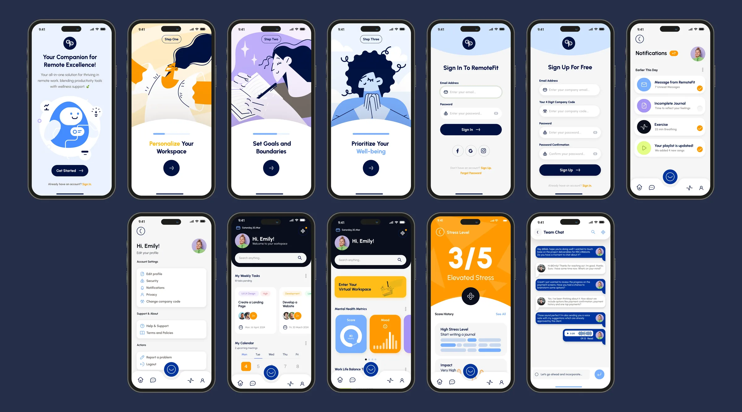
For the final presentation, we focused on the screens that made the product idea easiest to understand: onboarding, account access, notifications, dashboard, stress result, support chat, and history.

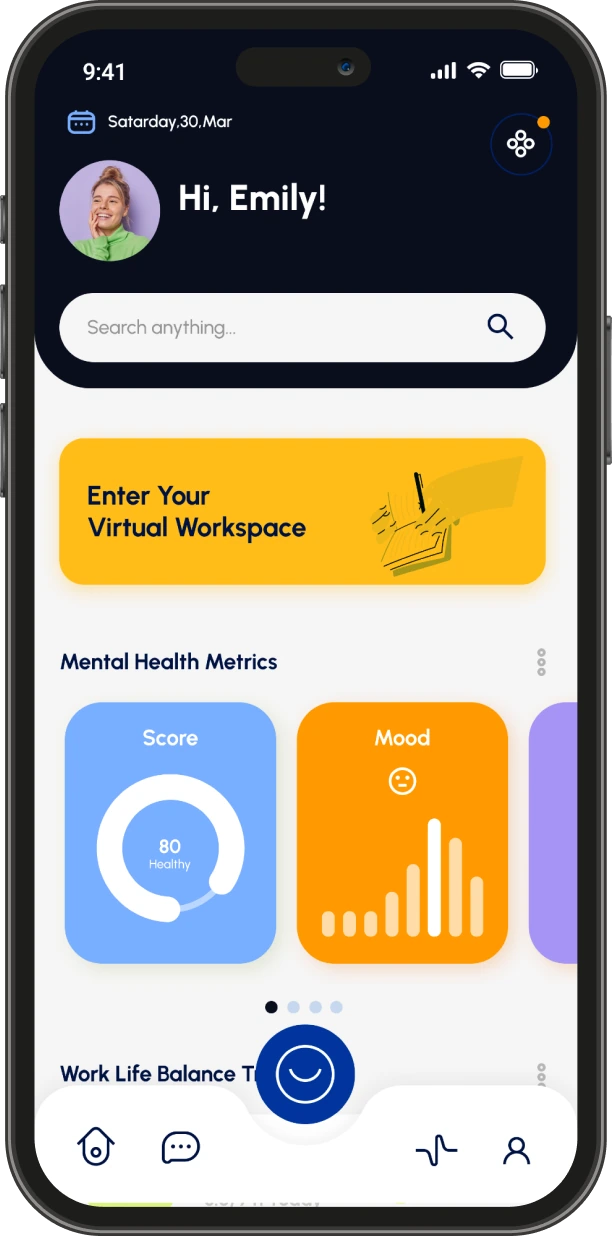
RemoteFit onboarding and dashboard screen

Onboarding

Sets up the support loop as a small remote-work habit.

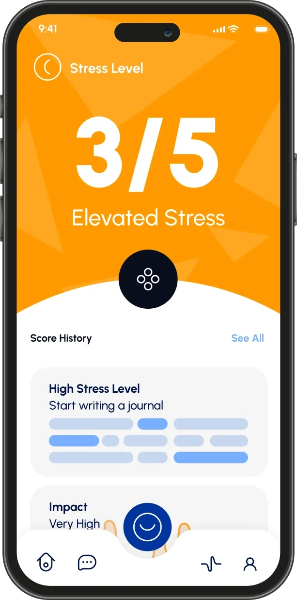
RemoteFit stress result screen

Stress result

Turns a check-in into a clear state users can act on quickly.

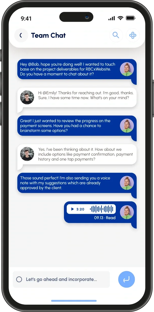
RemoteFit team chat support action screen

Support action

Connects the result to one practical next step.

RemoteFit high-fidelity screen set showing onboarding, sign in, notifications, dashboard, stress result, and support chat screens
Usability testing

Testing helped turn the prototype into clearer, more useful screens.

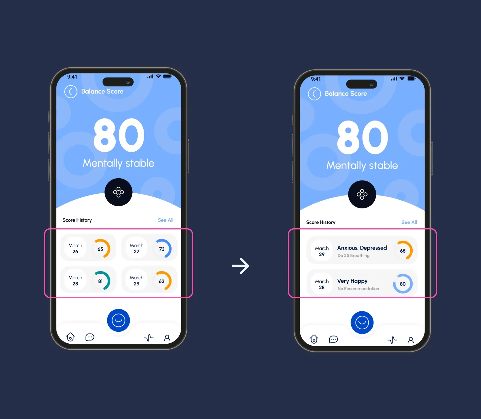
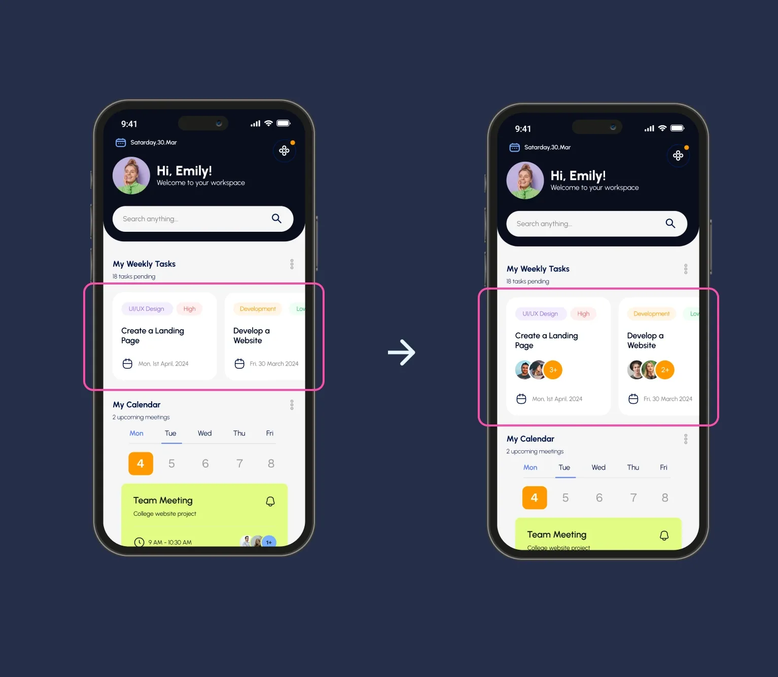
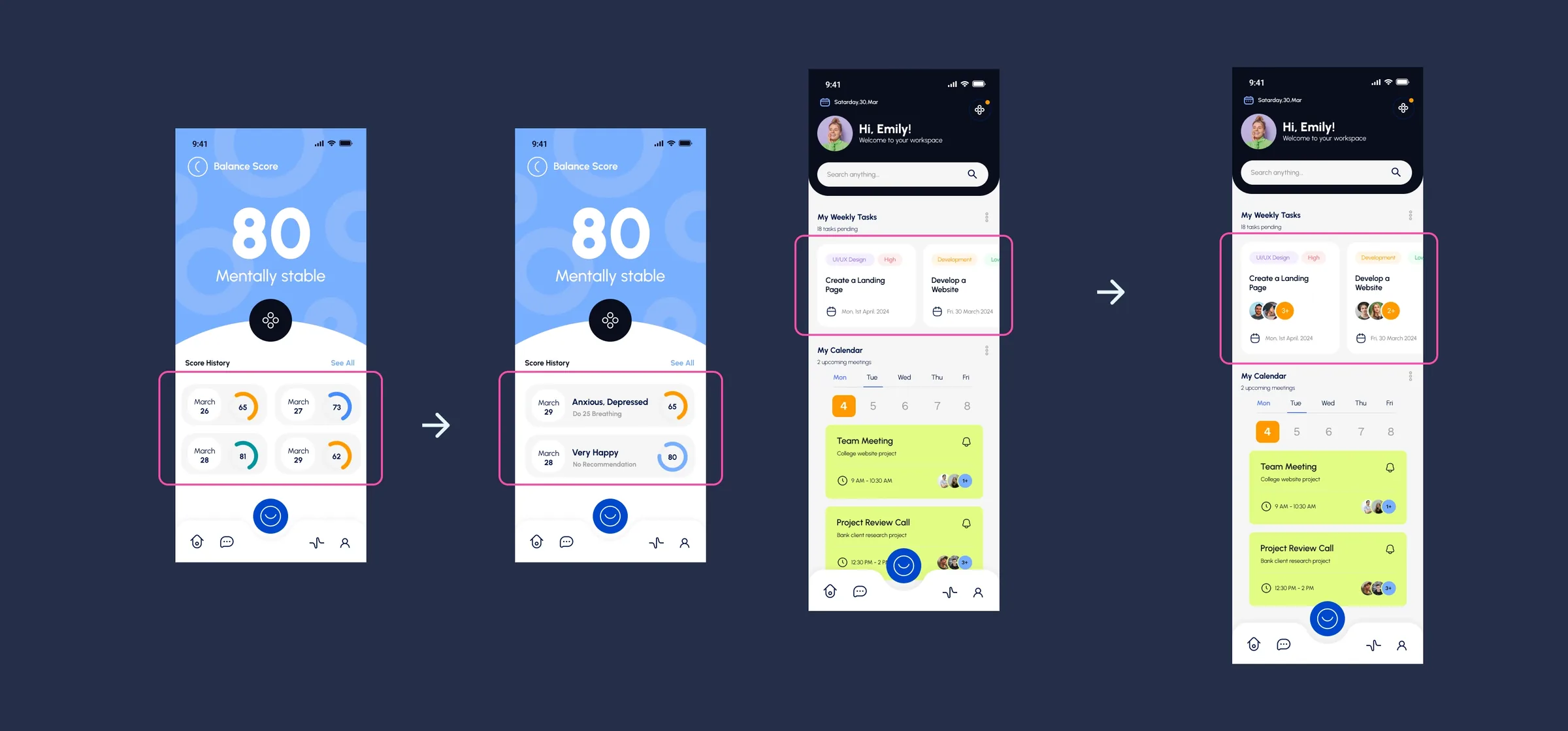
The usability feedback pointed to two places where the concept needed more clarity: mental-health metrics needed more context, and task cards needed to show who else was involved. Those changes kept the product aligned with the original goal: help remote workers understand their state and feel more connected during the workday.

RemoteFit usability testing frame showing balance score history changed into deeper mental health insights
Users wanted deeper insights and personalized recommendations from mental health metrics.
RemoteFit usability testing frame showing task cards updated with collaborators
Users could see who else was collaborating on a task and connect with that colleague.
RemoteFit usability testing overview showing both tested prototype improvements
The testing summary connected both changes back to emotional awareness and remote-team connection.
Interactive prototype

Click through the high-fidelity flow.

Key decisions

The strongest decisions kept the product focused.

Decision 01

Use a simple score.

The 3/5 stress state is easy to read and avoids turning the app into a heavy analytics tool.

Decision 02

Pair insight with action.

A result is only useful if it helps the user decide what to do next.

Decision 03

Keep the tone warm.

Illustration, soft color, and direct language make the product feel supportive rather than clinical.

Outcome

RemoteFit won first prize at the TMU UX Designathon.

The project was recognized for its focused problem framing, clear product loop, polished mobile prototype, and ability to communicate a useful idea within the constraints of a 24-hour challenge.

What I would validate next.

If RemoteFit moved beyond the designathon, I would test the check-in flow with remote and hybrid workers, refine privacy expectations, and validate whether the language around stress feels supportive without overpromising. A remote-work health product has to be careful: useful without diagnosing, simple without feeling shallow, and warm without becoming vague.

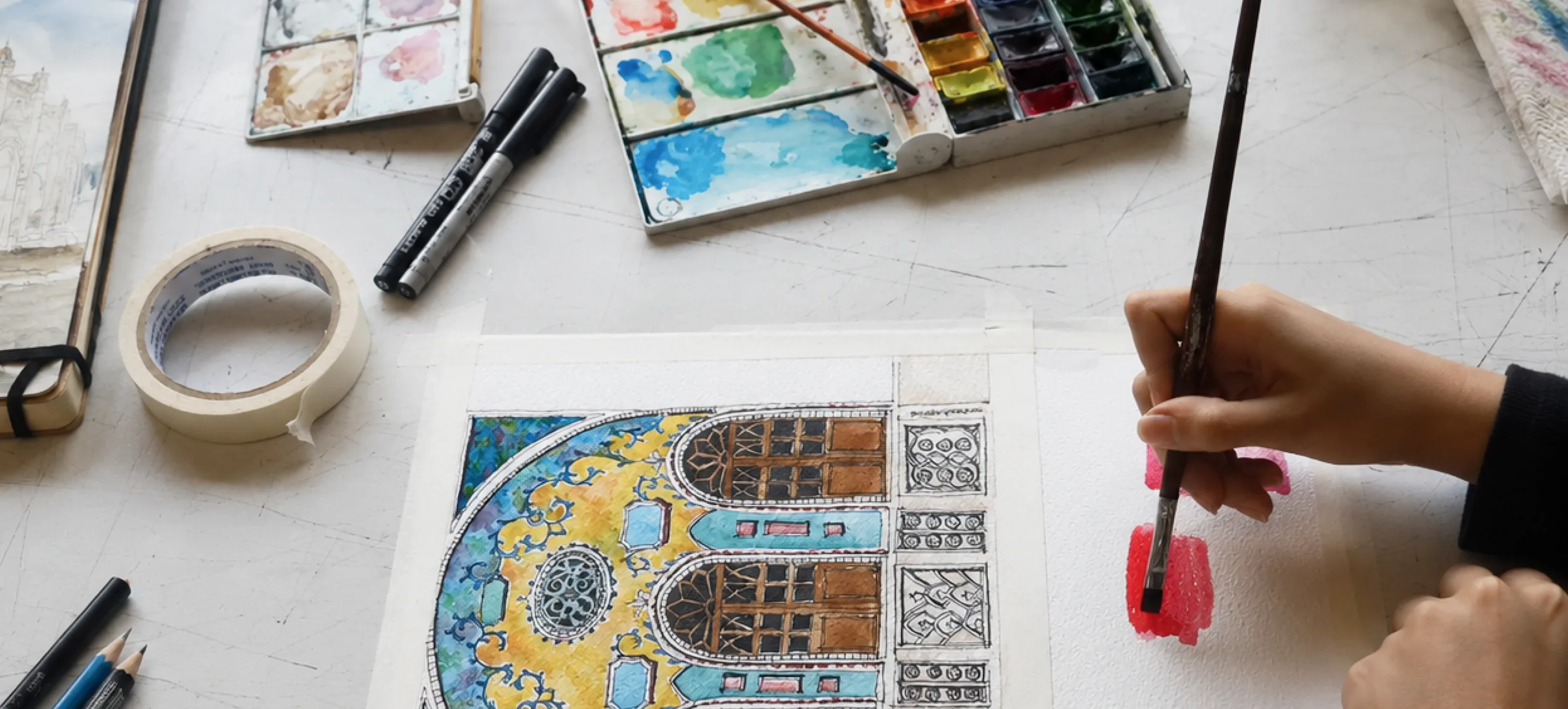
Watercolor paints, markers, and a hand painting an architectural illustration on a studio desk
Ongoing Personal Practice

Studio

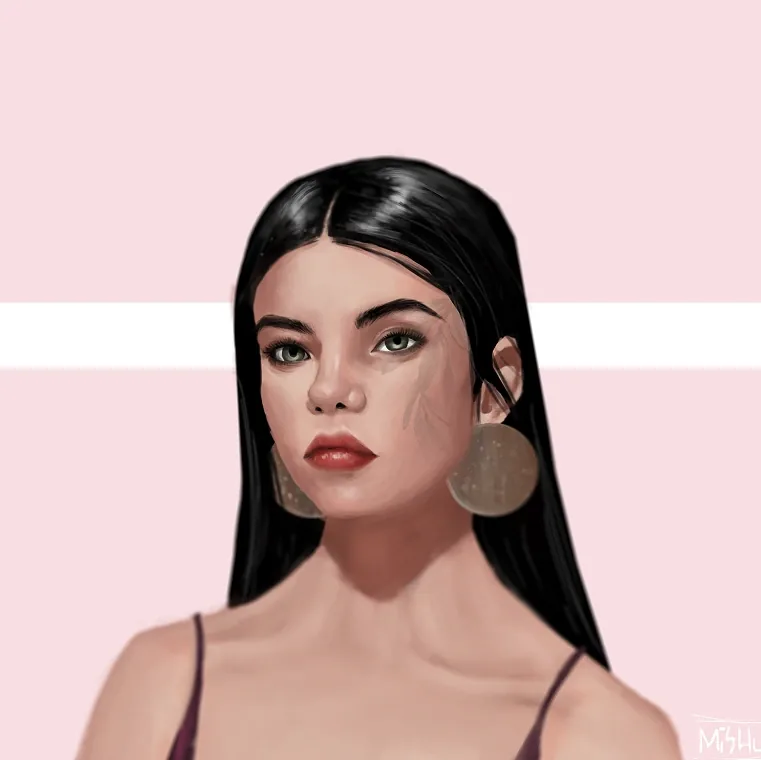
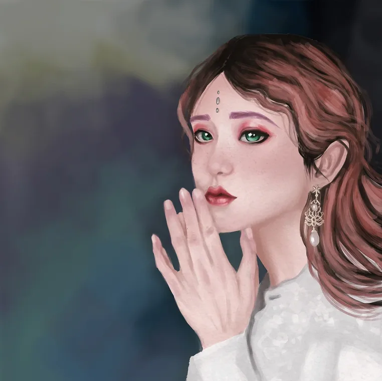
Drawing is the place where I let the work loosen up. It is less about solving a brief and more about following a line, noticing a mood, and seeing what kind of character, rhythm, or tiny world appears when I keep going.

Project overview

A personal drawing practice built through observation, mood, and repetition.

Studio is where the work can loosen up. Instead of beginning with a brief, each piece begins with a line, a place, a character, or a visual rhythm and develops through making.

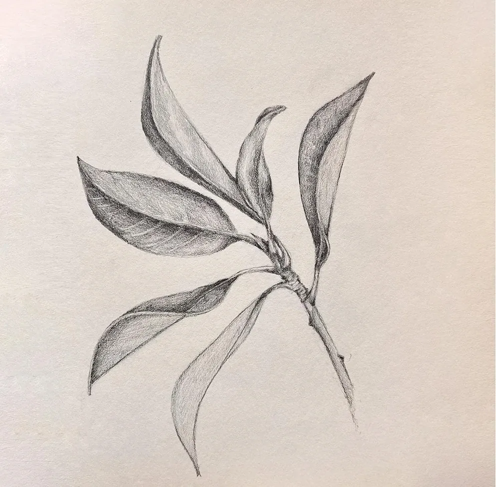
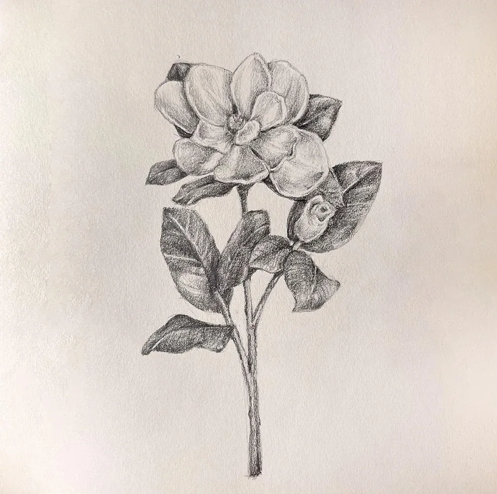
The collection moves between architectural studies, portraits, botanical sketches, characters, and imagined scenes. Together, the pieces form an ongoing visual notebook that keeps curiosity and hand-made expression close to the rest of my design practice.

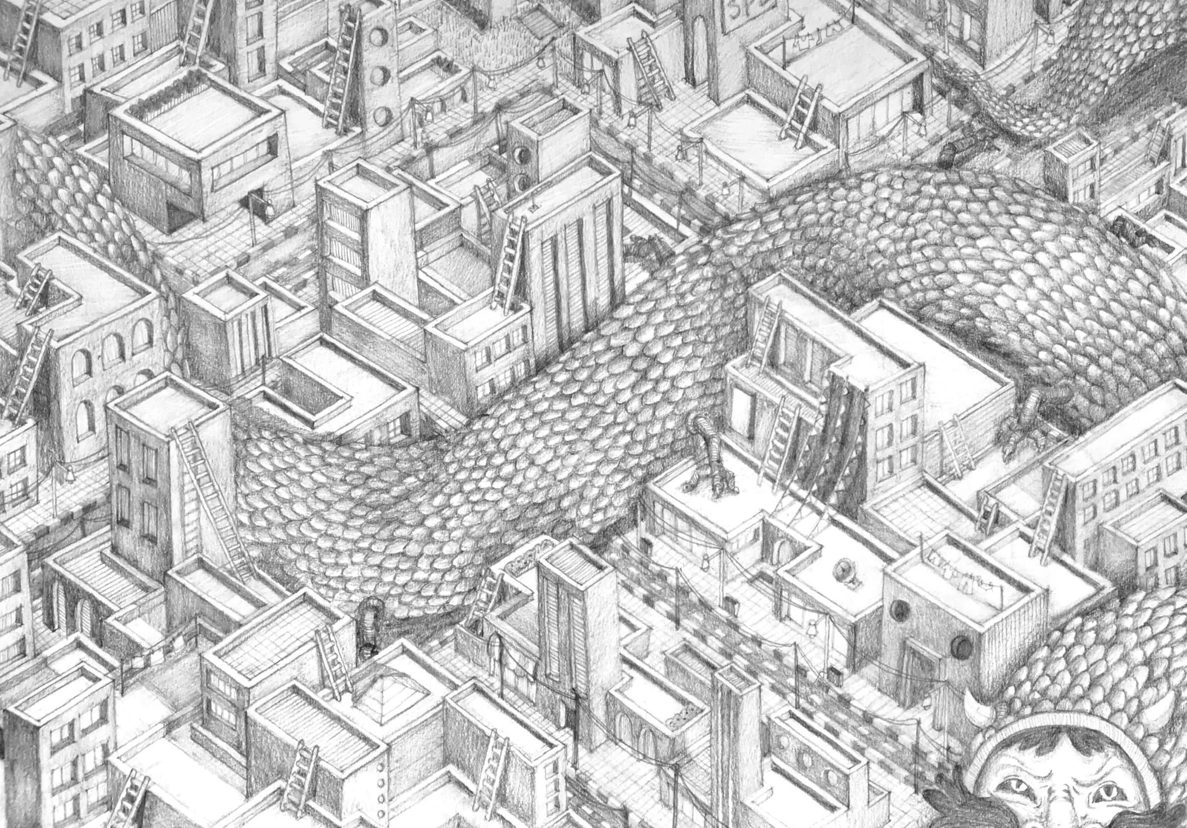
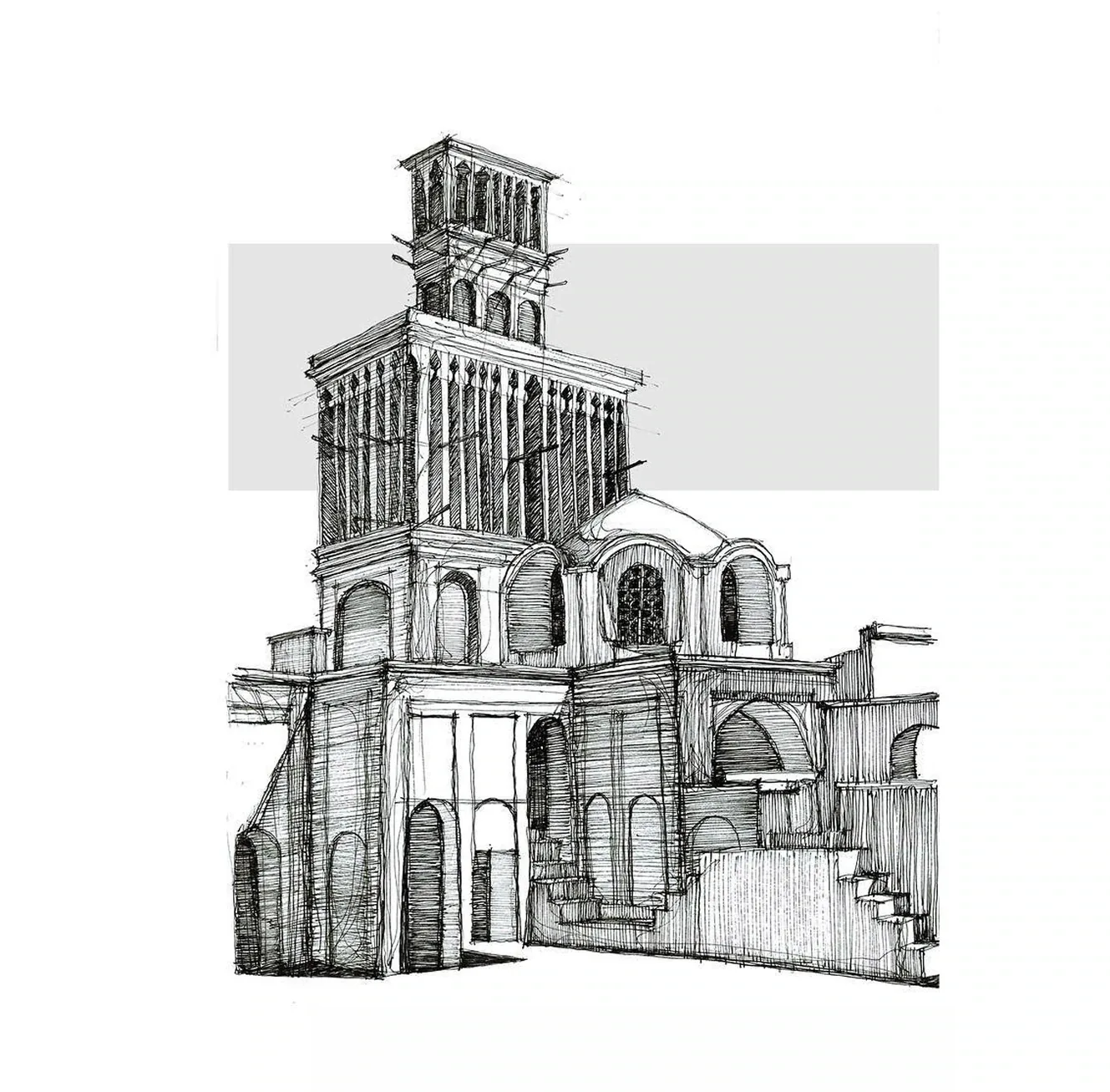
Architectural city sketch
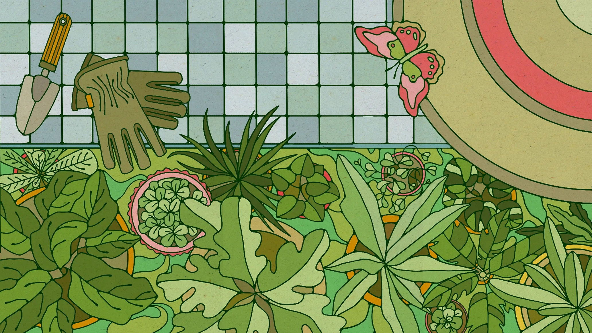
Green botanical pattern illustration
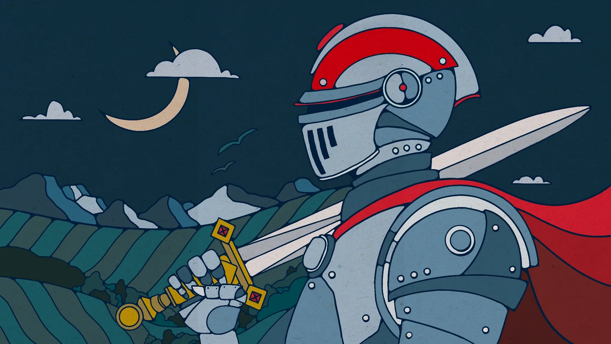
Blue knight character illustration
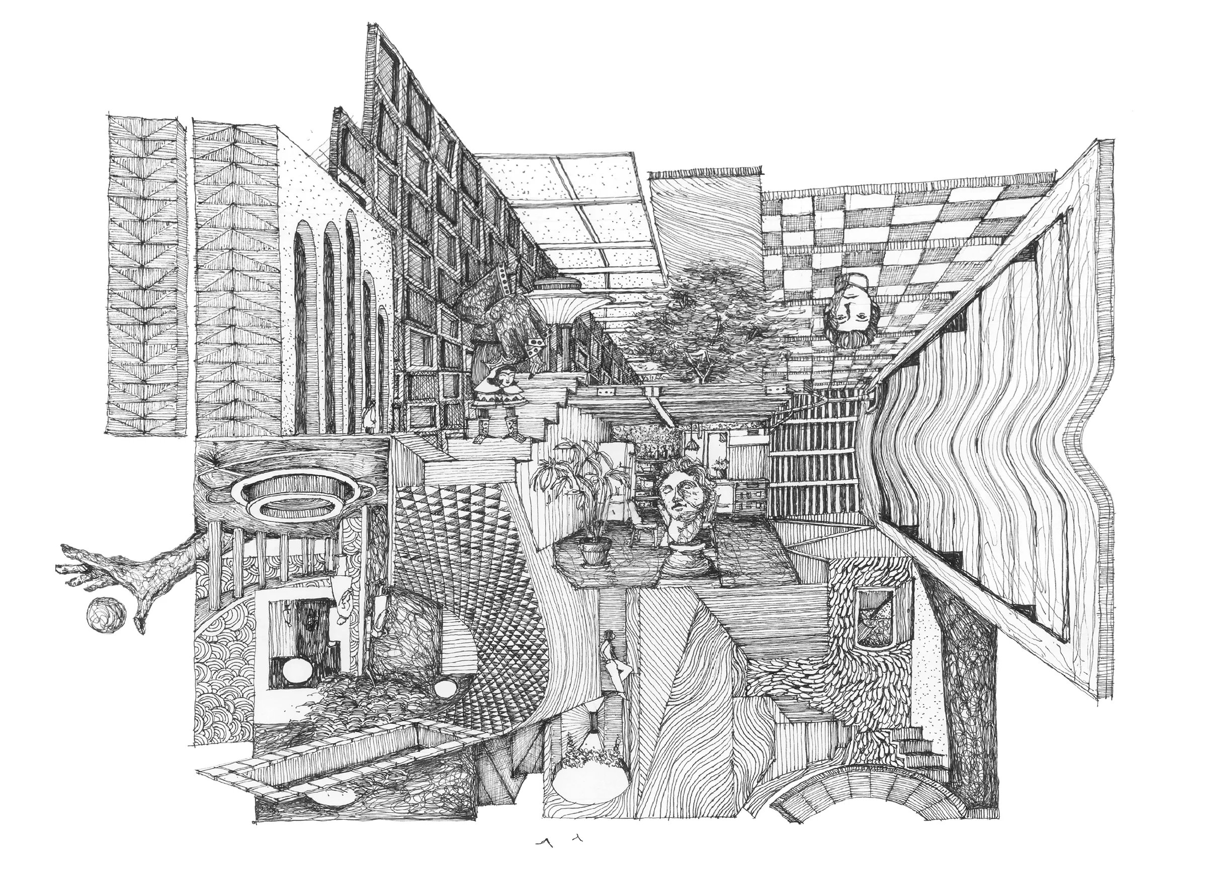
Interior perspective sketch
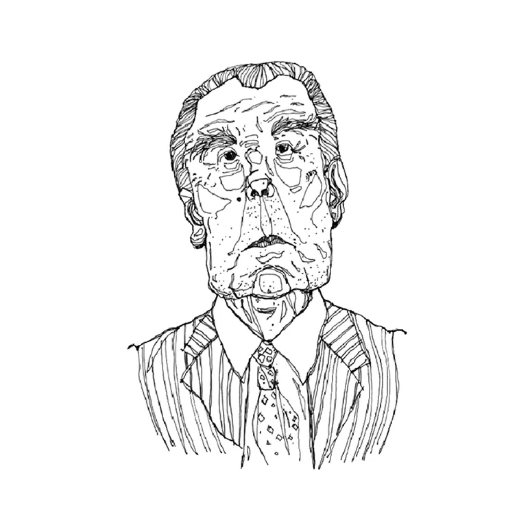
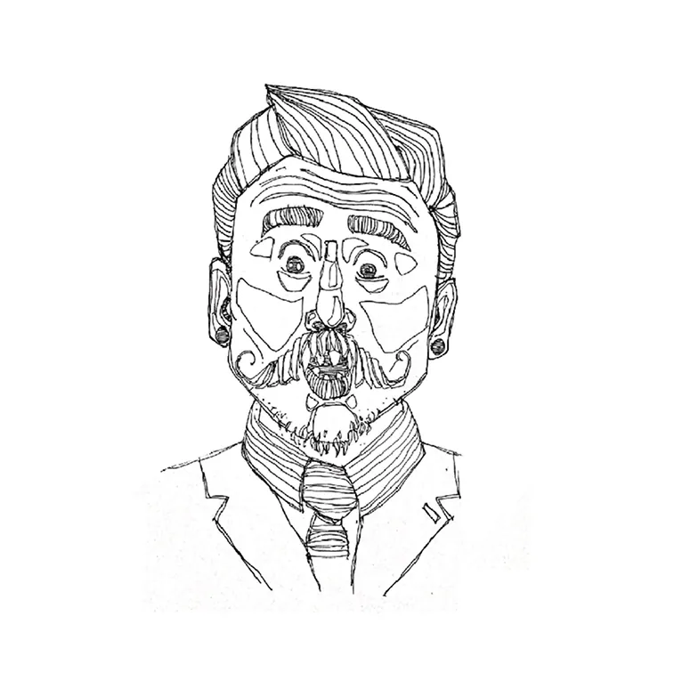
Suited portrait study
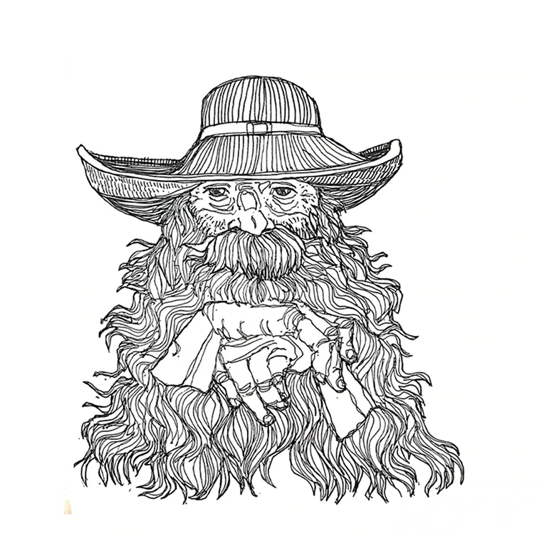
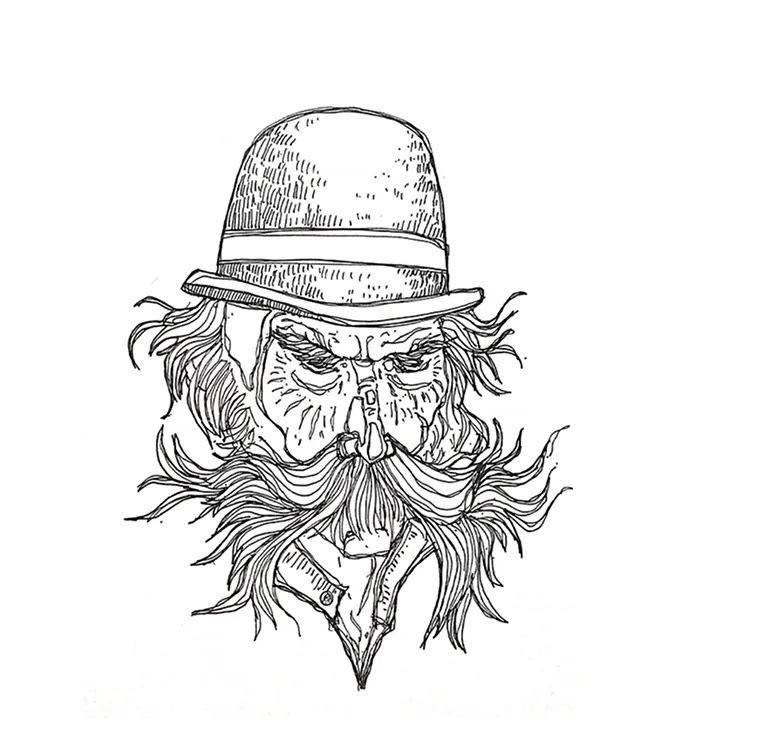
Bearded hat character study
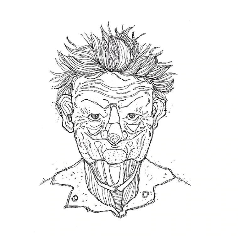
Expressive face study
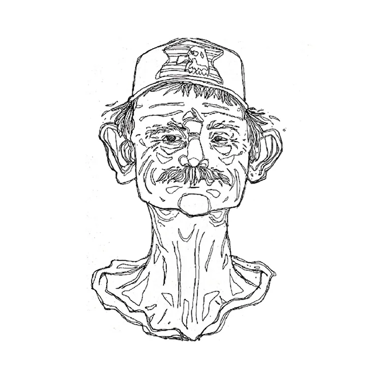
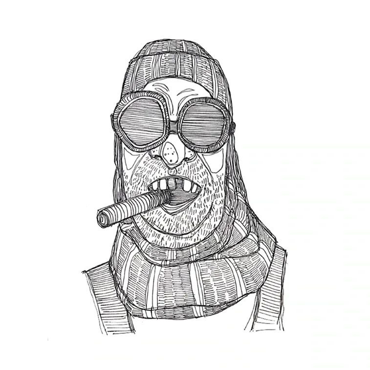
Cap portrait study
Mask-like portrait study
Young portrait study
Textured hair portrait study
Hat portrait study
Profile portrait study
Soft portrait study
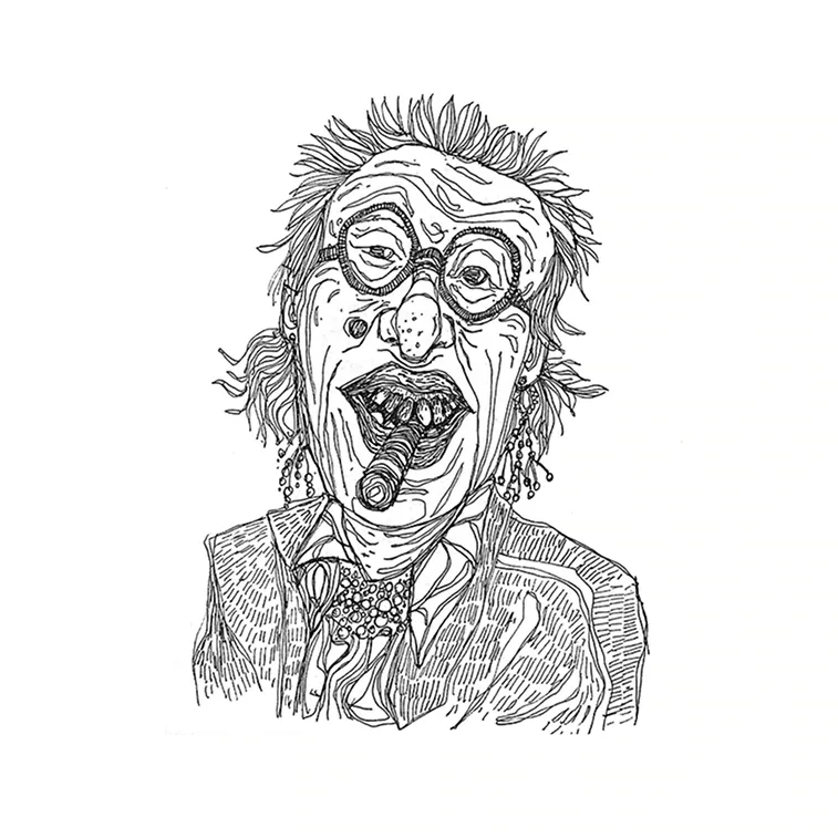
Laughing face study
Wide-brim portrait study
Spiky hair portrait study
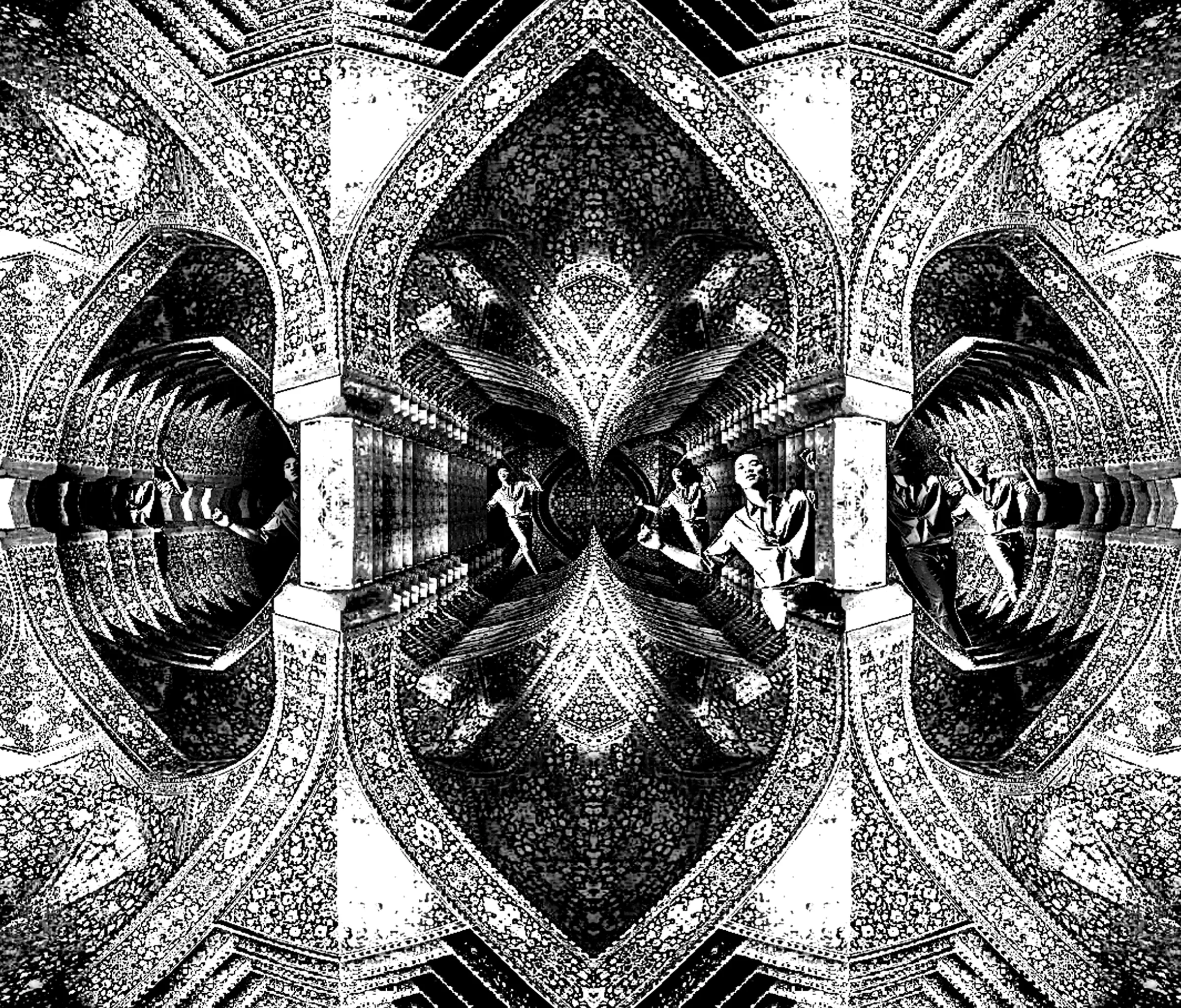
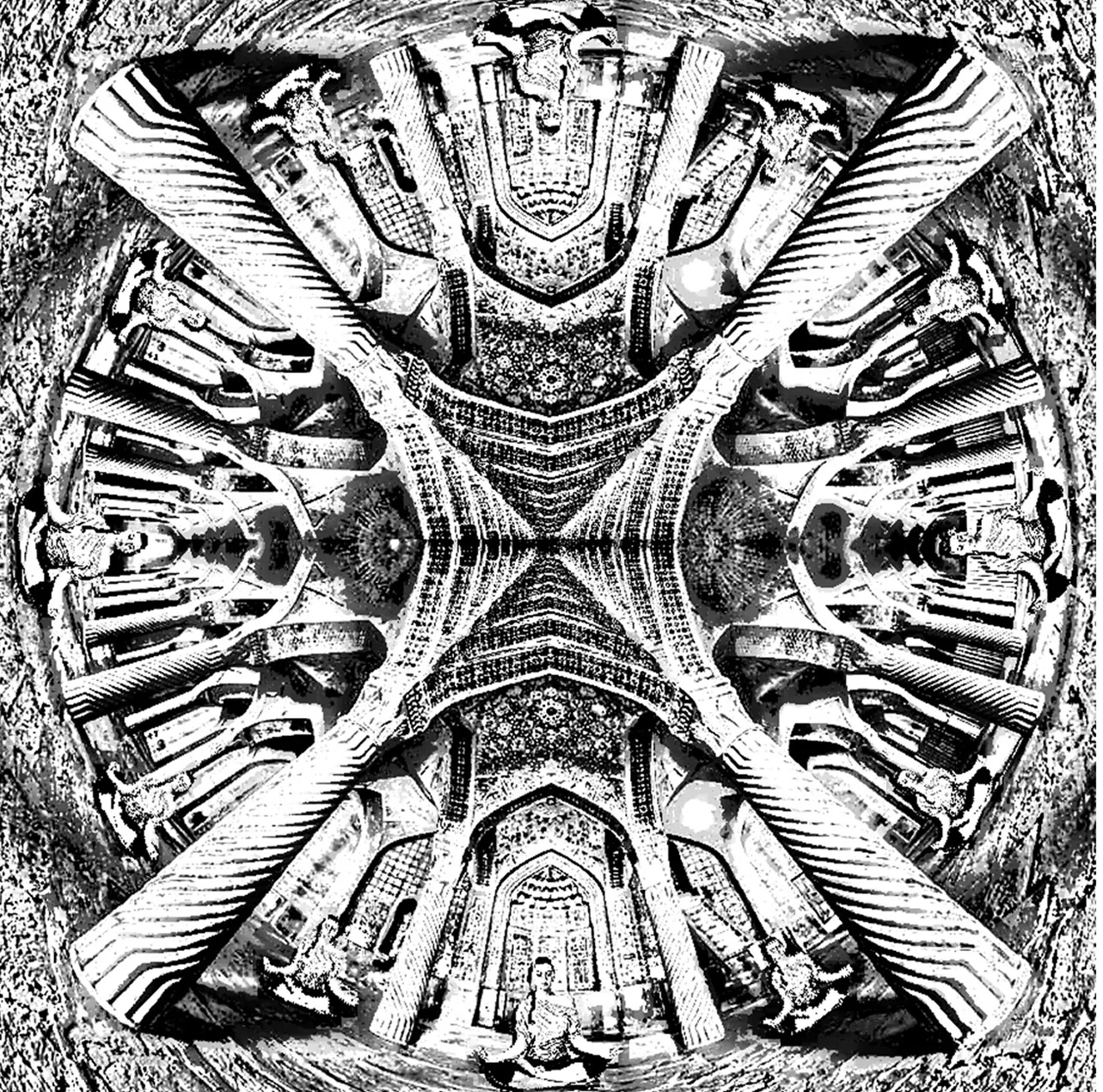
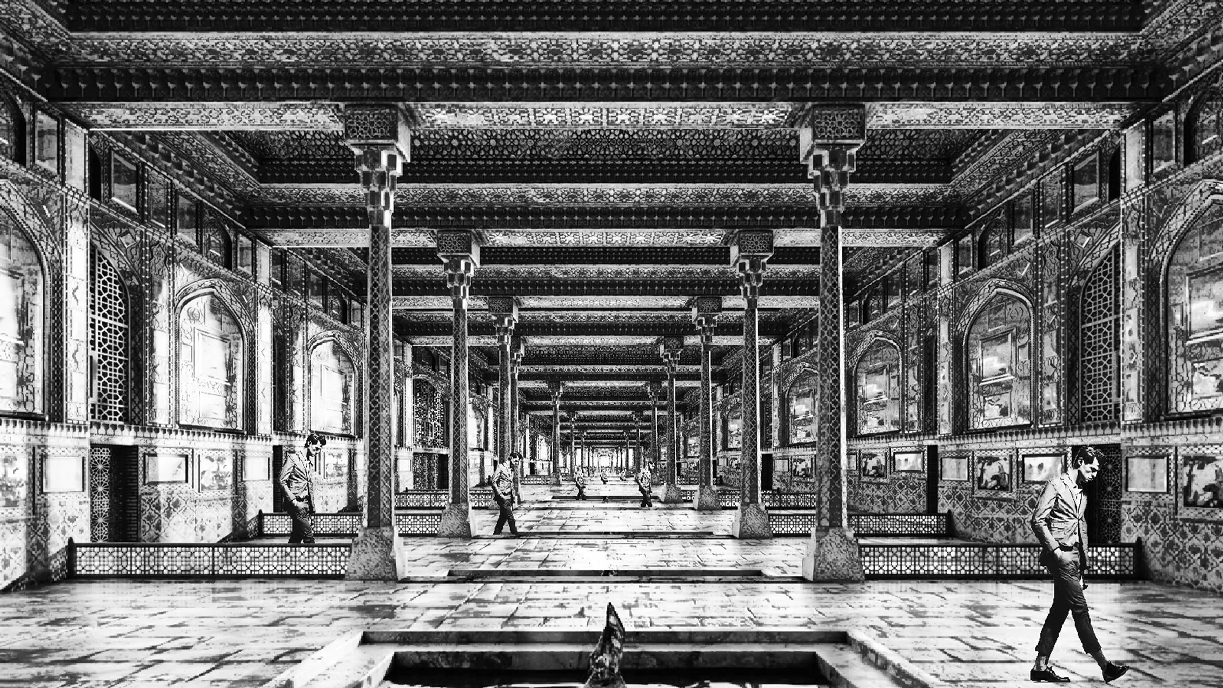
Black and white ornamental hall study
Ornamental ceiling detail study
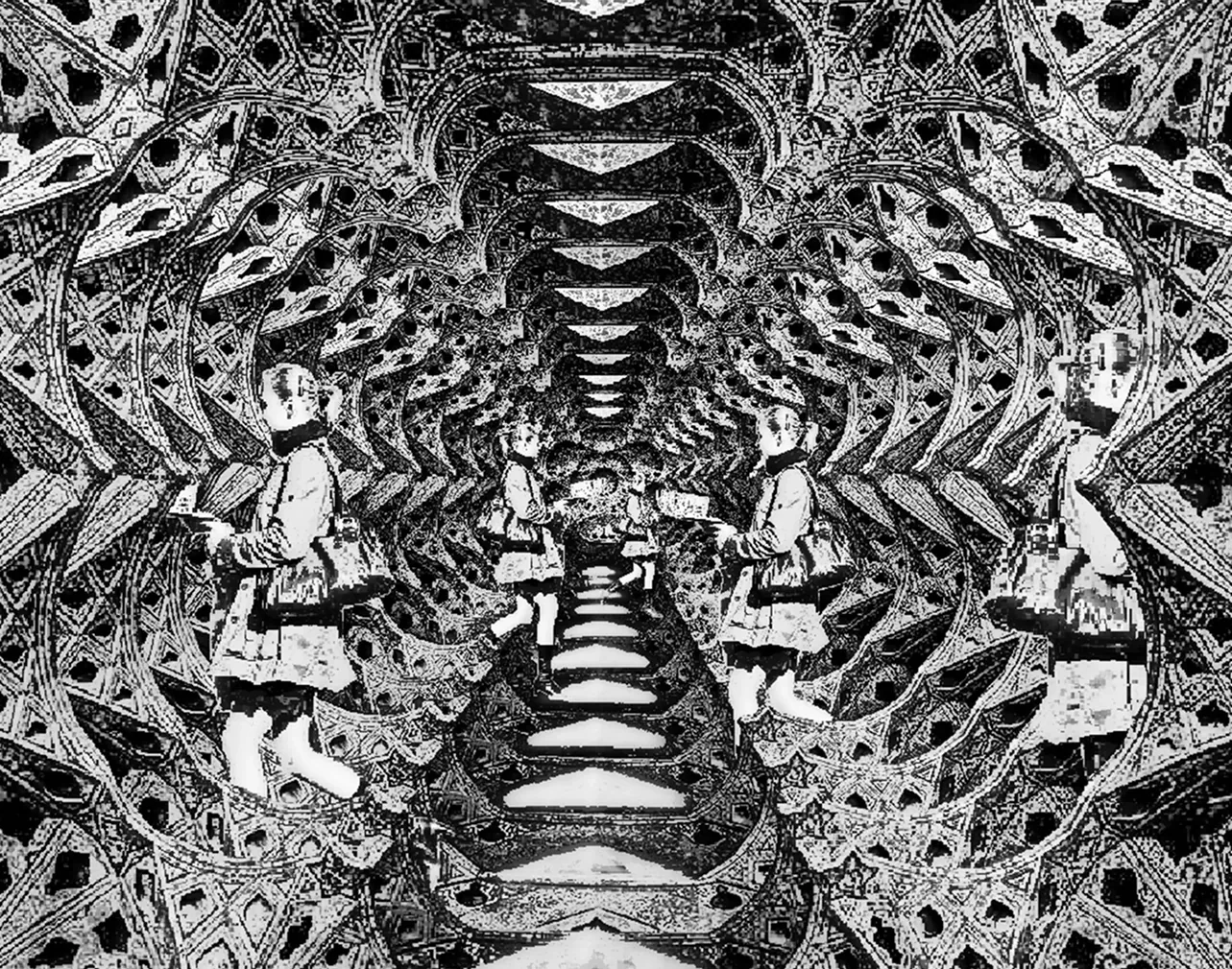
Repeating architectural arches study
Wide architectural hall drawing
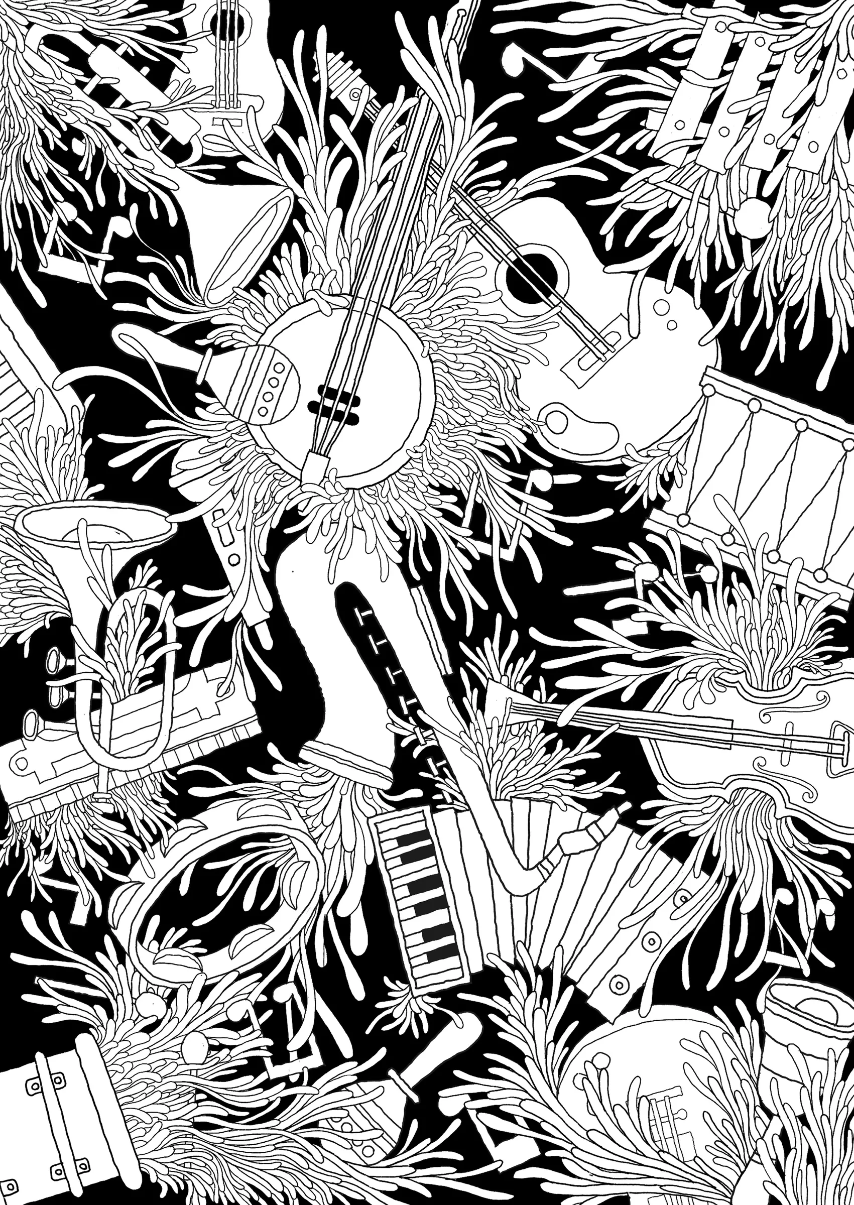
Black and white surreal instrument illustration
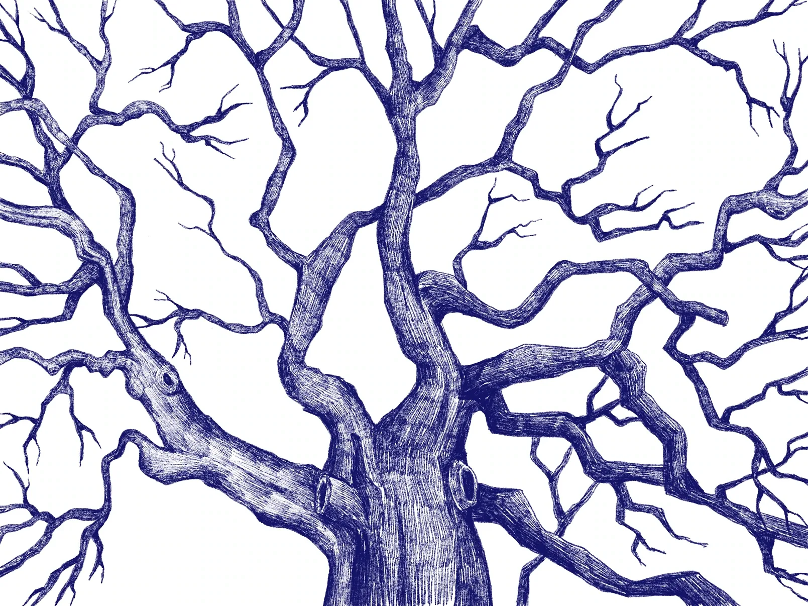
Branching tree study
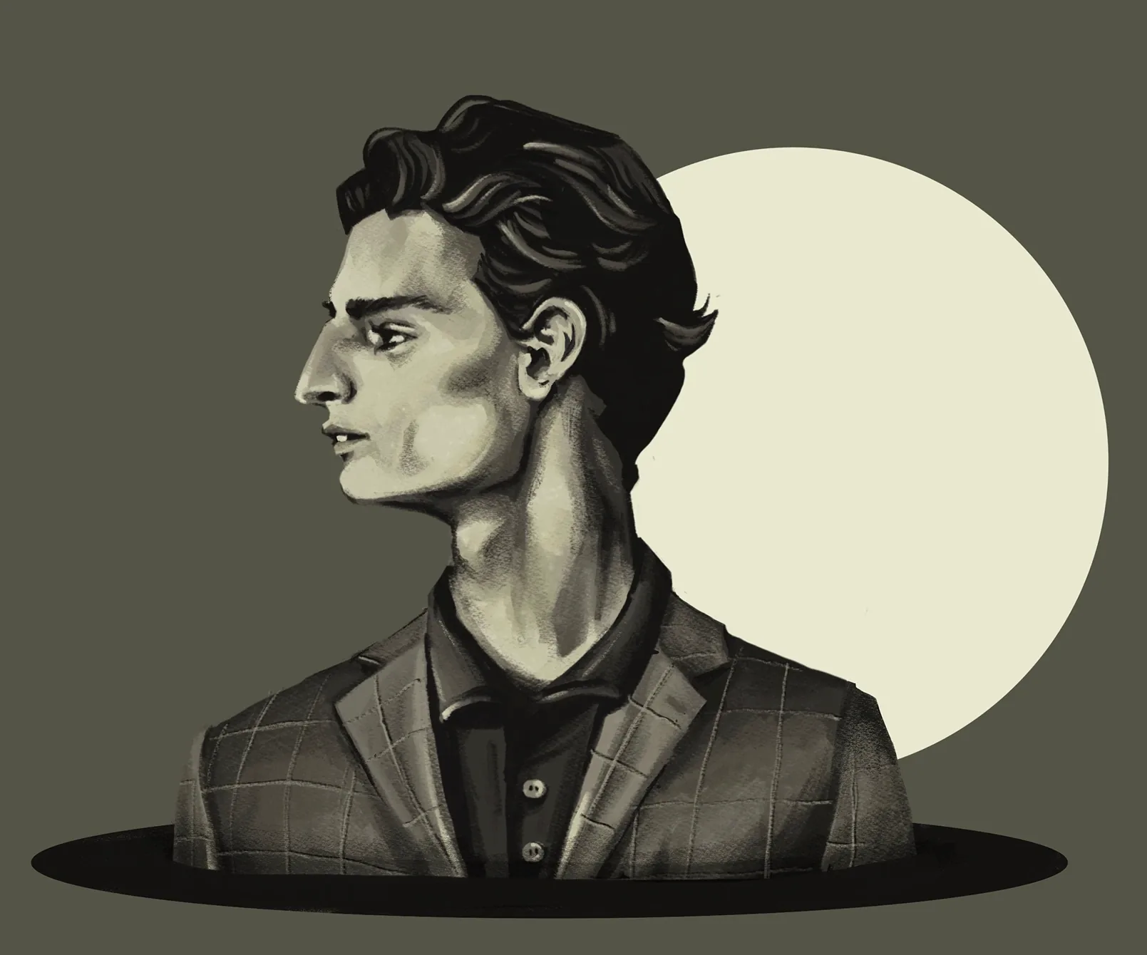
Moonlit portrait illustration
Red portrait study
Soft color portrait study
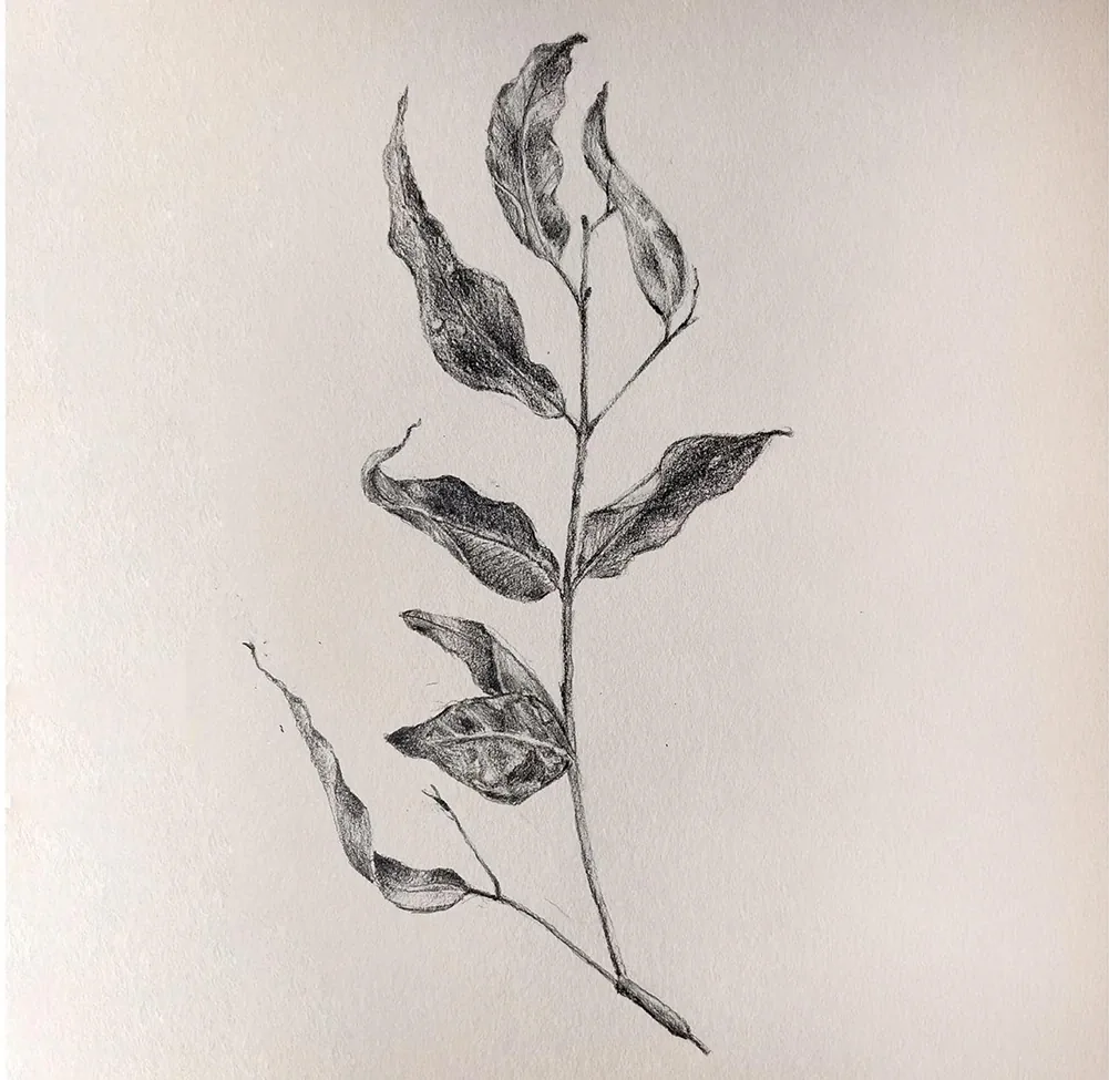
Botanical branch study
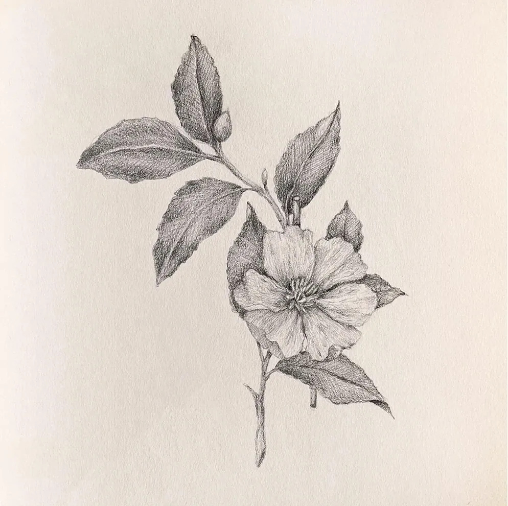
Botanical flower study
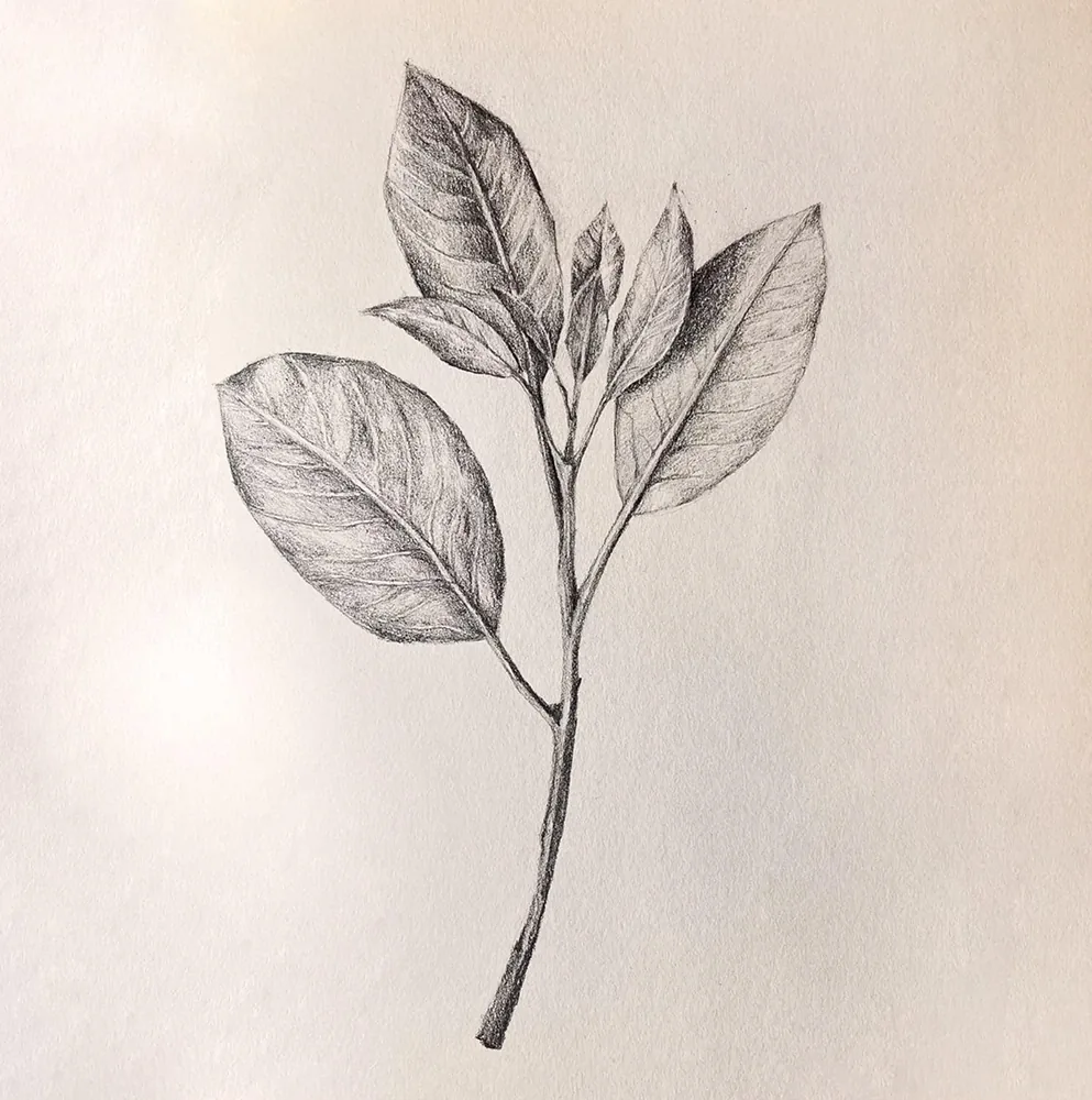
Botanical leaf sketch
Botanical flower sketch
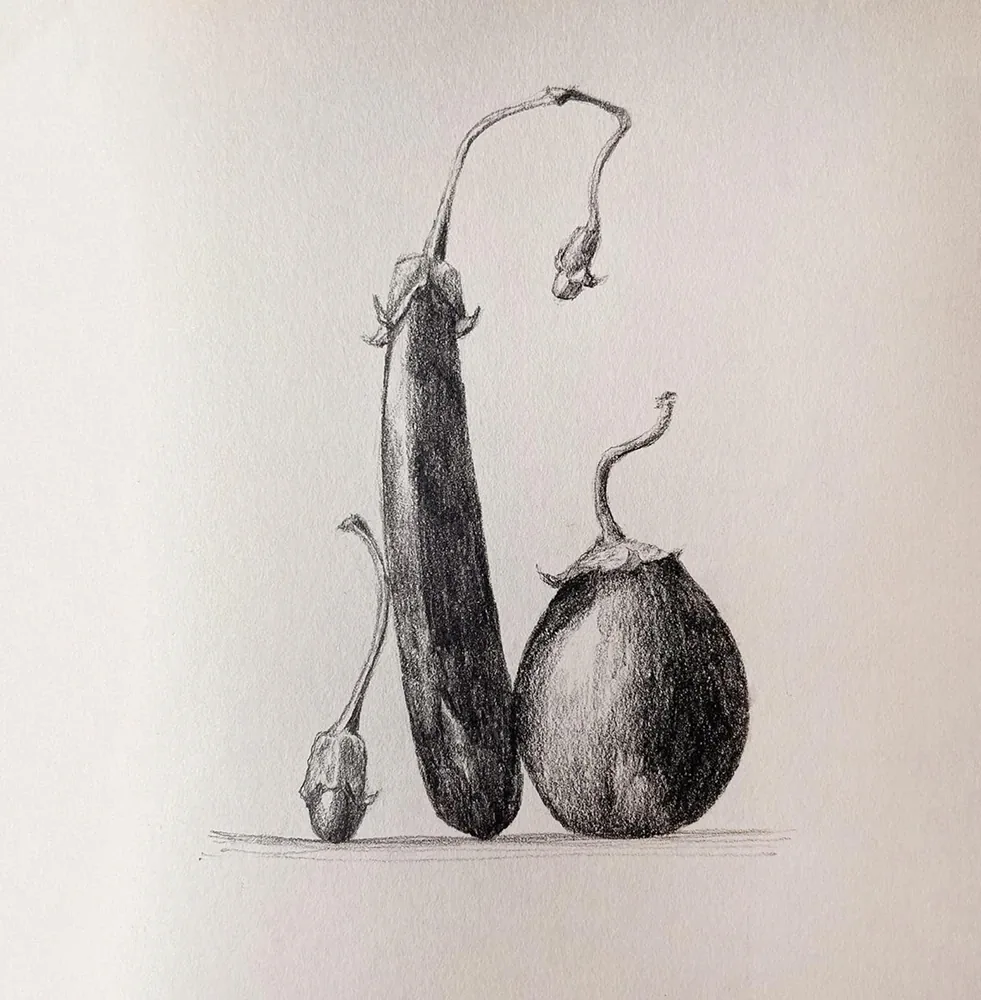
Botanical stem study
Pear still-life sketch
Dark eye illustration
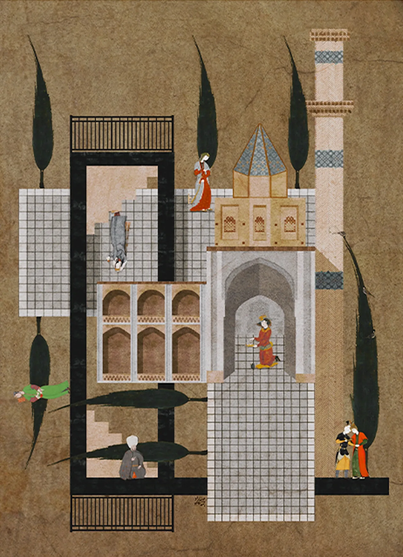
Architectural interior collage
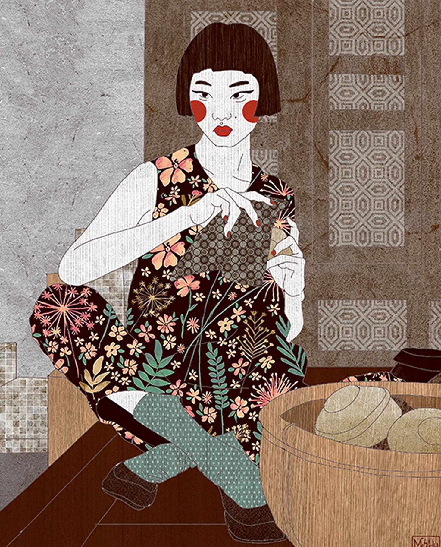
Seated floral figure illustration
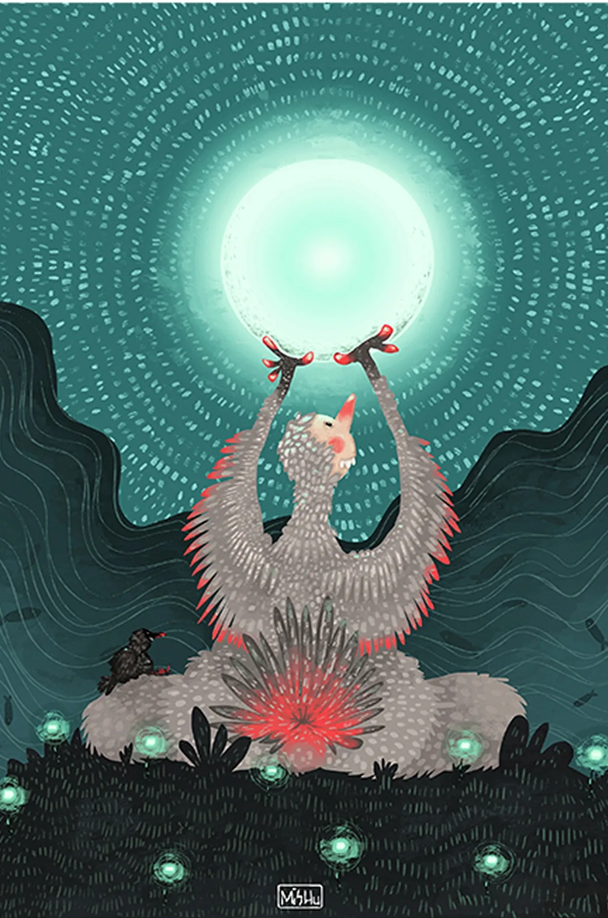
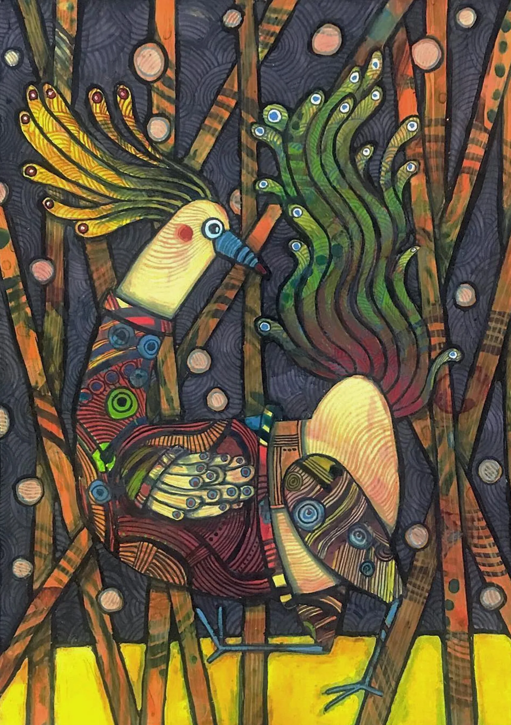
Glowing bird ritual scene
Colorful forest table scene
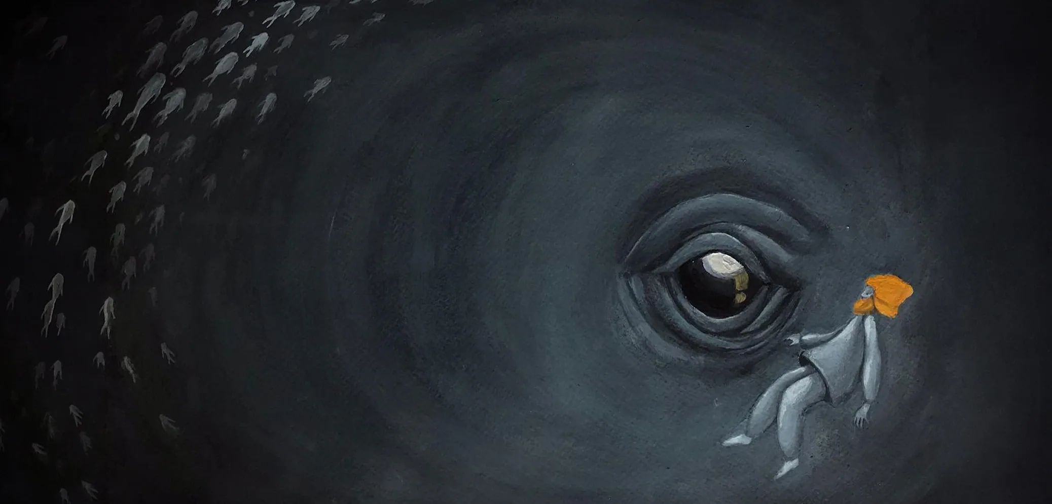
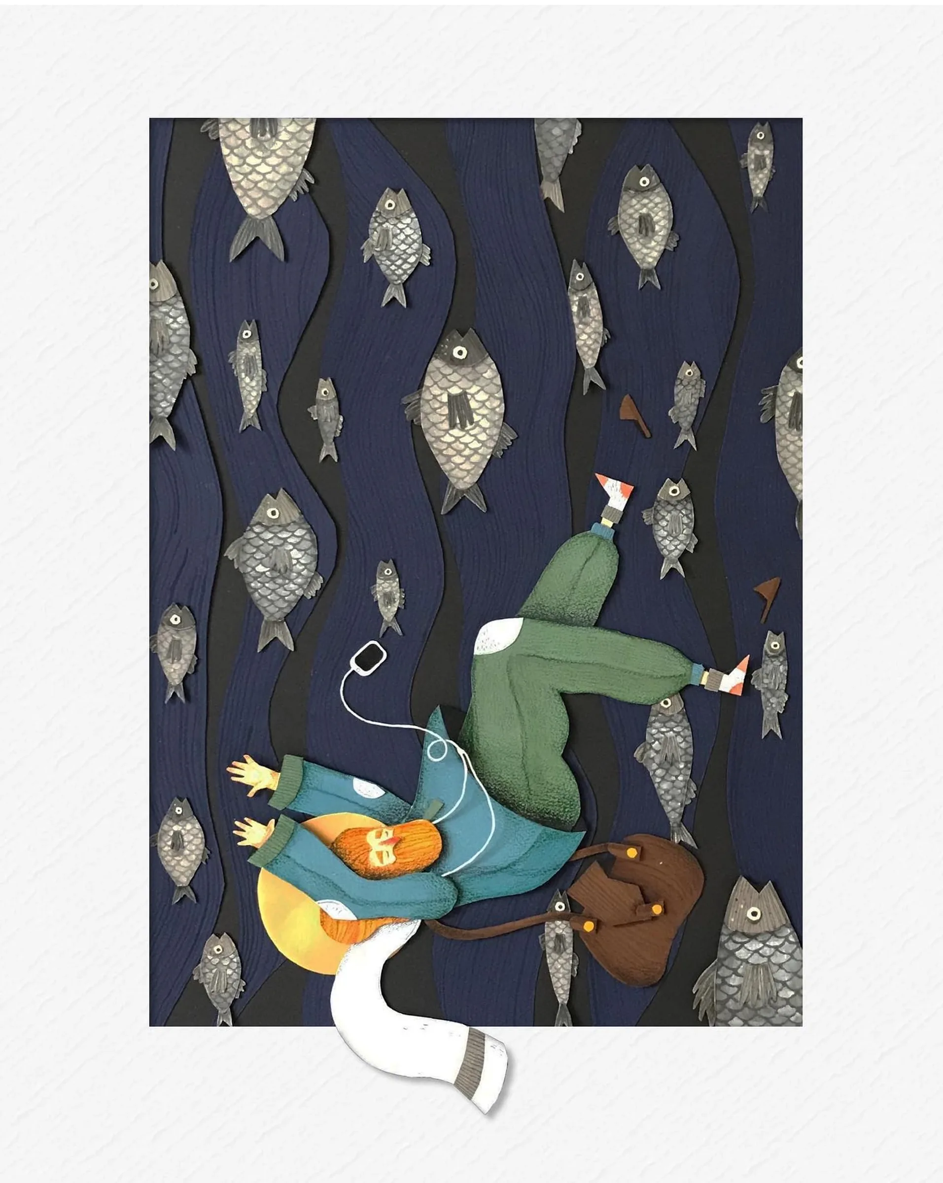
Floating figure night scene
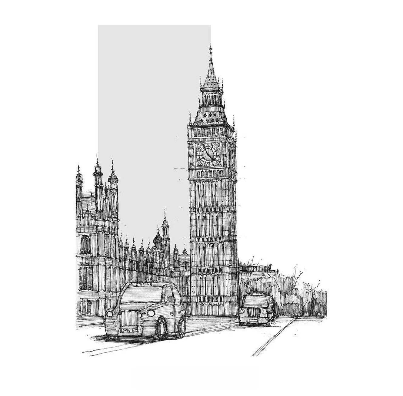
Clock tower street sketch
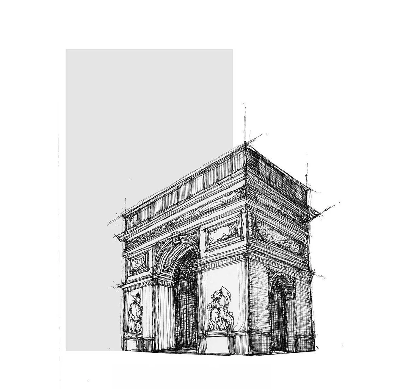
Arch monument sketch
Church architecture sketch

About Mahsa Rad

I’m Mahsa, a Vancouver-based designer working across brand identity, digital experience, and product design. I like making things feel clear, thoughtful, and a little more alive.

For the past nine years, I’ve moved between visual identities, campaigns, websites, digital systems, and product experiences for different kinds of brands. I’m happiest in the space where strategy, feeling, and small details start to click.

I’m a bit of a learning addict. I’m always picking up a new tool, reading about a new subject, testing a process, or following a question until it turns into something useful.

What keeps me close to design is the mix of structure and intuition: the rhythm of a layout, the tone of a brand, the way typography behaves, and the moment a visual system starts to feel natural. I care about work that feels refined, but still has warmth, clarity, and a point of view.

Outside of work, I’m usually cooking, walking around the city with my partner, checking in on my birds from afar, or noticing tiny things that other people might pass by. Those quieter moments often find their way back into the work.

Selected focus
Brand identity Digital experience Product design UX/UI Visual systems Campaign design Spatial narration

Let’s build something meaningful.

Mahsa Rad

Vancouver, BC

Experience

May 2024 – Present
Curbex
Senior Designer
  • Leading the ongoing redesign of the website’s UI/UX, improving clarity and aligning the experience with modern digital standards.
  • Developing digital marketing materials that support consistent brand communication across touchpoints.
Jun 2024 – Dec 2024
PHI
Business Partnership
  • Co-developed an immersive project exploring identity, transformation, and the ethical implications of genetic engineering.
  • Worked across physical installation, curated media, and virtual reality as part of a collaborative research-led experience.
  • Created in collaboration with Samuel Dias and Haomin Wang as part of the Master of Digital Media program.
Sep 2015 – Present
Freelance / Independent Practice
Designer
  • Provided design services across branding, illustration, digital assets, and visual communication.
  • Worked with clients to translate business needs into clear visual directions and design deliverables.
Jun 2012 – Mar 2021
Independent Illustration Practice
Illustrator
  • Created illustration and visual storytelling work across personal, editorial, and client-led projects.
  • Developed a strong foundation in composition, character, narrative, and visual craft.
Jun 2022 – Dec 2023
Rabex
Designer
  • Spearheaded brand development across digital and physical platforms, creating a more unified visual identity.
  • Designed digital marketing materials including web assets, social media graphics, and email campaign visuals.
  • Collaborated with marketing, product design, and OCS teams to support an integrated design process.
Jun 2021 – May 2022
PILBAN Creative Agency
Designer
  • Worked on branding, UI/UX, marketing materials, and visual identity design for diverse clients.
  • Contributed to the agency’s own rebranding, including logo, pattern, and color system development.
  • Conducted research and visual exploration to shape creative direction across industries.
Feb 2020 – Jun 2021
Armina Smart Home
Designer
  • Developed packaging, presentations, brochures, manuals, and marketing materials.
  • Supported brand communication and customer experience through clear visual assets.
Sep 2018 – Sep 2019
Ponisha
Designer
  • Provided graphic design and illustration services across brand identity, brochures, websites, and marketing materials.
  • Collaborated with clients to understand their needs and translate direction into clear, visually appealing design work.
  • Applied design principles and production best practices to deliver polished client-ready assets.
Sep 2014 – May 2019
University of Tehran
Extracurricular Teacher
  • Taught AutoCAD and Adobe Photoshop to architecture and design students.
May 2017 – Aug 2017
Boghche
UI/UX Intern
  • Redesigned the mobile app UI/UX to improve usability and visual appeal.
  • Conducted user research and gathered feedback to inform interface improvements.
  • Collaborated with developers to support implementation of the redesigned experience.
Oct 2016 – Jun 2017
Center of Architectural Technology at University of Tehran
Advertising Manager
  • Created and implemented advertising campaigns for CEAT.
  • Managed advertising budgets and supported efficient campaign delivery.

Education

Toronto Metropolitan University
Master of Digital Media
University of Tehran
MA Interior Architecture
University of Tehran
BSc Architectural Engineering

Response within 1–2 business days.

Kloud hero image
Brand Identity · 2023

Kloud

A strategic identity for a branding agency built around Black Clouds, bold change, and the ambition to move brands higher.

Role

Designer

Project Type

Branding Project
Fall 2023

Brand Design Logo Freelance Project Social Media
Project Note

Kloud was a branding project for a young creative agency that wanted to enter the market with more than a polished logo. The challenge was to build a brand that could make strategy feel desirable: serious enough for business owners, expressive enough for digital culture, and memorable enough to become a world of its own.

I treated the project as a translation of a business feeling. Kloud speaks to people who are looking for a shift, a clearer position, a stronger campaign, or a smarter way to be seen. The identity needed to capture that moment before growth happens, when pressure turns into direction and uncertainty starts becoming momentum.

The central visual idea came from Black Clouds. I did not use the cloud as a soft decorative symbol. I used it as atmosphere: dark, charged, intelligent, and full of potential. From that concept, the identity moved into a system of marks, strokes, typography, patterns, color, icons, social content, and brand applications that could all speak the same language.

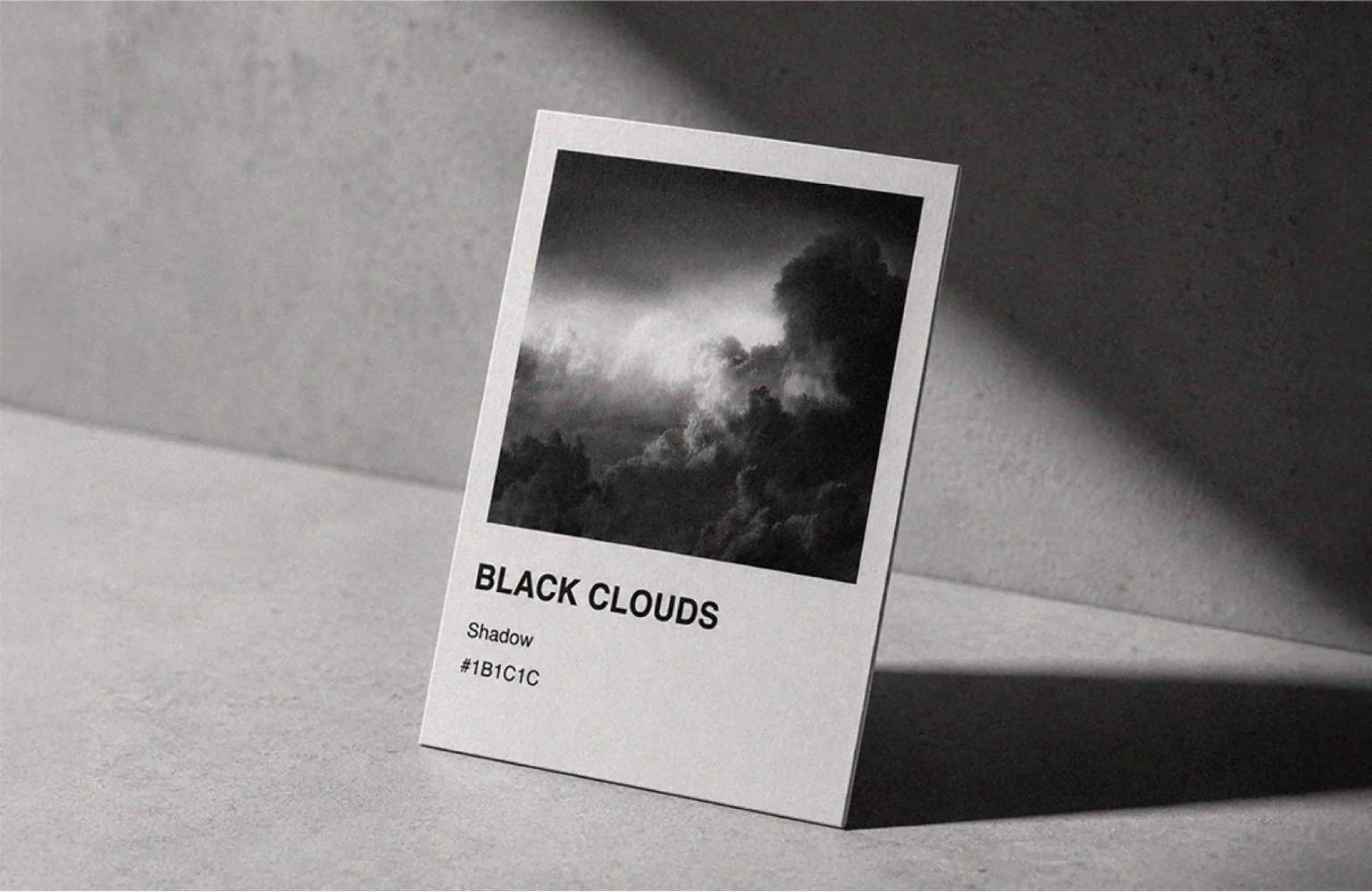
Kloud black clouds card
Case Study Expansion

When a
black cloud
becomes
a signal.

The black cloud became the conceptual anchor of the project. It carries mystery, pressure, movement, and the feeling of something about to change. I used that tension to shape a brand language that feels confident without being loud and strategic without becoming cold. The system is built on contrast: dark atmosphere with clear structure, soft cloud-like strokes with disciplined geometry, and a visual voice that can move from business strategy to cultural content without losing its identity.

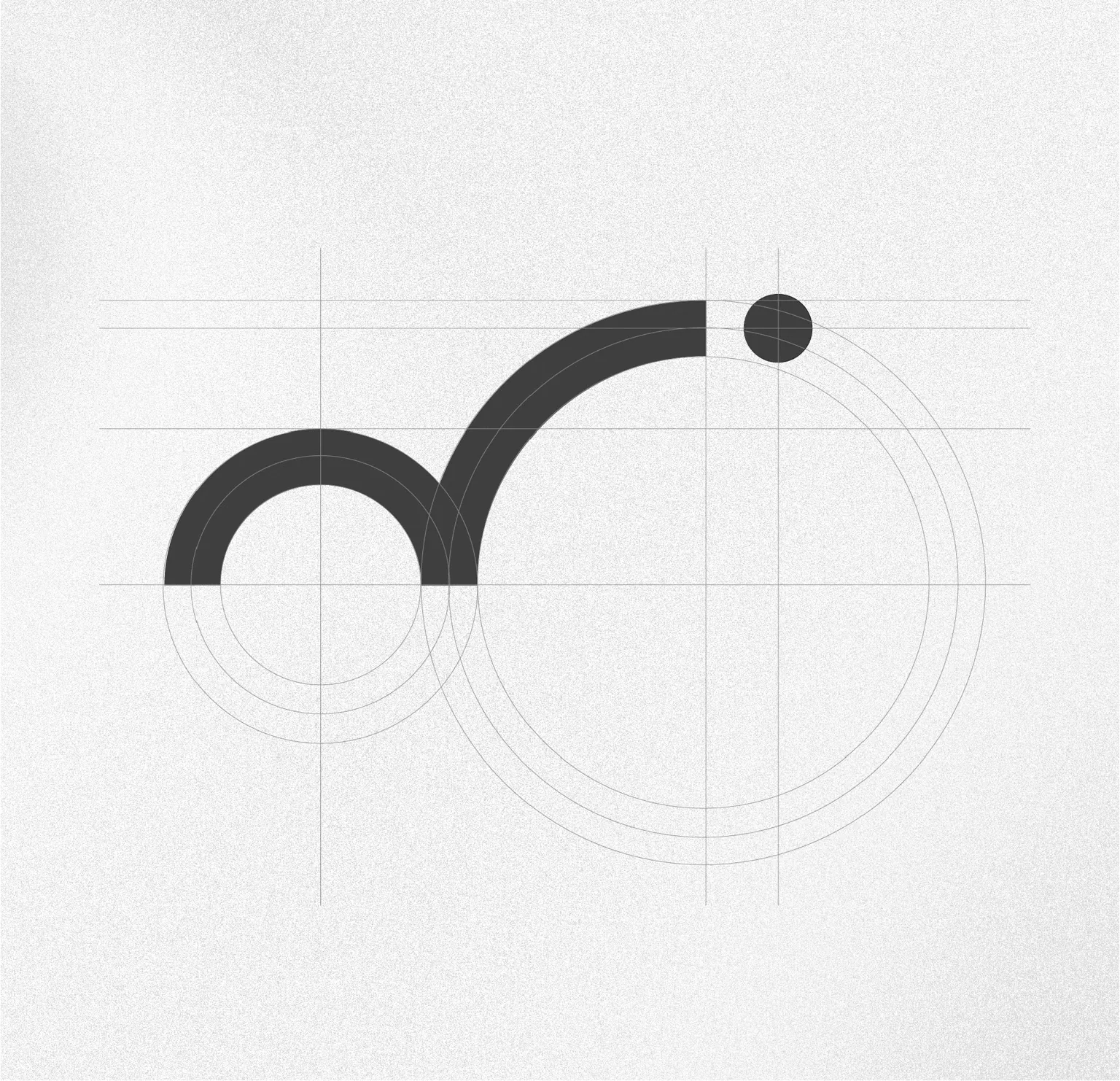
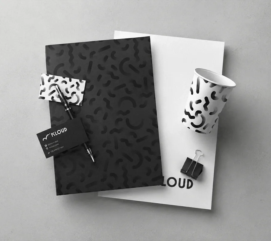
Kloud logo construction
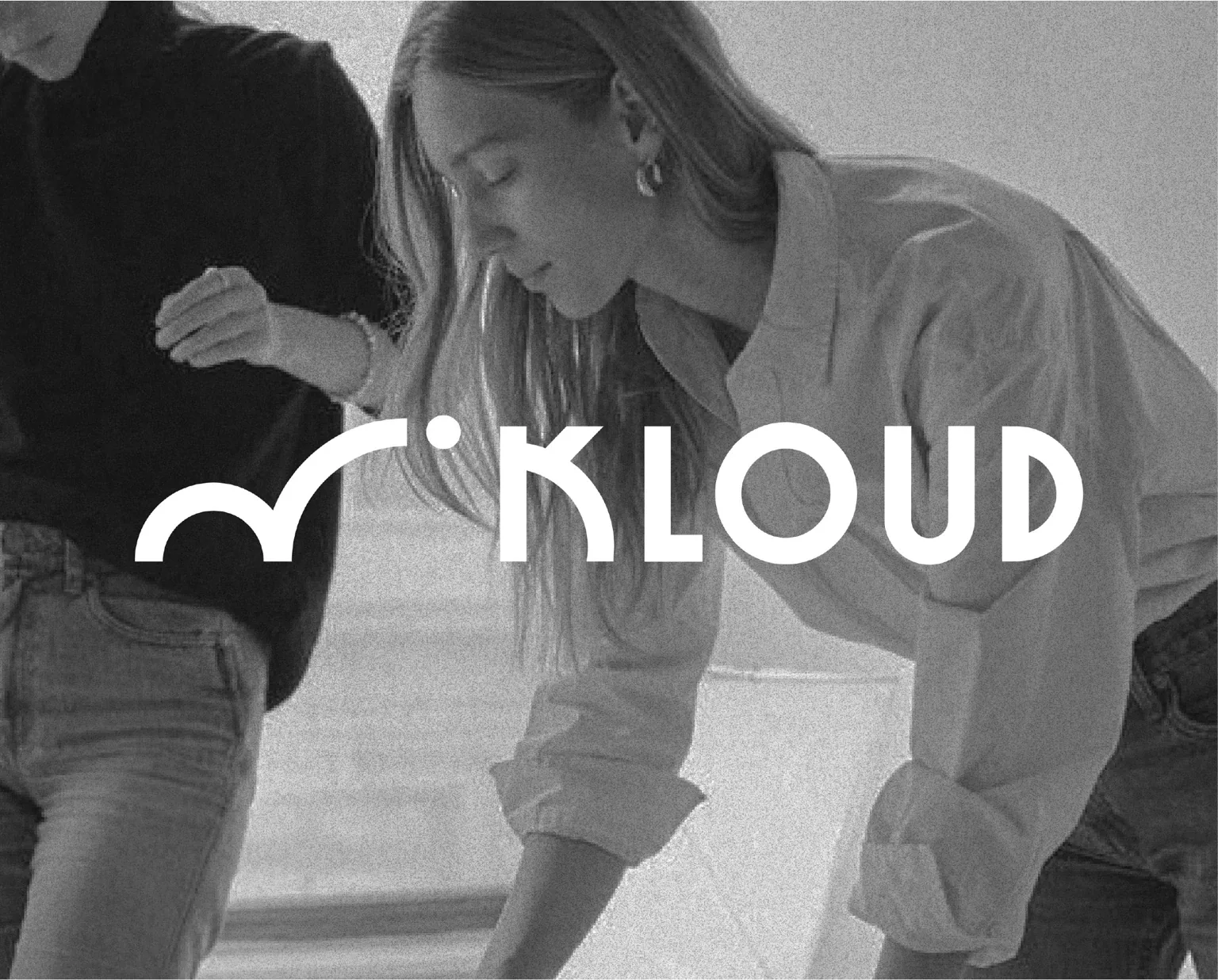
Kloud logo over human image
Kloud stationery system
Visual Direction

A logo shaped from black cloud energy.

The logo was designed to carry the brand’s atmosphere in its simplest form. I started from cloud-like strokes and refined them into a controlled mark that feels fluid, memorable, and usable across different scales.

The design decision was to avoid literal illustration. Instead of drawing a cloud, the mark suggests movement, elevation, and transformation through form. That gave Kloud a symbol that feels conceptual, but still practical as a brand asset.

Brand System

A system that expands without losing its origin.

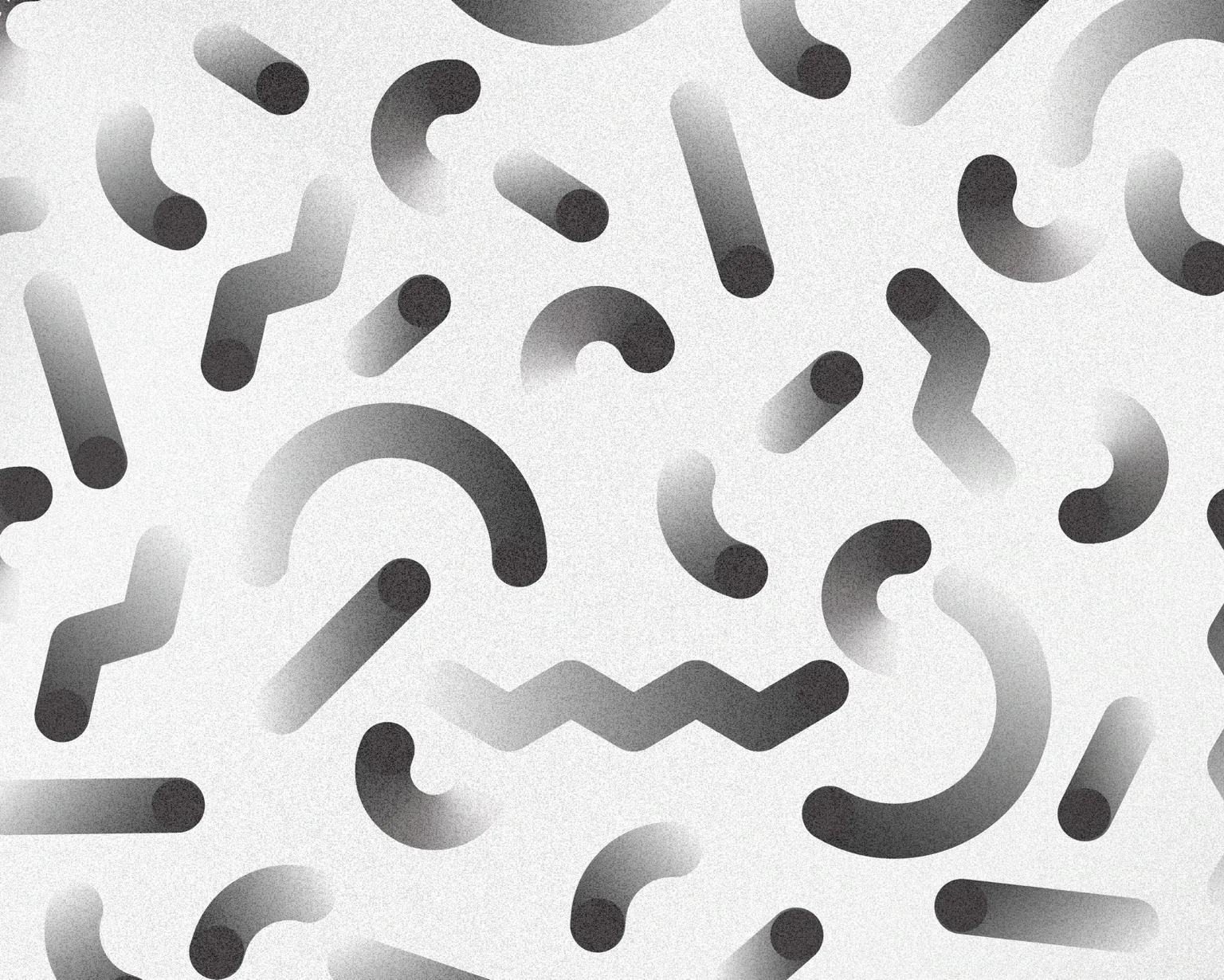
The pattern language was extracted from the logo rather than added as a separate graphic layer. Curves, dots, and directional strokes were separated, repeated, and recomposed to create a flexible visual rhythm.

This method allowed the identity to scale across stationery, packaging, digital layouts, and motion while still feeling connected to the original mark. The system creates recognition through behavior, not repetition.

Kloud pattern system
System Foundation

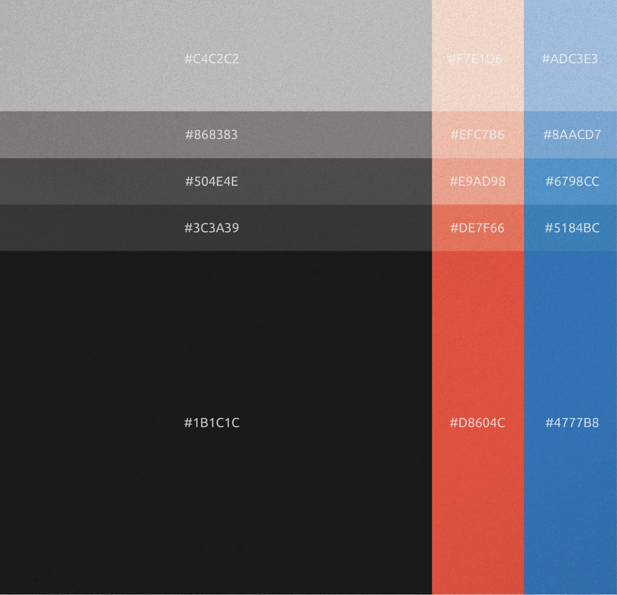
A palette built from Black Clouds.

Black Clouds is the foundation of the palette: deep, focused, and quietly powerful. It gives Kloud authority, mystery, and a strong strategic presence.

The accents are intentionally restrained. Sky Blue opens the system for digital clarity, while Sunset Red adds urgency and campaign energy when the brand needs to shift tone.
Kloud color palette system
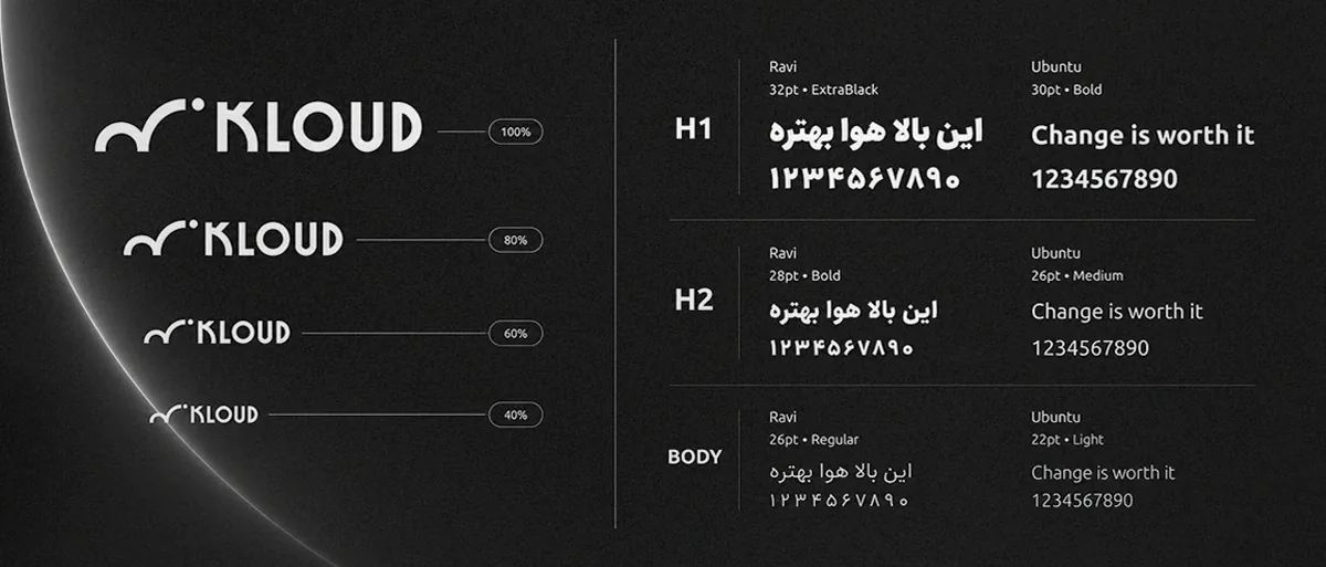
Typography hierarchy system using Ravi and Ubuntu for bilingual clarity
Icon System Motion

Extending the system into culture.

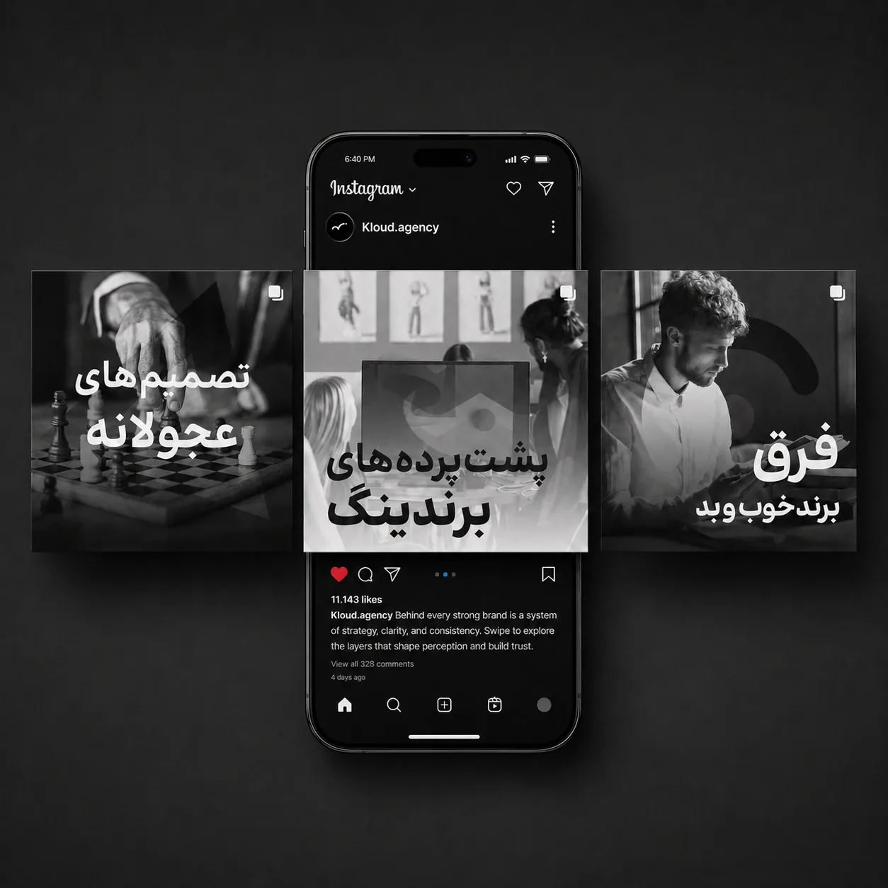
After the identity system was defined, I treated social media, iconography, and merch as proof of its flexibility. Social posts became a space to combine bold Persian typography, monochrome imagery, transparent overlays, and strategic messaging in a way that feels sharp, current, and recognizable.

The icon system follows the same organic-geometric logic as the logo, allowing Kloud to build a consistent digital language for services, highlights, navigation, and content categories. The same visual logic also extends into clothing and merch, turning the brand into something people can encounter, wear, and remember beyond the screen.

Social media application showing Kloud's bold content language
Kloud Instagram social media application
Fashion Application
PILBAN hero illustration
Branding Project · Fall 2021

PILBAN

A creative agency identity built around memory, making, and the strange emotional weight of a simple hand.

Project Note

PILBAN began with a shift in name, but the real design challenge was deeper than a new label. The agency, formerly ASU, needed an identity that could make its creative work feel sharper, more confident, and easier to recognize in a competitive market of branding, design, and digital marketing services.

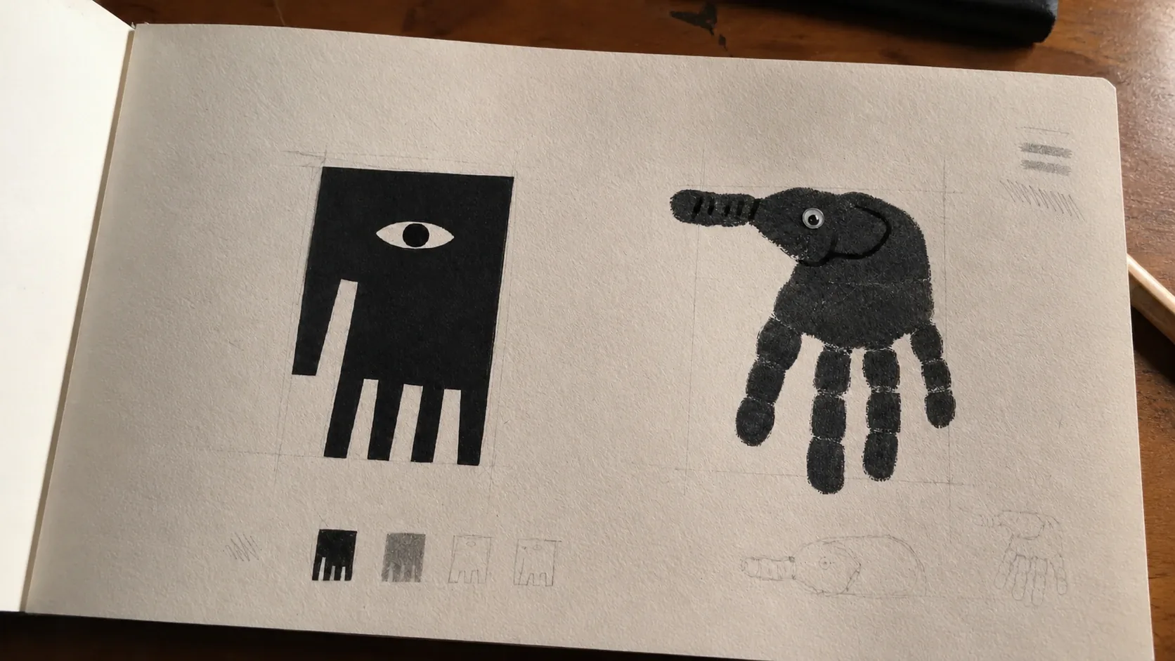
I approached the project as a system of meaning before treating it as a visual exercise. The mark had to carry two ideas at once: the hand as a sign of making, craft, and creative labor, and the elephant as a sign of memory, patience, scale, and presence. That double reading became the conceptual core of the brand.

From there, the identity grew outward. The logo was not treated as a finished object, but as a seed for a larger world: printed material, apparel, packaging, illustration, digital interfaces, and motion pieces that could all feel connected without repeating the same move. The goal was to build a brand that felt intelligent, playful, and grounded at the same time.

PILBAN logo development process

A hand,
an elephant,
and the weight
of identity.

The strongest part of the concept was its ambiguity. A hand is immediate and human. An elephant is heavy, slow, and impossible to forget. I used that contrast to create a logo that does not explain itself too quickly, but leaves a memorable impression.

The result is a mark that feels both handmade and monumental, simple enough to work as a logo, but strange enough to become a character, a pattern, and a visual device across the brand.

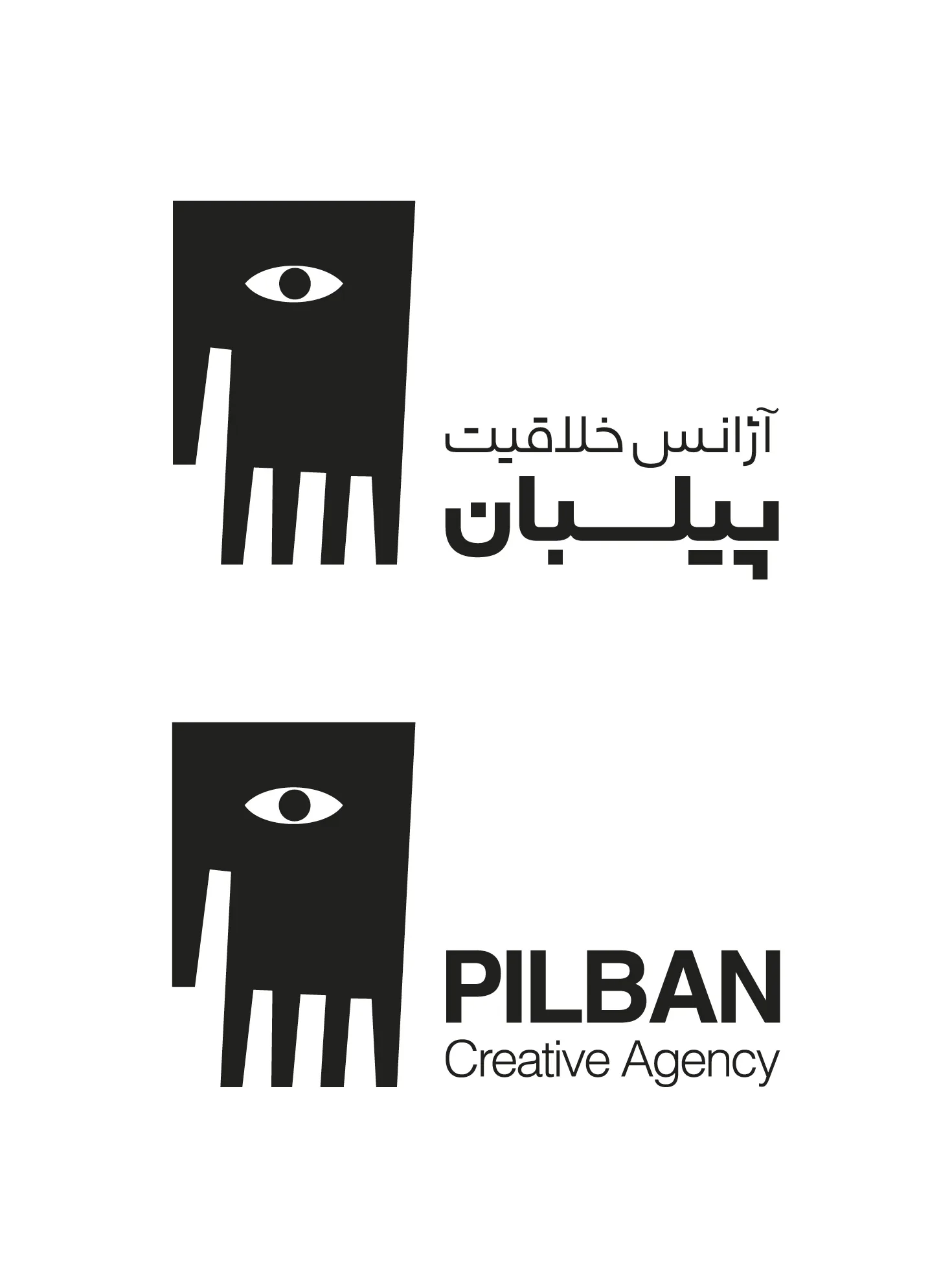
PILBAN bilingual logo lockups

A symbol made to feel both human and monumental.

The design method was built around restraint. I wanted PILBAN to feel imaginative without becoming noisy, and professional without becoming generic. The hand-elephant symbol gave the agency a visual personality that could be serious, playful, cultural, and digital depending on where it appeared.
Every application was a test of that idea. If the mark could sit quietly on a business card, become expressive on a tote bag, turn into an illustration character, and still feel like the same agency on a landing page, then the identity was working as a system, not just as a logo.

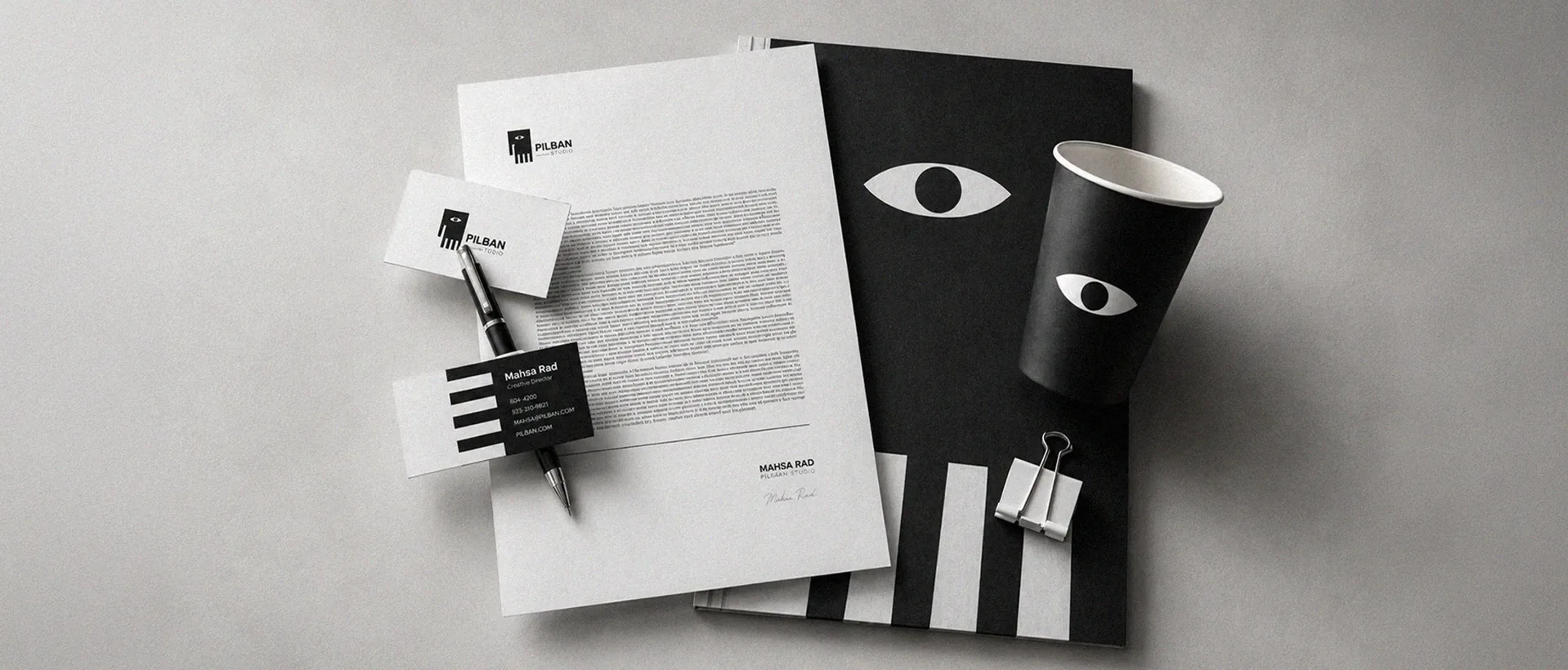
PILBAN stationery mockup
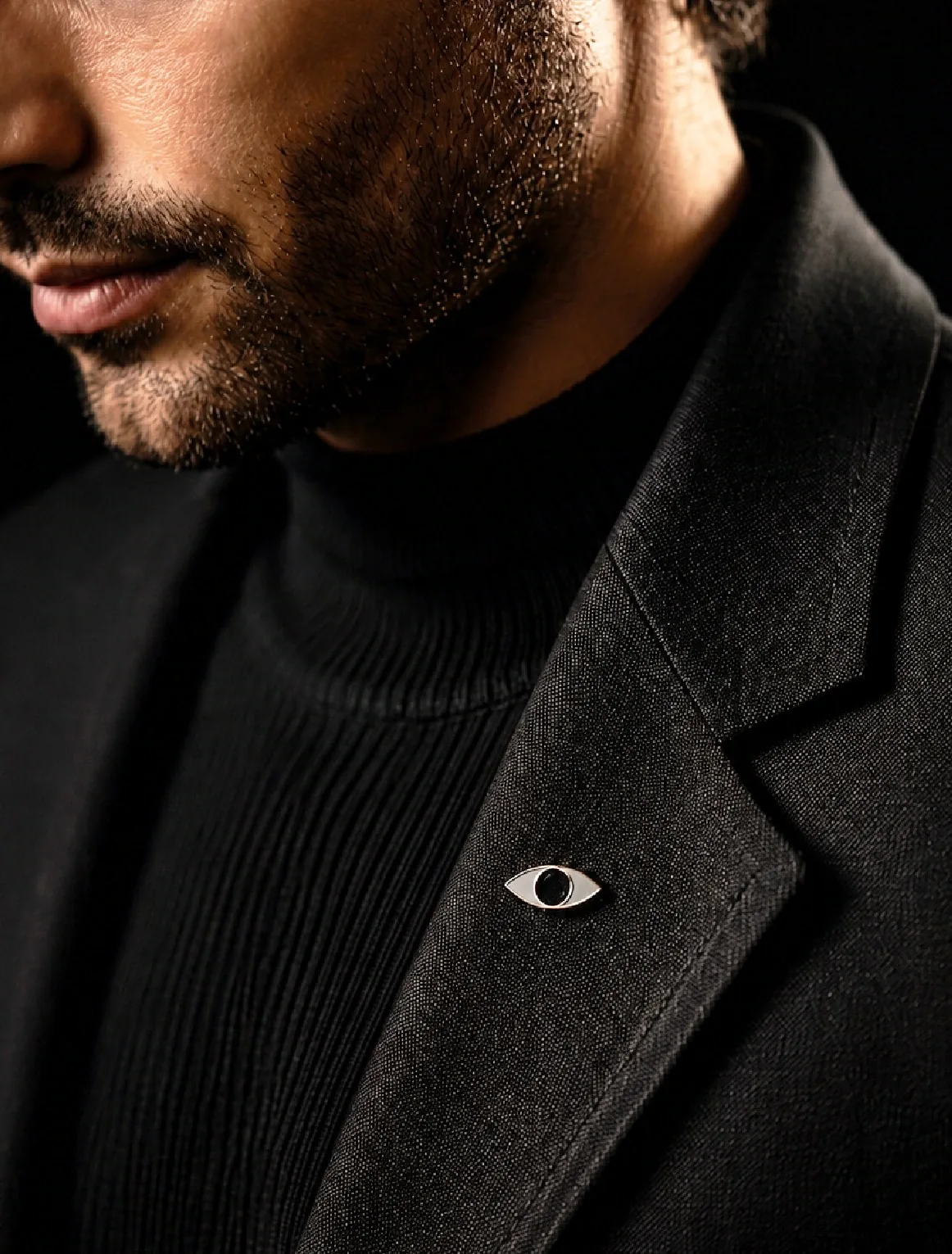
PILBAN eye pin on black jacket
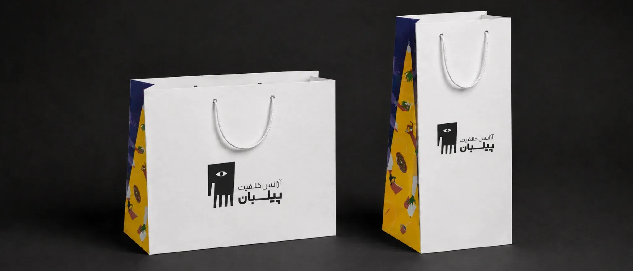
PILBAN packaging bags

Illustration as part of the system.

Illustration became one of the main engines of the PILBAN identity. I did not use it as decoration or filler. I used it as a way to make the agency feel alive across team profiles, service pages, campaign headers, mobile screens, social moments, and small interface details.

The characters were built from the same symbolic logic as the logo: a simple black body, the eye, and expressive objects around it. This gave the brand a recognizable visual behavior, not just a collection of drawings.

For a creative agency, this mattered. The illustration layer made the brand feel human, flexible, and ownable. It gave PILBAN a world that could expand with the business and still stay connected to the original idea.
A visual language for stories, not just surfaces.

Illustration turned the identity into narrative. Instead of repeating the logo as a stamp, I used its logic to build scenes, characters, and campaign moments that could live across web, content, and service storytelling.

The result was a broader system with the same recognizable core: playful, strategic, and flexible without feeling disconnected from the original mark.

Web elements that carry the same visual logic.

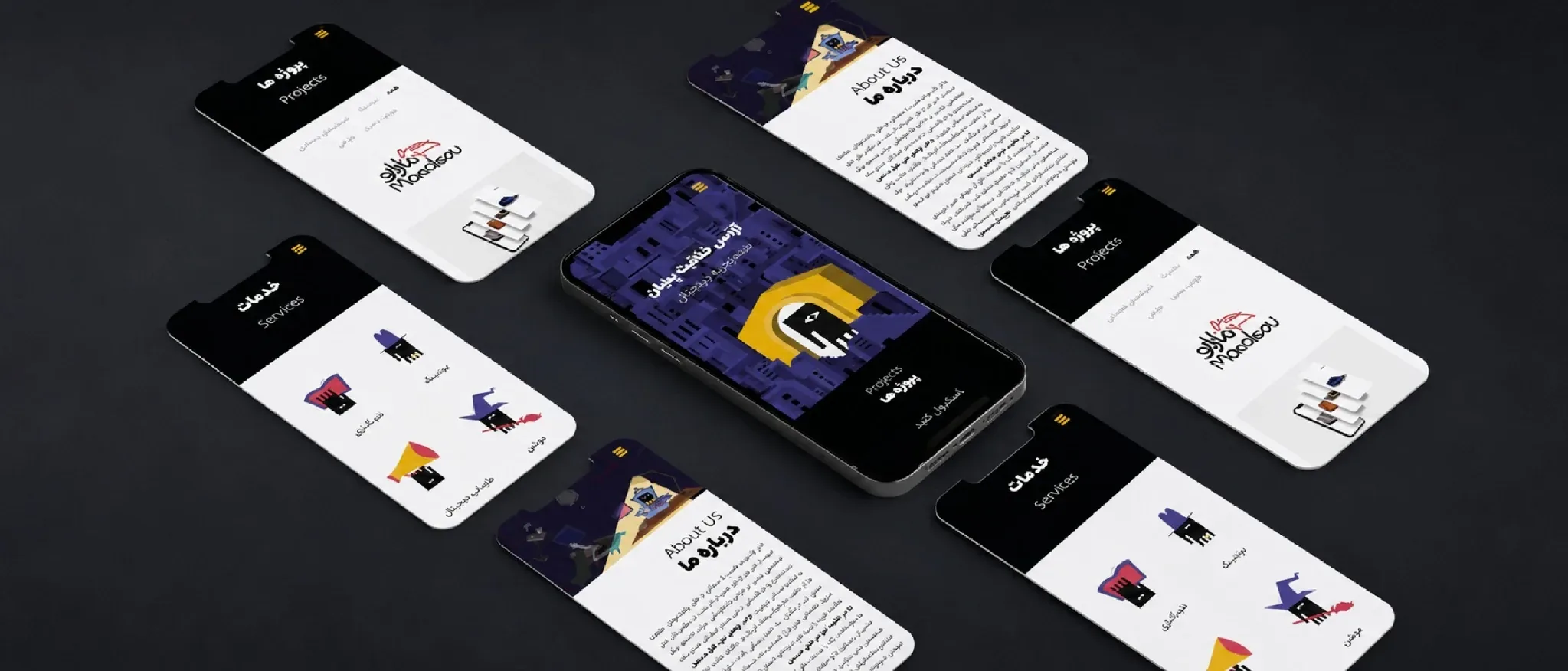
The digital pieces were designed as extensions of the identity, not separate interface decorations. Icons, service visuals, cards, and motion moments follow the same structure: a simple black core, a strong eye, and expressive objects that make the idea read faster.

This gave the website and mobile experience a more branded rhythm, letting even small interface moments carry PILBAN’s personality.

PILBAN mobile website screens
PILBAN website landing pages
PILBAN full application board
Druket icon pattern hero image
Digital Branding Project · Fall 2022

Druket

A pharmacy brand system designed to make care feel warmer, clearer, and easier to trust.

Project Note

Druket began with a simple but demanding brief: make a pharmacy brand feel less transactional and more reassuring without losing the precision people expect from healthcare.

The concept frames Druket as pharmacy with peace of mind. I treated that promise as a design system, not a slogan. The identity needed to guide people through prescriptions, product choices, questions, delivery moments, and in-person support with the same sense of clarity and care.

The final direction brings together a precise bilingual logo, the exact Druket red, a soft smile-like mark, and a modular icon language that expands into pattern, packaging, digital interfaces, and spatial cues. Each layer was built to make the brand easier to recognize and easier to approach.

Designing trust as a system, not a single symbol.

The work follows the customer journey from first recognition to final handoff: seeing the brand, understanding a category, choosing a product, asking for help, receiving a package, and returning with confidence. Every visual decision had to reduce friction and make the pharmacy feel calm, legible, and dependable.

A mark built around reassurance.

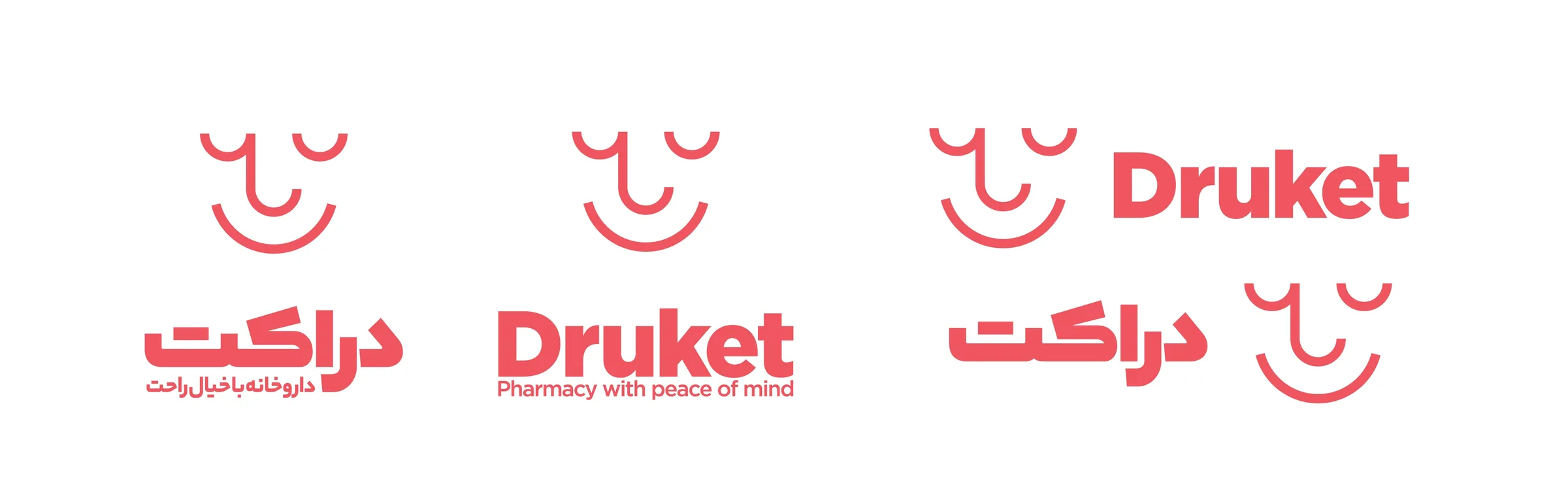
The logo turns a small facial expression into a sign of care. Its curved geometry creates a human presence, while the disciplined construction keeps it reliable across prescriptions, stationery, signage, packaging, and digital screens.

The animation, construction studies, and bilingual lockups show the balance at the center of the identity: friendly enough to feel approachable, structured enough to belong in a healthcare environment, and flexible enough to move between Persian and English applications.

Druket logo system in English and Persian
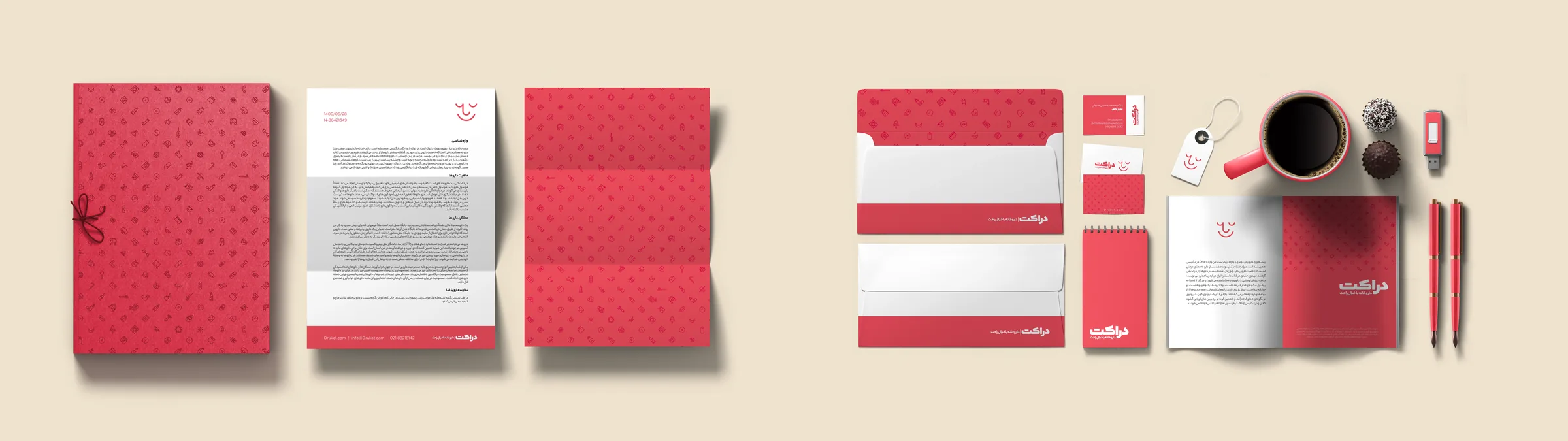
Druket stationery and brand application system

Design Method

The rebranding process began with several strong creative directions. Each route had a different way of expressing pharmacy expertise: some felt more clinical, some more expressive, and some more service-led. Because multiple options had potential, the final decision could not rely on taste alone.
We brought the choice back to the people already living with the brand. A survey with Druket's current customers helped clarify which direction felt most trustworthy, approachable, and aligned with their expectation of the pharmacy. That insight gave the process a practical anchor: the selected direction was visually distinctive, but also grounded in real perception and customer confidence.
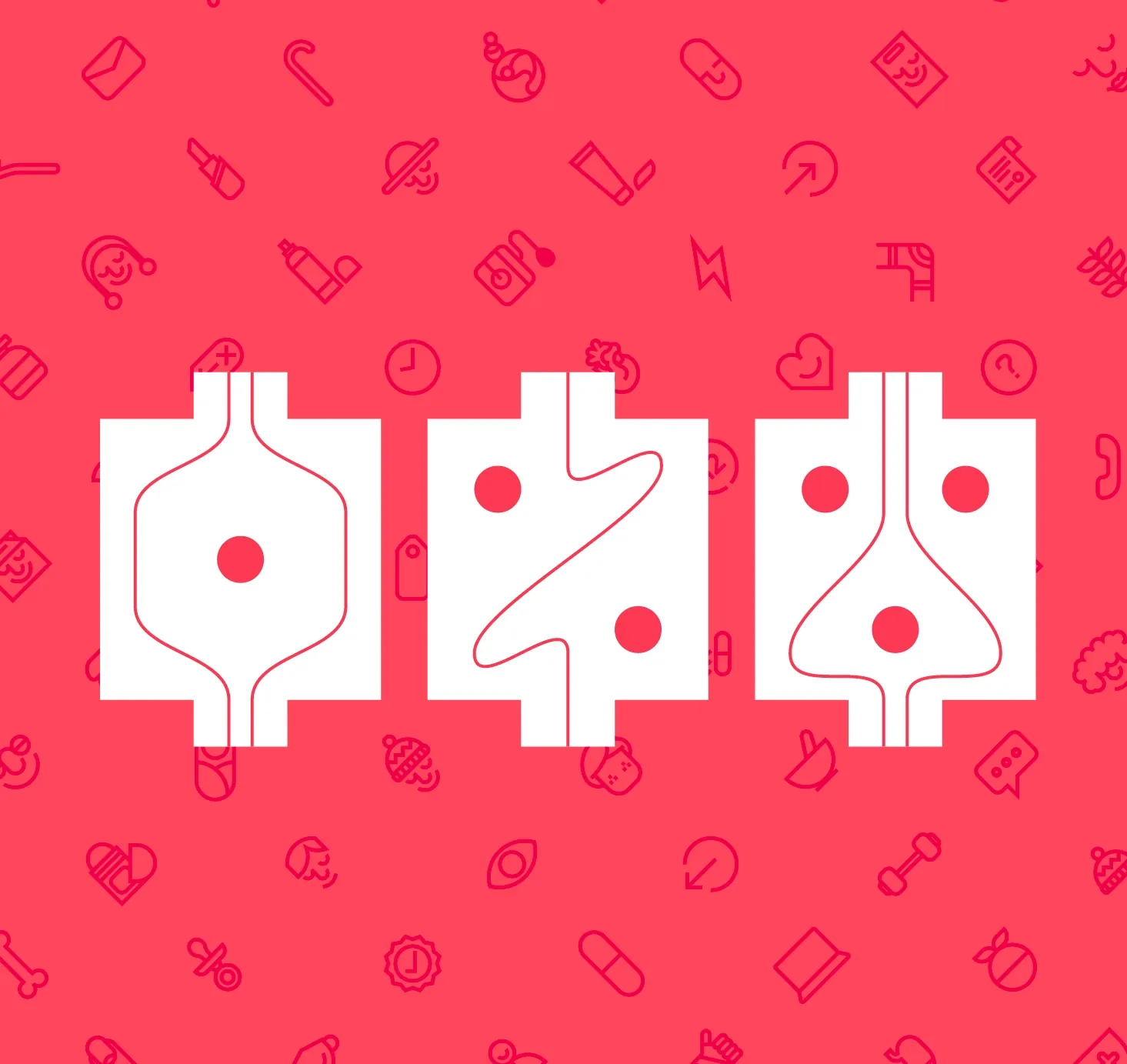
01Recognize the pharmacy
02Understand the category
03Choose with confidence
04Ask for support
05Receive with clarity
06Return with trust

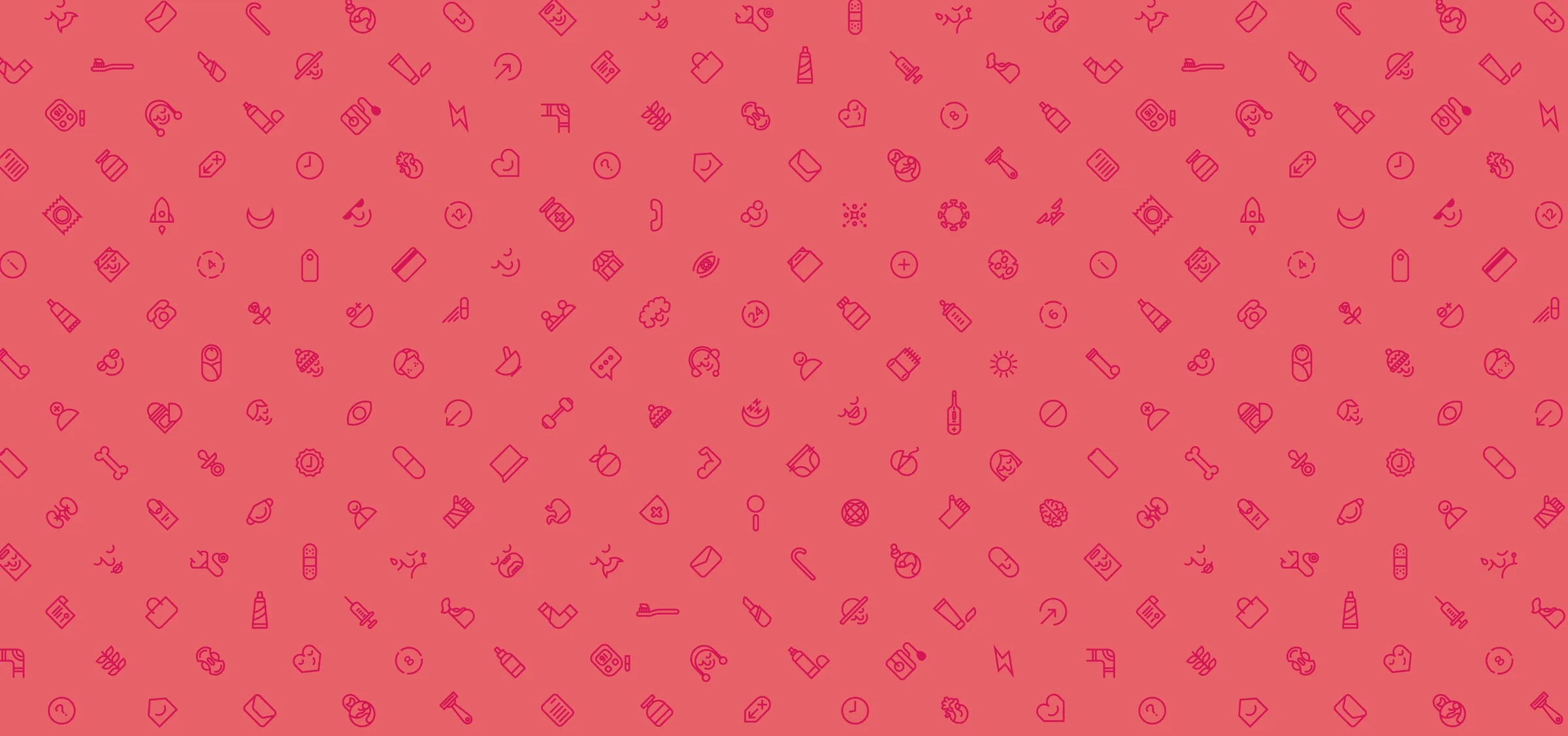
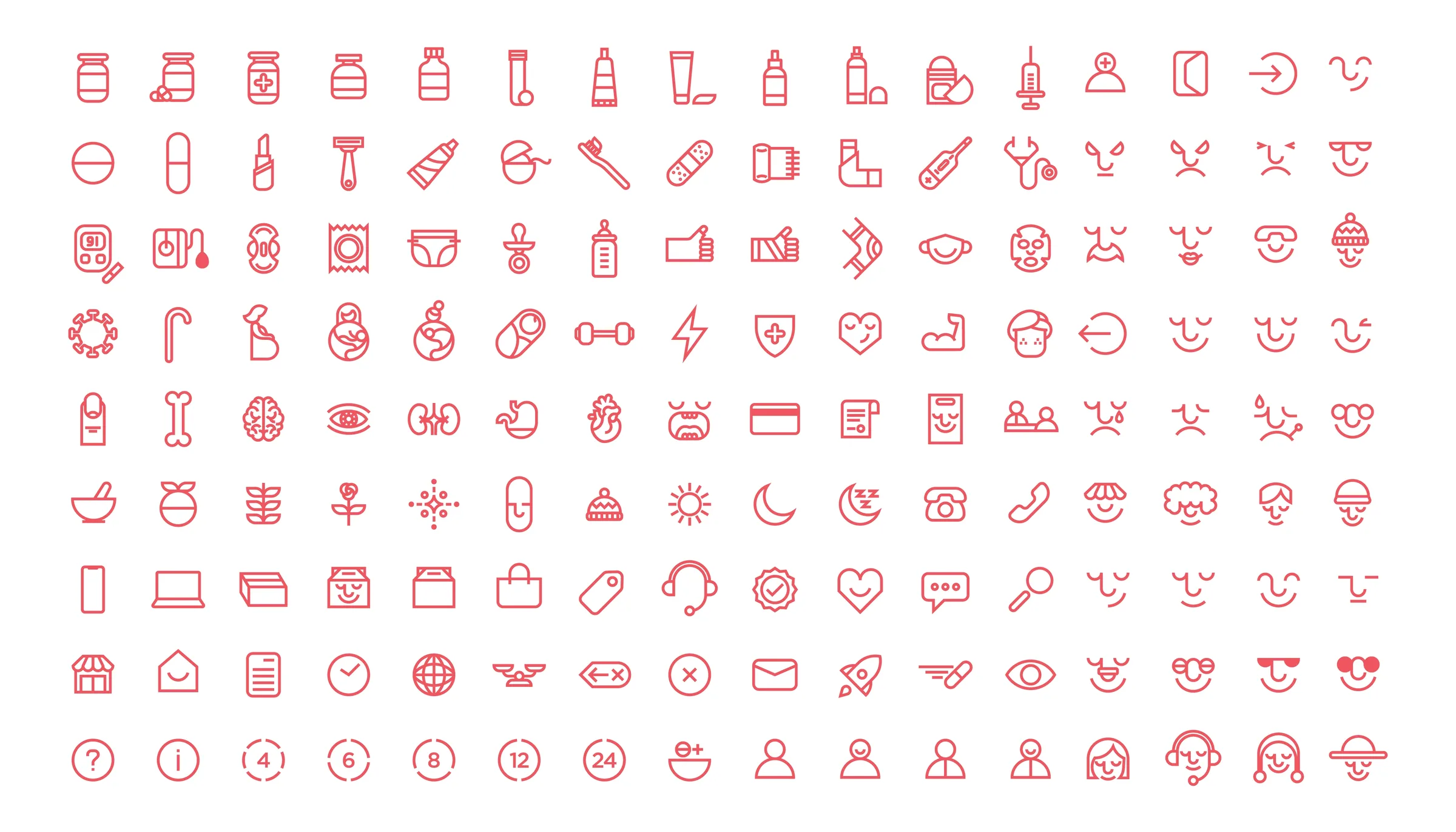
How the icons become the pattern.

The pattern is built from the same icon language that organizes the pharmacy experience. What starts as practical service information becomes a soft, ownable texture for packaging, service moments, digital backgrounds, and environmental surfaces.

01

A library of care moments.

Medicine, support, delivery, wellness, and customer needs are translated into rounded red line icons. The system begins with useful information before it becomes atmosphere.

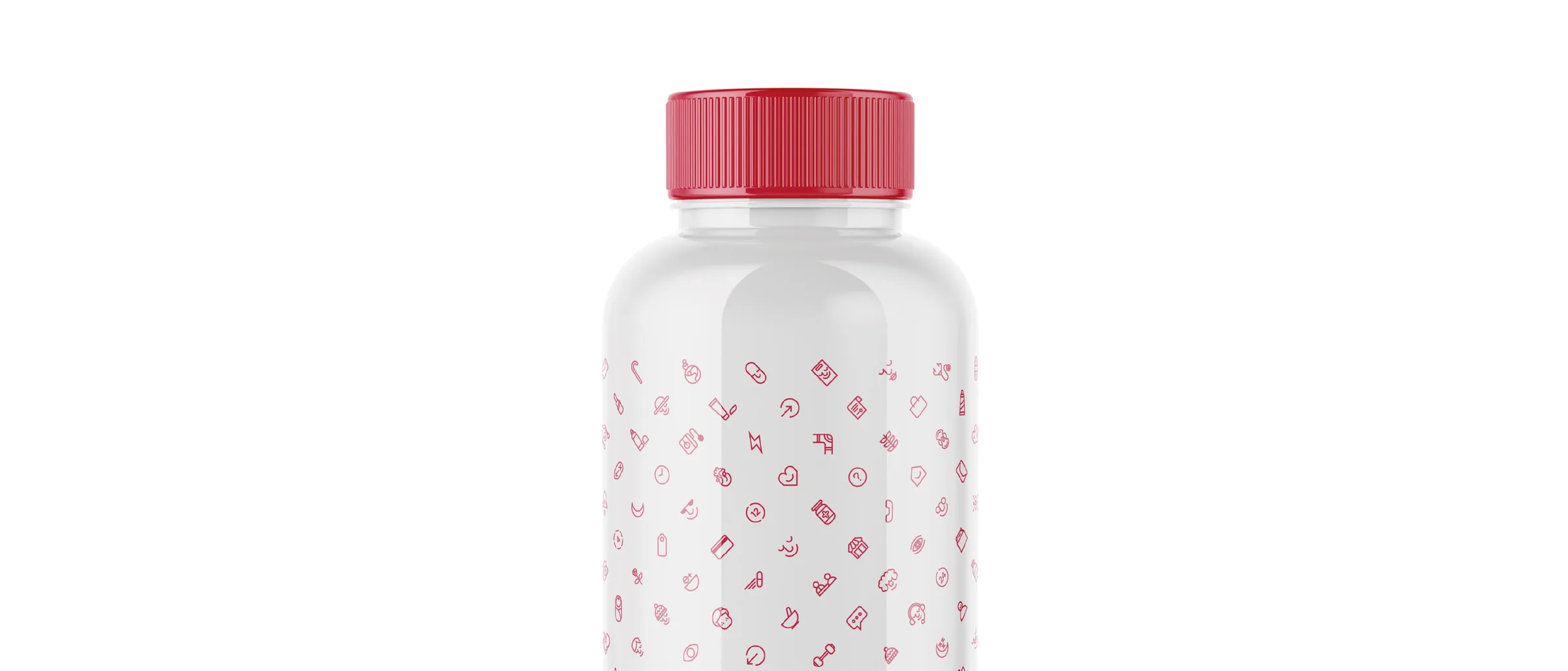
02

Scaled into a quieter rhythm.

When the icons are reduced and repeated, they stop behaving like individual signs and become a surface language. The pattern adds warmth without competing with products, labels, or service messages.

03

A memory carried across the system.

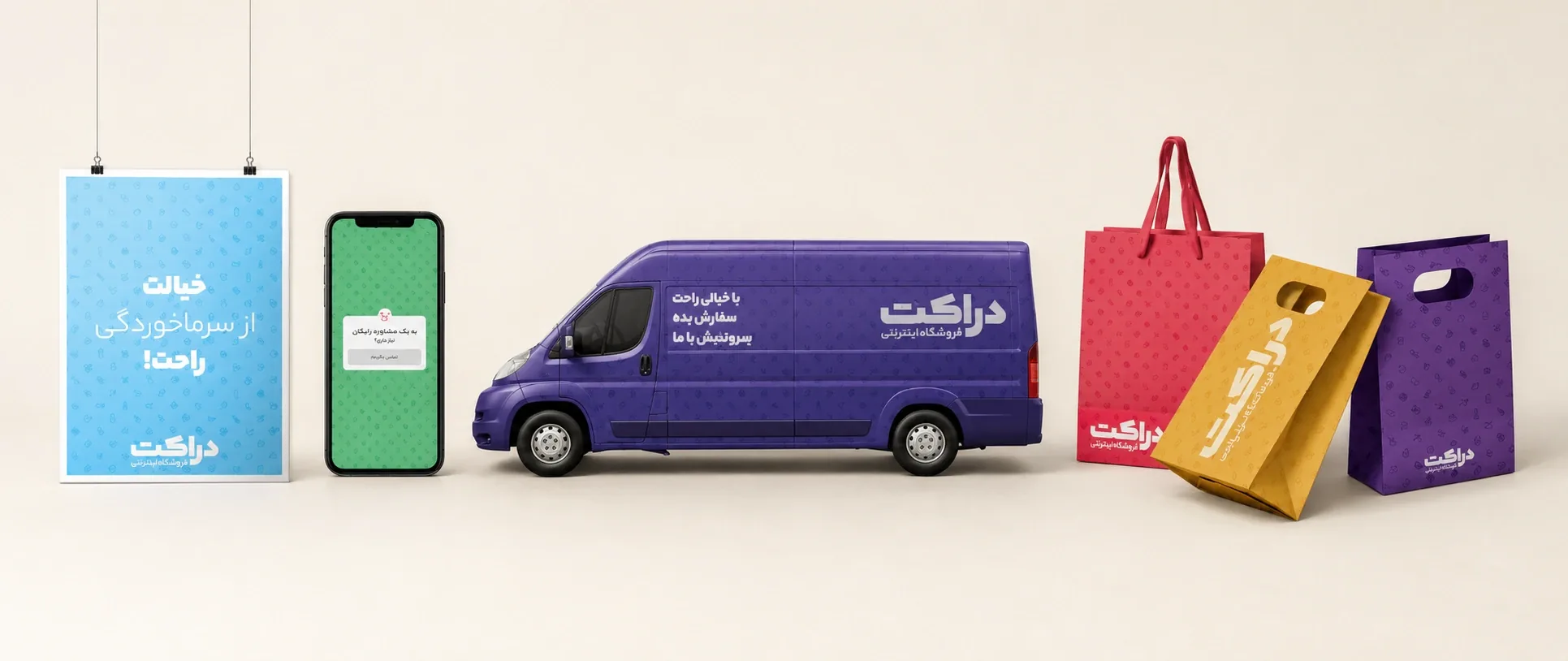
The same texture appears on stationery, packaging, delivery materials, digital backgrounds, and interior surfaces, so every touchpoint feels connected to the same calm pharmacy world.

Druket icon library and pattern elements
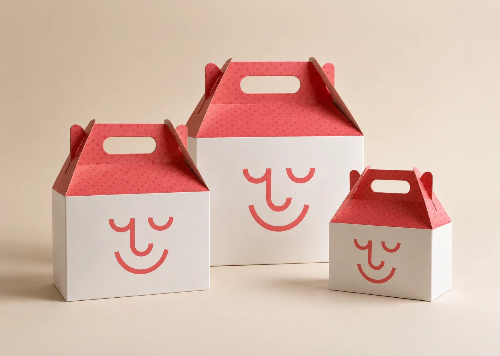
Druket service touchpoints including delivery, digital, and shopping bags
Druket patterned medicine bottle packaging detail

Printed touchpoints with a service mindset.

The stationery and packaging system brings the brand promise into the physical handoff. Folders, letters, labels, envelopes, tags, notebooks, delivery packs, and pharmacy boxes use the same red, mark, and pattern logic so the identity feels present before, during, and after the service moment.

These materials are not treated as decoration. They make the pharmacy feel organized, recognizable, and attentive at the exact points where people expect clarity.

Druket packaging and stationery box system

A digital pharmacy experience built for clarity.

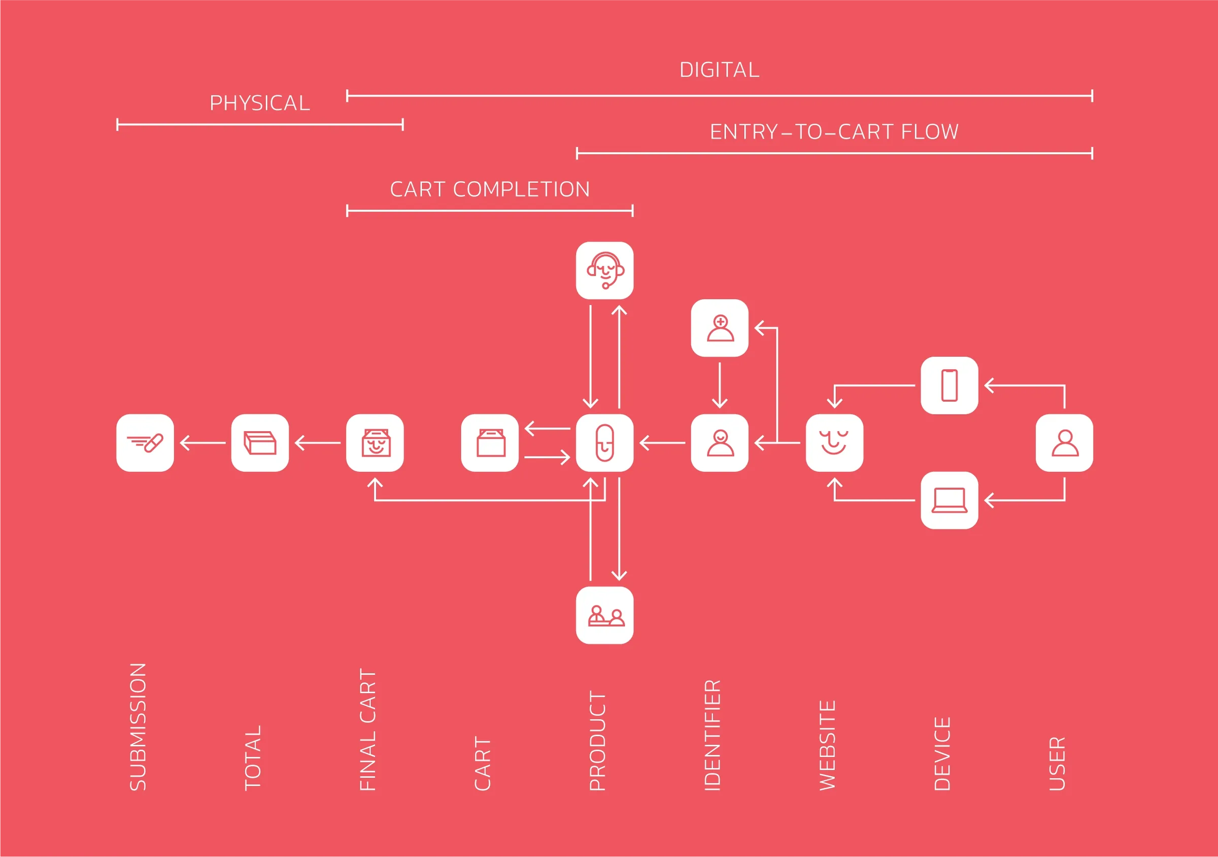
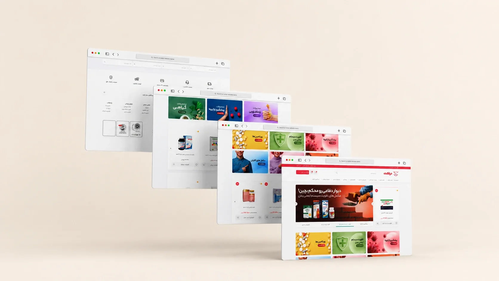
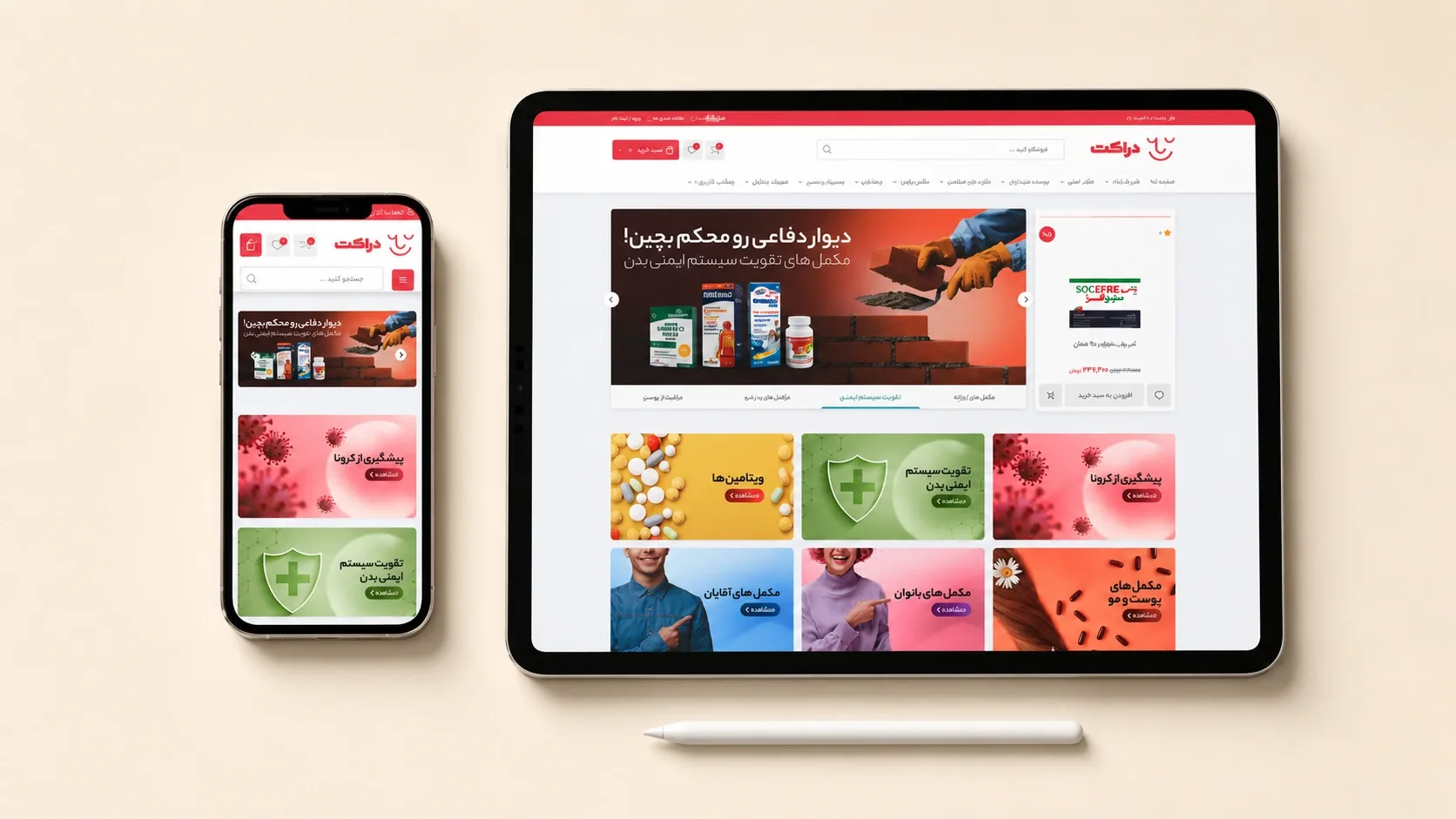
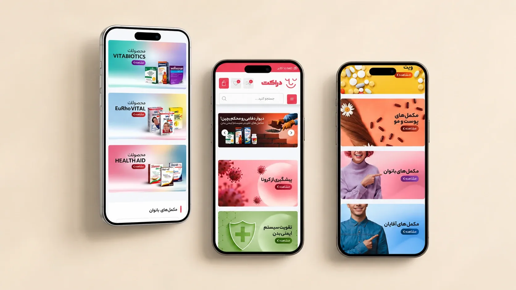
The digital system translates the same care logic into browsing and shopping. The flow map connects physical touchpoints, product selection, support, and cart completion, while the layered website and responsive interface screens show how rounded cues, clear hierarchy, and warmer product storytelling make the pharmacy easier to navigate across desktop and mobile.

Druket digital service flow map from physical touchpoints to cart completion
Druket website interface overview with layered browser screens
Druket responsive storefront on tablet and phone
Druket mobile shopping and category flow
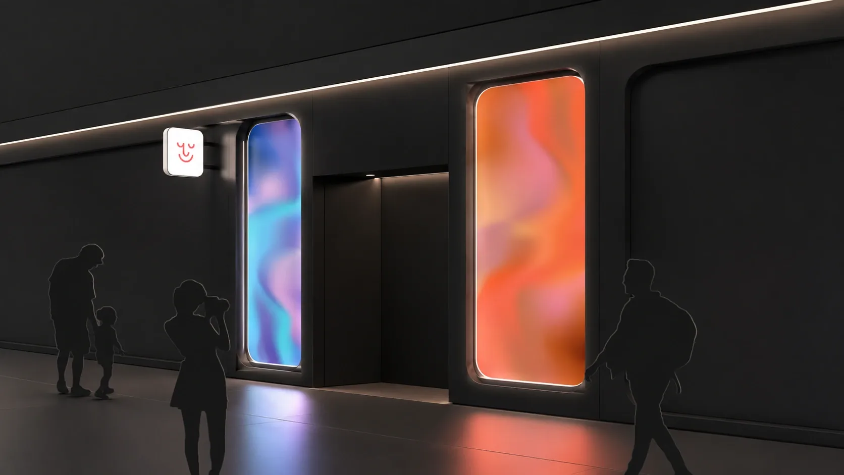
Druket spatial interior signage and wayfinding cue system

A spatial identity for easier orientation.

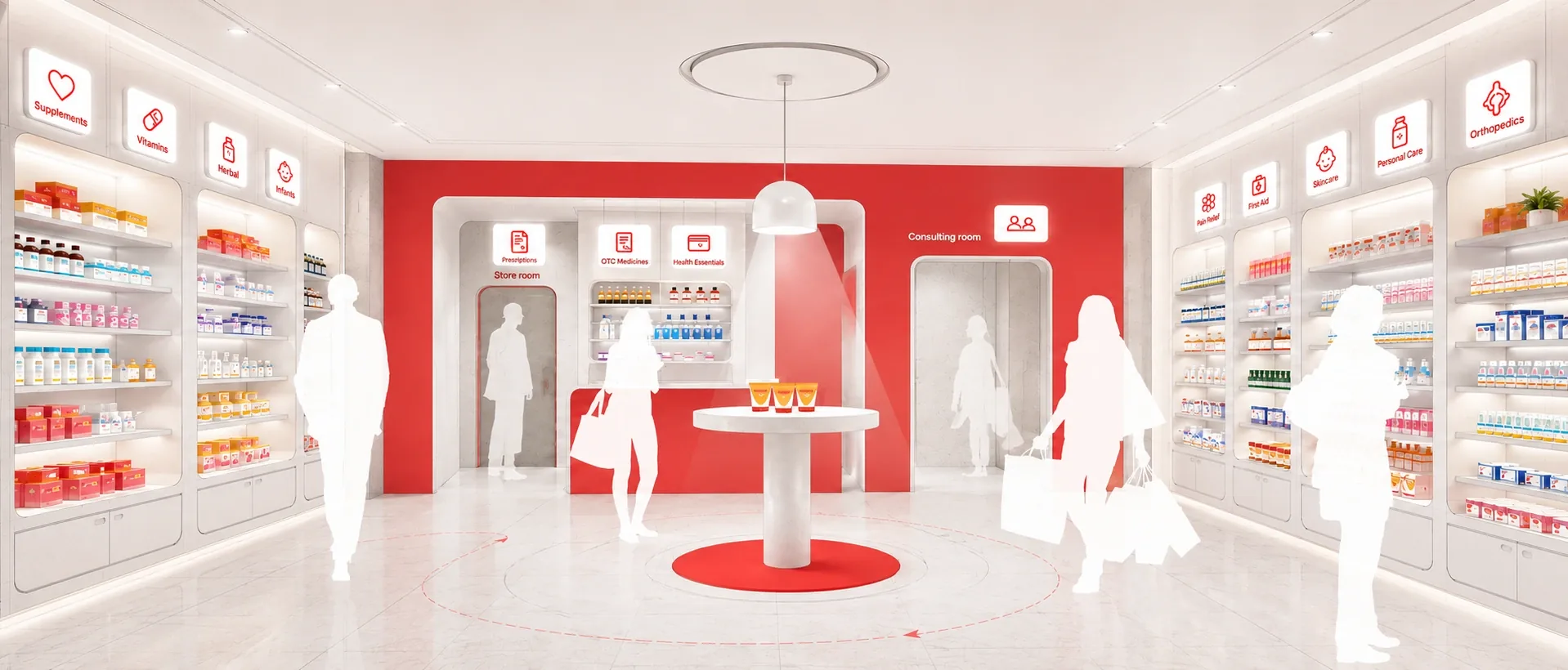
The spatial system extends the brand into the pharmacy environment through signage, shelving, category markers, lighting, and orientation cues. The diagrams explore how people move, pause, compare, ask, and decide inside the space, while the render shows how the system becomes calm guidance at full scale.

Druket spatial flow diagram for in-store orientation
Druket spatial wayfinding panel system diagrams
Druket spatial display lighting diagrams
Druket pharmacy interior wayfinding and category signage render
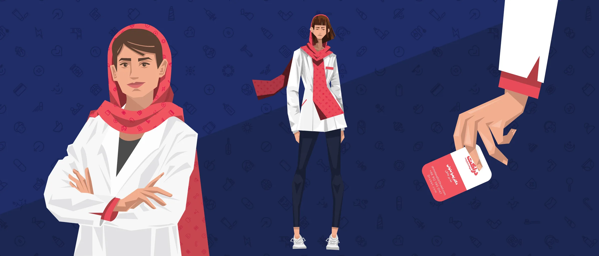
Druket pharmacist brand character and staff touchpoint illustration

One smile, carried through every touchpoint.

The final system brings the mark, bilingual voice, care icons, printed materials, digital flows, and spatial cues into one calm pharmacy experience: clear, warm, and quietly dependable.

Biroon blue wave pattern hero banner
Brand Identity · Spatial Experience · 2022

Biroon

A cafe identity built around stepping out of routine: bright, social, easy to enter, and designed to leave a light rhythm behind.

Project Note

Biroon begins with a simple emotional shift: leaving the routine and entering a place that feels lighter, more social, and easier to stay in. The identity needed to feel open and playful without losing discipline.

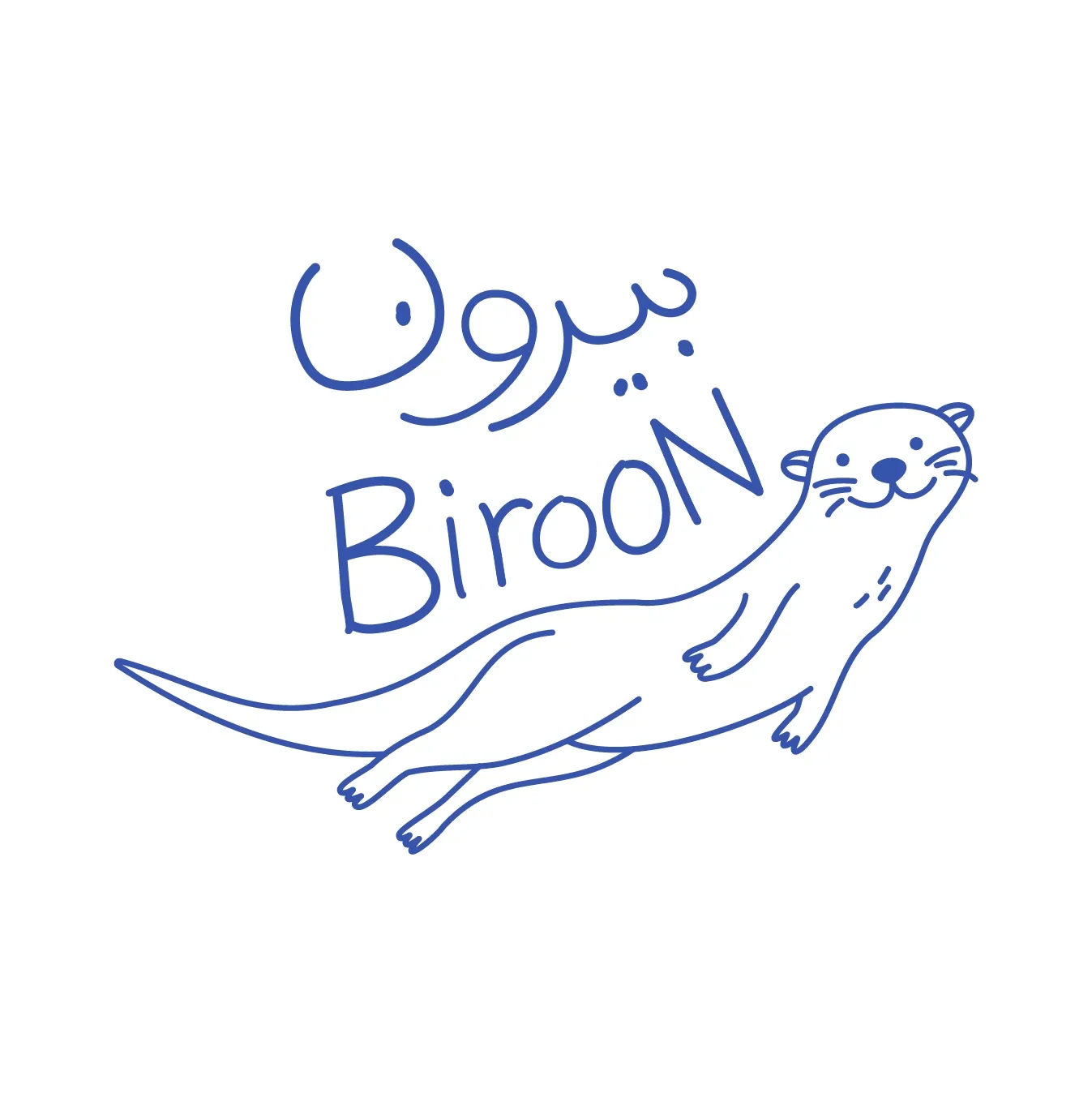
The bilingual mark, loose linework, and otter character create the first layer of warmth. Around them, a clear blue, generous white space, and repeatable symbols turn a casual drawing into a flexible visual system.

The same logic carries into space and service. Cups, uniforms, icons, blue blocks, soft surfaces, and warm interior cues work together so each touchpoint feels like part of one guided cafe experience.

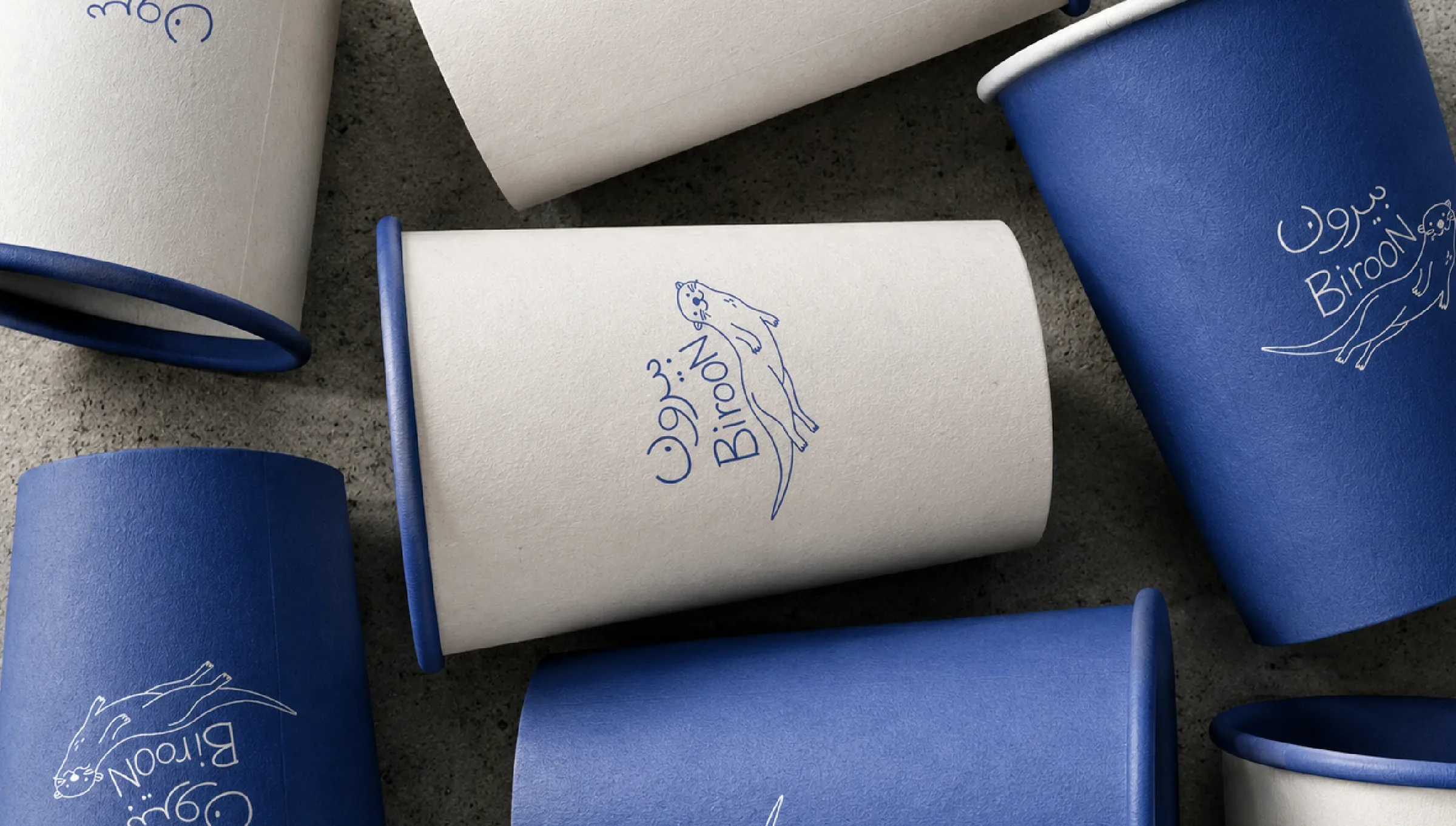
Biroon branded cup touchpoints in blue and white

Designing the feeling of being out.

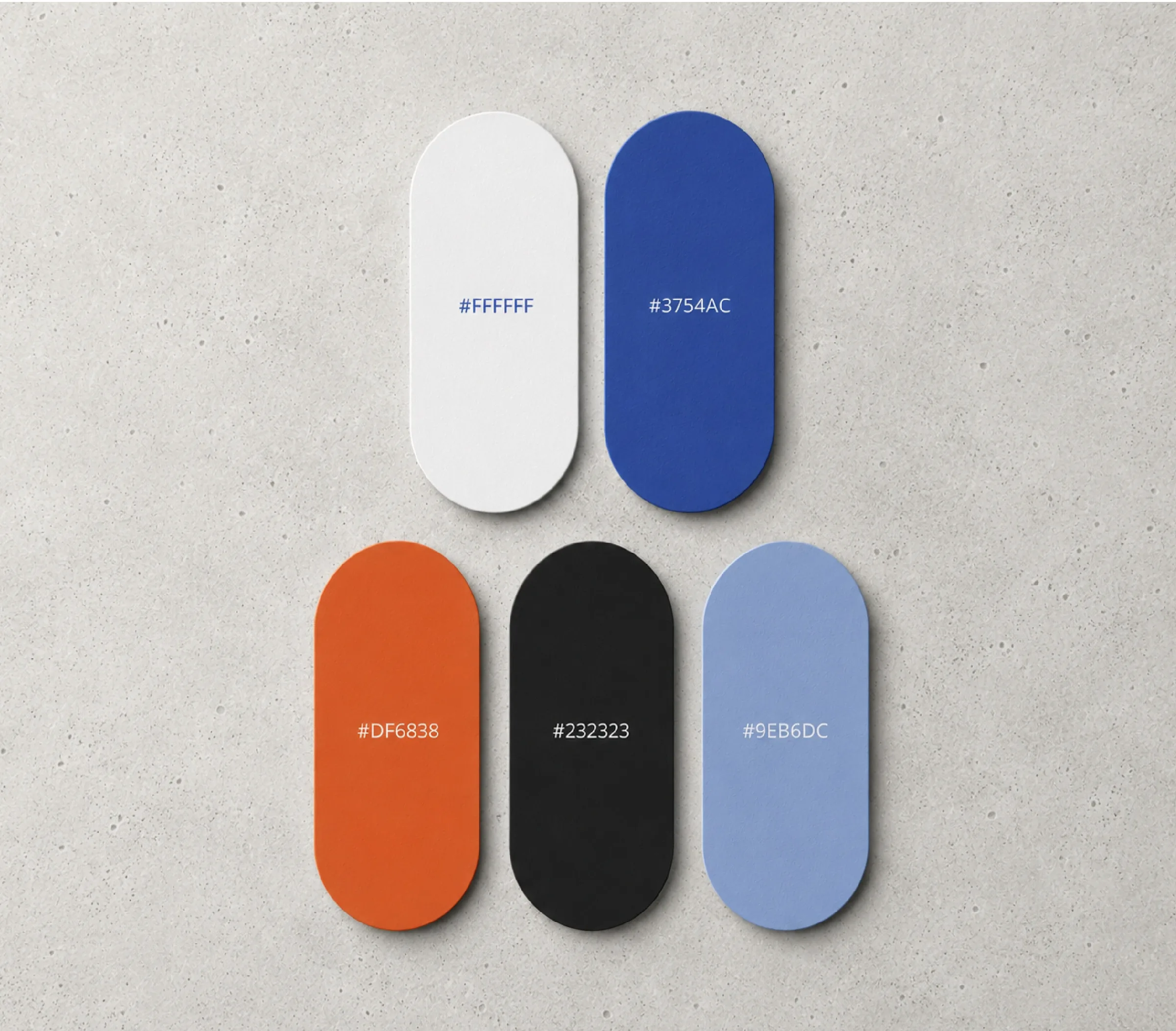
The identity is built from a small set of gestures: a confident blue, open white space, flowing linework, and a character that feels in motion. Together they create a system that is casual enough for daily use and structured enough to be remembered.

Biroon color palette with blue, white, orange, black, and pale blue

A mark with motion, warmth, and memory.

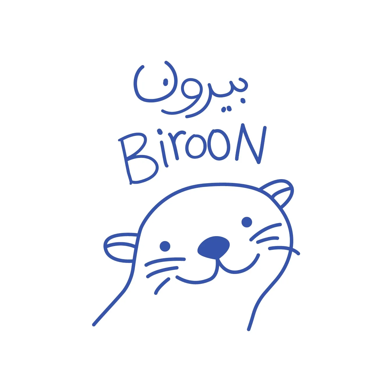
The mark carries the brand’s sense of movement: informal, buoyant, and easy to recognize. The otter gives the identity warmth, while the hand-drawn line keeps it from feeling overly polished or distant.

The bilingual lockup makes the system feel local and fluid across Persian and English contexts. It can sit quietly on packaging, scale up for motion, or become a memorable graphic signature in space.

A character system with a light emotional range.

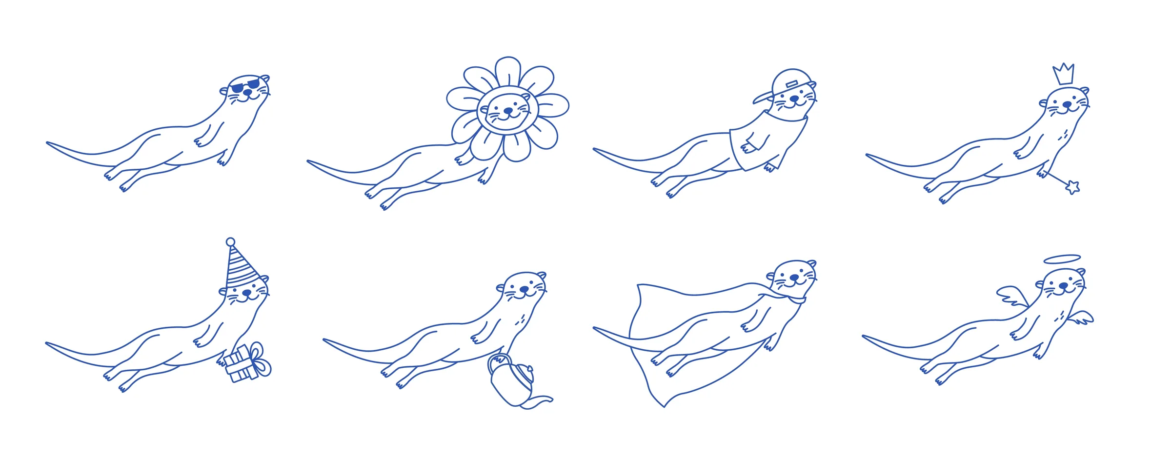
The otter is treated as a flexible brand character rather than a single mascot pose. Its long floating body, soft face, and loose blue linework make it feel curious, social, and always slightly in motion.

Costumes, gestures, icons, and expressions extend that personality into different moments of the cafe experience. The character can be playful, helpful, celebratory, or quiet without leaving the same visual language.

Biroon otter character variations and costume explorations
Biroon icon system drawn in blue linework

One blue line connects the whole experience.

From the storefront to the counter, Biroon blue works as both a visual signature and a wayfinding cue. It marks where to enter, where to pause, what to notice, and how the brand continues from object to space. The customer should feel the system before they need to read it.

01Enter through a clear blue cue
02Read the rhythm of the space
03Order through simple orientation
04Stay inside a warmer social mood

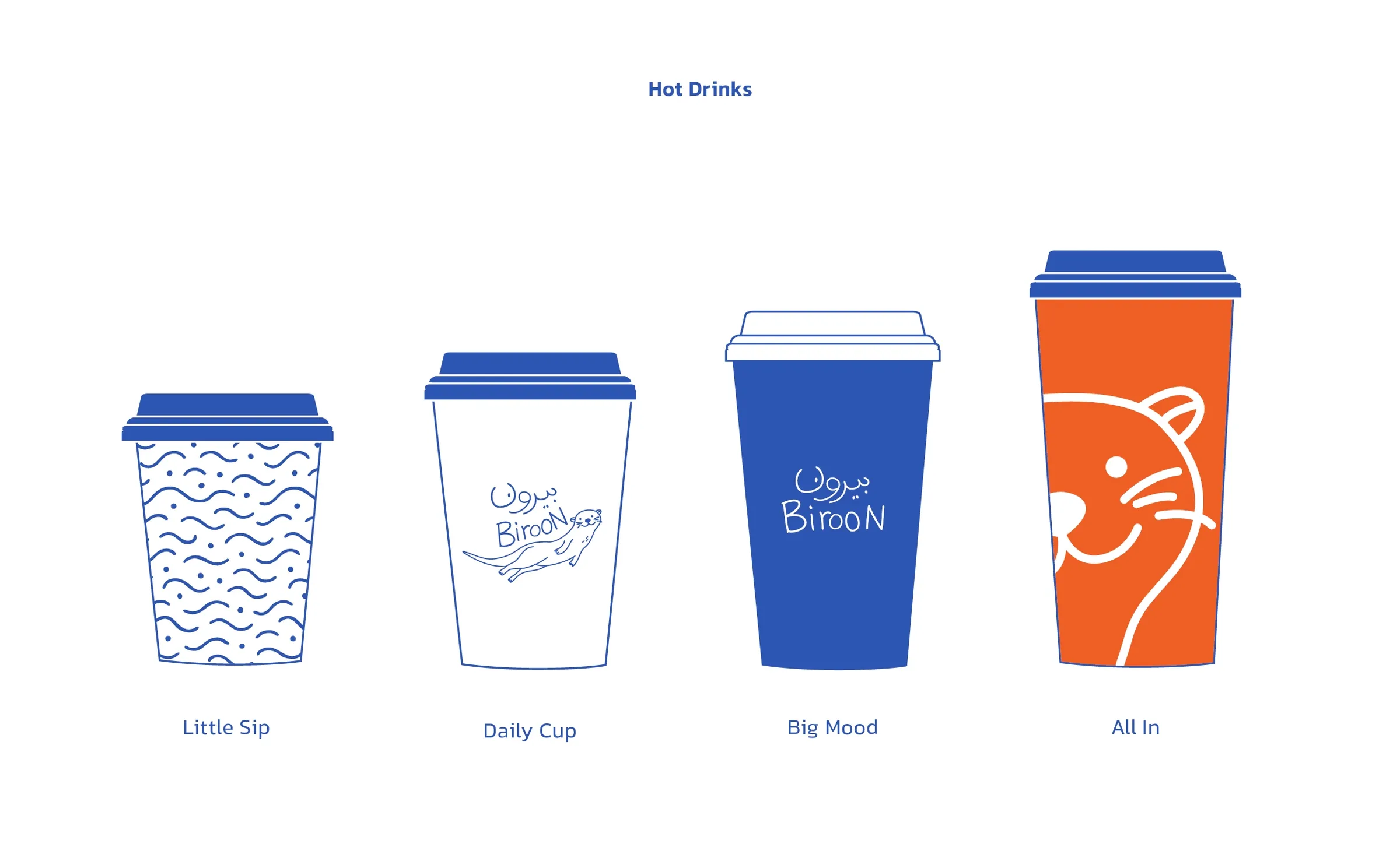
Cups designed as a size system with personality.

The cup family turns ordering into a small brand moment. Each size has its own character: a patterned small cup, a clean daily cup, a confident blue cup, and a bold orange cup that uses the otter as a graphic crop.

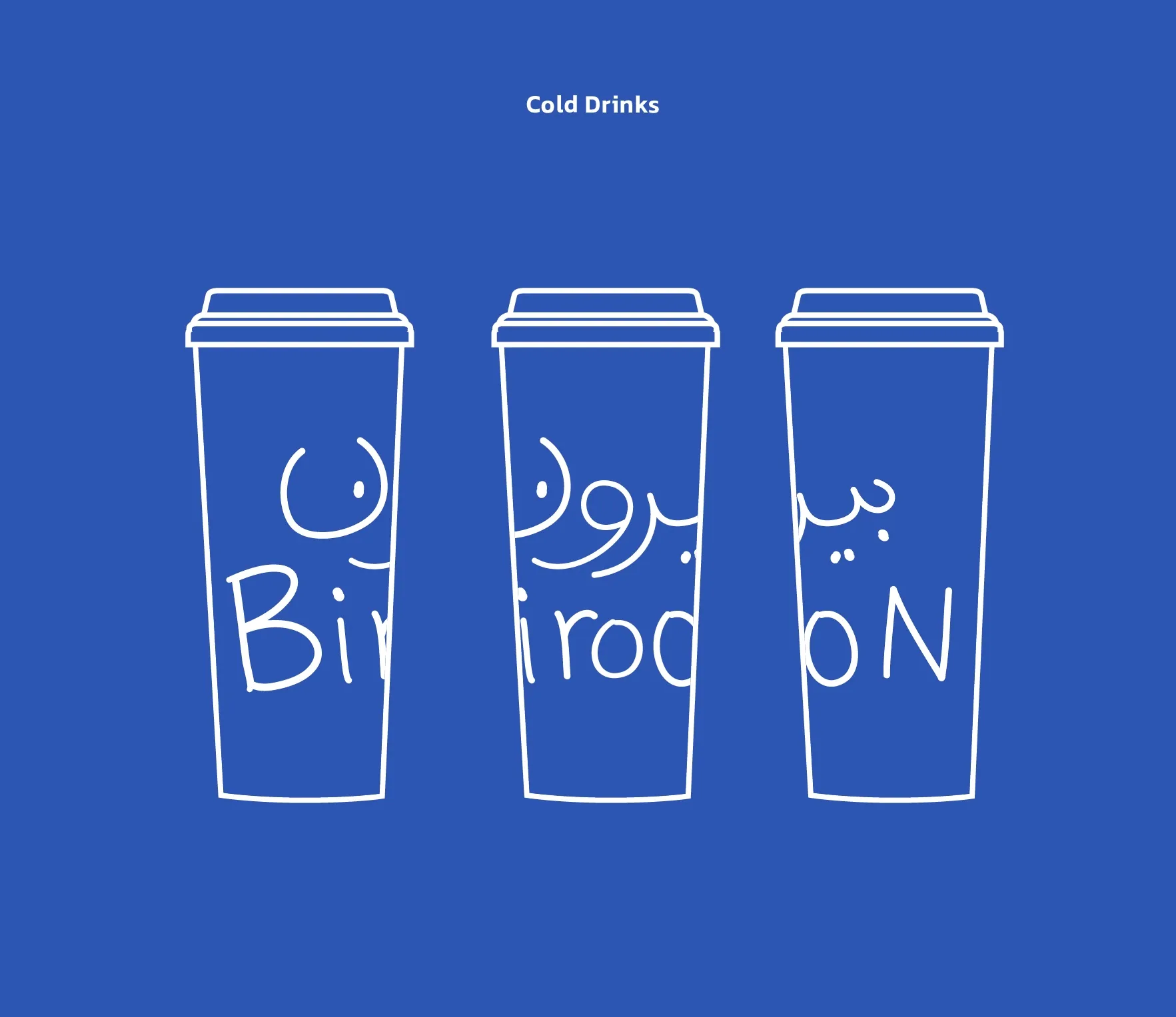
The sizing system is practical first, but the creativity is in how each format changes the expression. The customer can read the range quickly, while the brand keeps a sense of rhythm, humor, and collectability across hot and cold drinks.

Biroon hot drinks cup size system
Biroon cold drinks cup application system

Interior as part of the identity system.

The interior direction translates the graphic system into space. Blue blocks, soft white surfaces, warm lighting, mirrors, and pale wood create a cafe that feels relaxed, but still clearly guided.

Rather than becoming a fixed decoration style, the space works as a set of rules: repeat the blue, control the light, keep the surfaces calm, and let each location become a new version of the same mood.

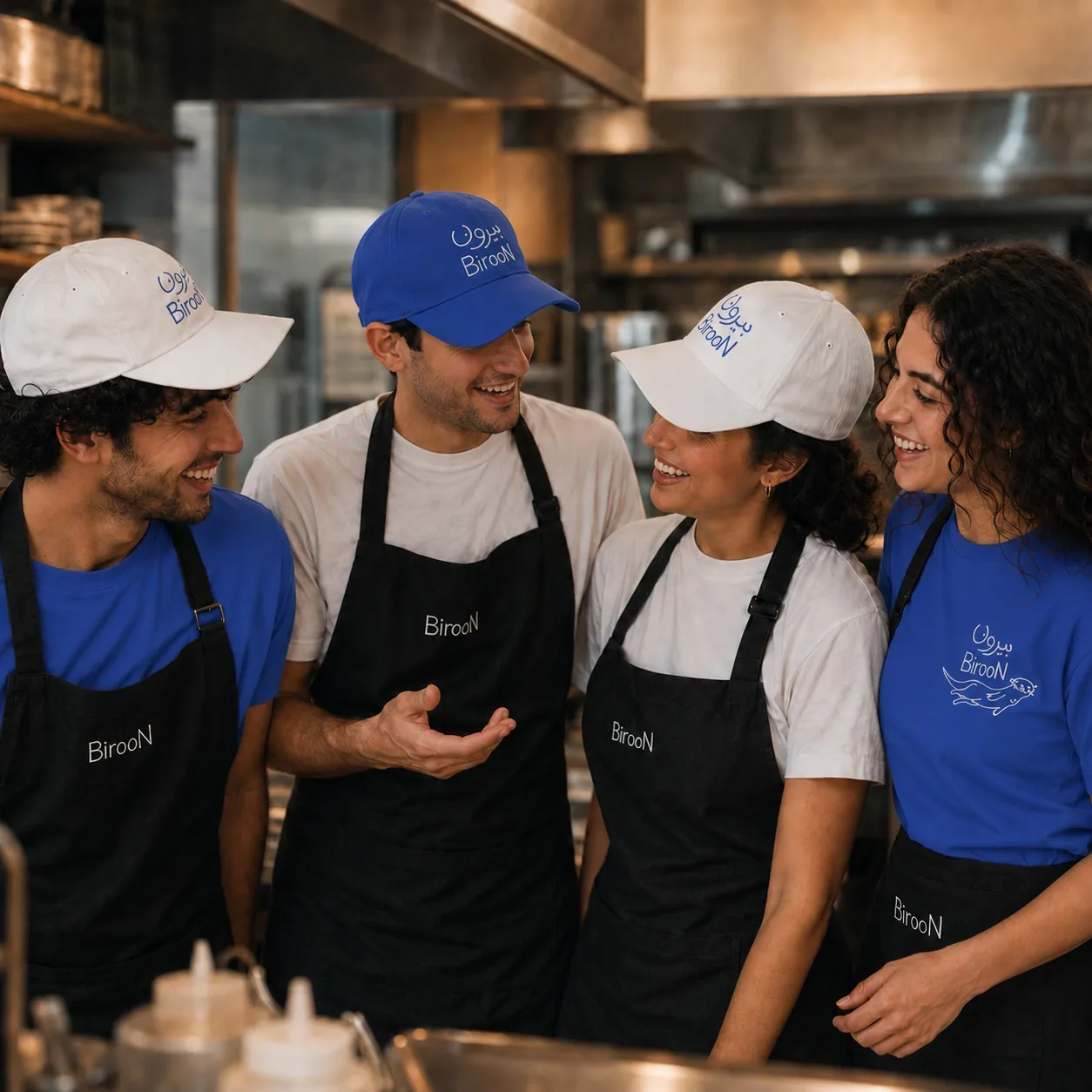
Biroon staff uniforms and packaging identity in cafe environment

Graphic details that stay light and useful.

The smaller details carry the identity into daily use. Patterns, icons, uniforms, printed pieces, and staff apparel extend the blue line language without making the system feel heavy.

Clothing and merch are treated as part of the service atmosphere, not separate souvenirs. Caps, aprons, shirts, hoodies, and tote bags make the staff feel connected to the brand while giving customers familiar objects that can travel beyond the cafe.

Each application has a job: make the brand easier to recognize, easier to use, and easier to remember. The result feels social, practical, and wearable rather than decorative.

Packaging as a small moment of recognition.

Biroon packaging turns ordinary cafe objects into small moments of recognition. Cups, sleeves, bags, stickers, and takeaway pieces use the same blue line language so the experience stays connected from counter to handoff.

The system is intentionally restrained: a pattern where rhythm is needed, a character where warmth is useful, a clear mark where recognition matters, and enough white space for every object to feel light, friendly, and considered.

A cafe brand built as a small invitation.

Biroon brings a playful mark, a confident blue, and a spatial design language into one cohesive cafe experience. The identity moves from cups to uniforms, from icons to interiors, and from packaging to small moments of service.

From the first visual cue to the smallest printed detail, the system is built to feel social, clear, and quietly memorable: an invitation to step out, stay a little longer, and carry the mood with you.

Digital Branding Project · 2023-2025

Rabex

Turning a fintech identity into a scalable brand system.

Project Note

Rabex came with an existing visual foundation: a recognizable mark, a bold blue presence, and the beginning of a digital personality. My role was to preserve that recognition while building a clearer system around it.

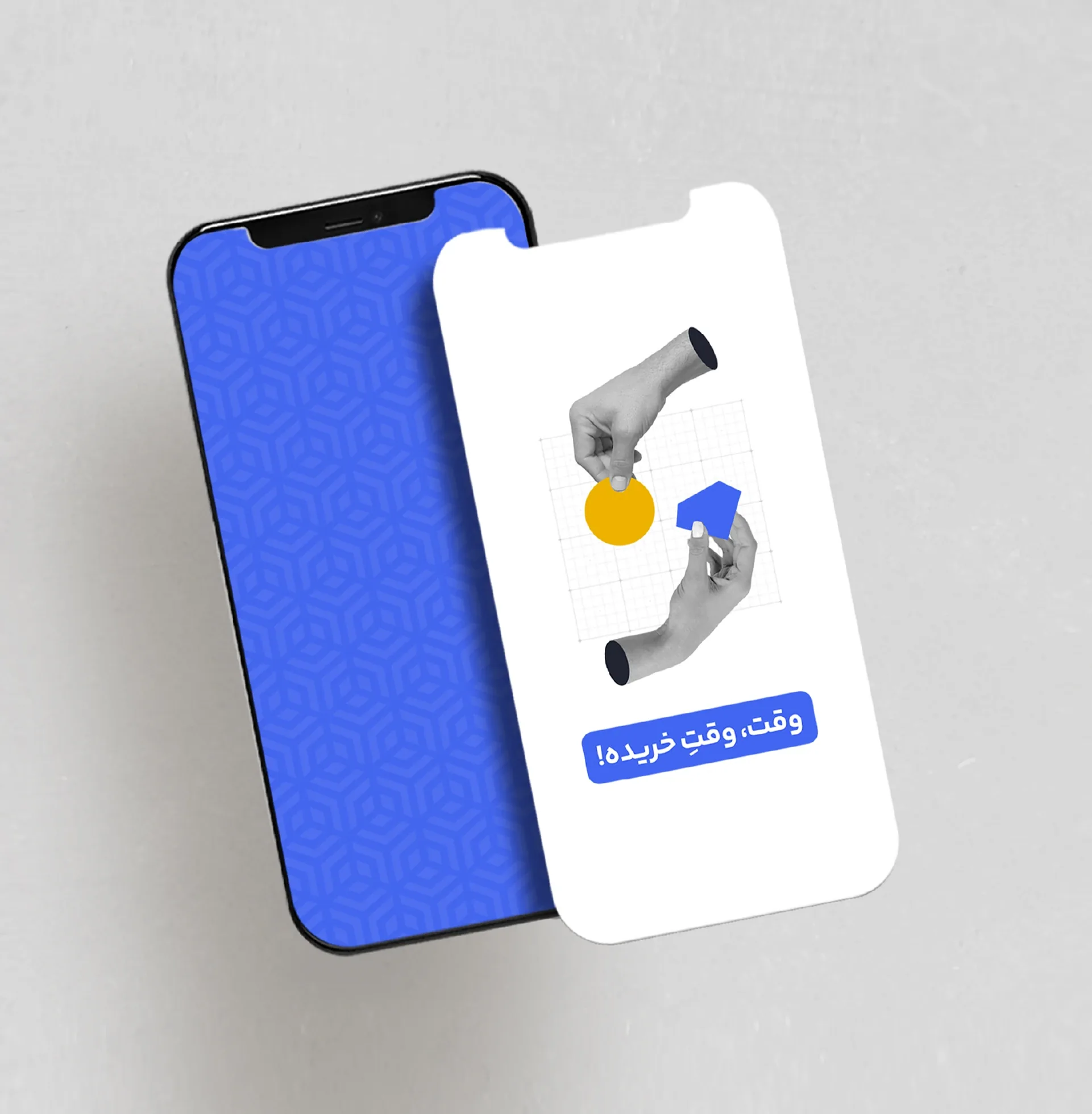
I refined the identity logic, matured the color system, translated the logo geometry into patterns, and extended the brand across social media, typography, illustration, motion, and everyday communication.

The goal was not to replace what already worked. It was to make the brand more consistent, scalable, and ready for daily use across product, content, and campaign touchpoints.

From logo recognition to a complete identity system.

Rabex already had a visual starting point. What it needed was the world around it: practical rules for how the brand should appear across content, campaigns, digital channels, and physical applications.

The identity needed to feel technological without becoming cold. Human-centered imagery helped balance precision, trust, and accessibility while keeping the brand sharp and future-facing.

I systemized that foundation through repeated design decisions: how the blue should behave, how pattern could support hierarchy, how illustration could explain finance topics, and how social templates could stay recognizable without becoming repetitive.

Protecting recognition while improving clarity.

Because the mark already had recognition, the design process began with refinement and expansion rather than replacement. I focused on how the logo should behave across small digital spaces, social media, stationery, presentations, and branded graphics.

The symbol became the foundation for the wider system. Its geometry informed the pattern, the layout rhythm, the angled details, and the overall sense of movement.

Turning logo logic into a design language.

The geometric logic of the Rabex symbol was translated into a repeatable pattern system, allowing the brand to appear consistently across backgrounds, packaging, social media, and campaign visuals without relying on the logo every time.

Used subtly, the pattern adds depth. Used boldly, it becomes a recognizable brand field that connects different touchpoints while keeping the system flexible.

Maturing the brand’s signature blue.

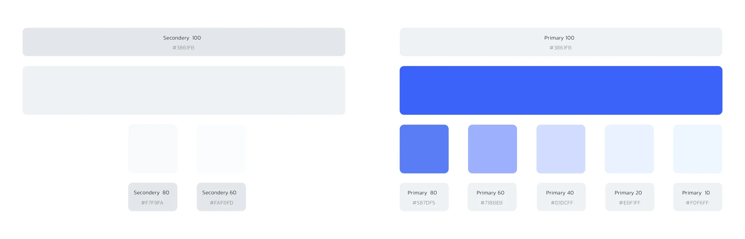
Rabex already had a strong blue presence. I refined that color into a system: recognizable enough to carry the brand, controlled enough for formal materials, and flexible enough for daily digital communication.

The blue became a signature brand asset, supported by softer secondary tones for hierarchy, UI flexibility, and content variety across print, social media, web interfaces, alerts, educational content, and brand documentation.

Primary blues

The core blue stayed sharp and digital, while lighter steps created room for backgrounds, highlights, interface surfaces, and longer reading moments.

Functional states

Info, error, warning, and success palettes were defined so product communication could stay clear without leaving the brand system.

Print to digital

The palette was organized to move between printed applications and screen-based assets, balancing strong brand fields with quieter supporting tones.

Rabex primary and secondary blue color system with tint values
Rabex interface status color palette for info, error, warning, and success states

Refine before redesigning.

Rabex already had recognition, so the work began with respect for what existed. The strongest direction was to preserve the foundation, mature the system, build rules from the logo, and make the identity flexible enough for daily communication.

01Respect the existing brand
02Refine before redesigning
03Build rules from the logo
04Make the system flexible

Illustrating the brand’s knowledge layer.

Beyond templates, I created illustrated content for Rabex blog posts and educational materials. These visuals helped translate abstract financial ideas, exchange activity, and digital-asset topics into clear, scan-friendly communication.

The illustration system followed the same brand logic: simple forms, controlled contrast, blue accents, and direct visual metaphors. It made dense explanations more accessible without softening the brand’s authority.

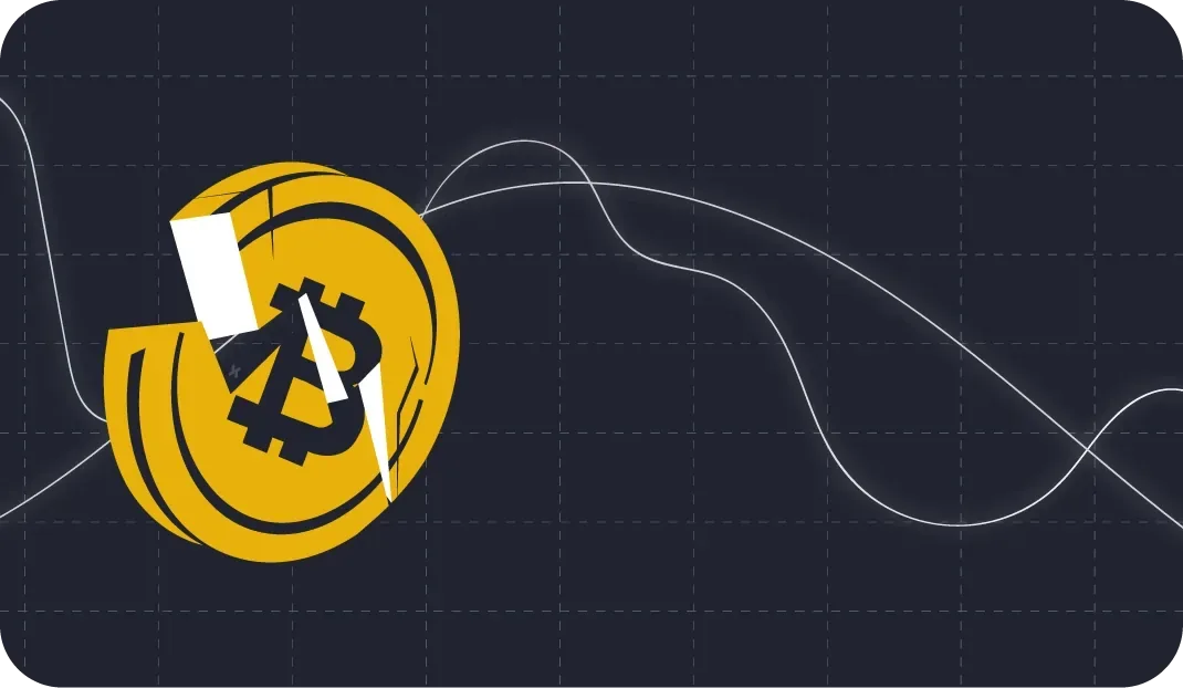
Rabex illustration showing a bitcoin speedometer on a dark background
Rabex illustration with a hand and dollar coin over a yellow world map
Rabex illustration with Shiba coin and hand gestures on blue
Rabex illustration showing a bitcoin object on a dark grid
Rabex illustration showing a digital network diagram on blue
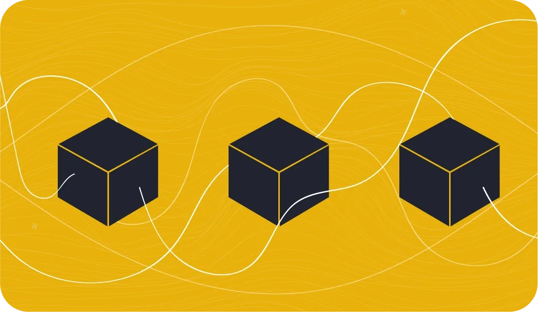
Rabex illustration showing cubes and flowing lines on yellow
Rabex illustration of a unicorn profile on yellow
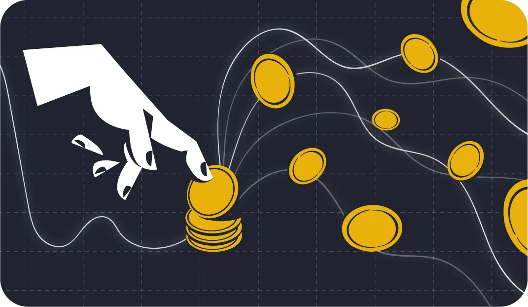
Rabex illustration showing a hand placing coins on a dark grid
Rabex illustration of a football player holding a crypto symbol
Rabex illustration of an eye with constellation lines on blue
Rabex illustration of hands and brand symbol in a blue field
Rabex illustration of a masked character on yellow

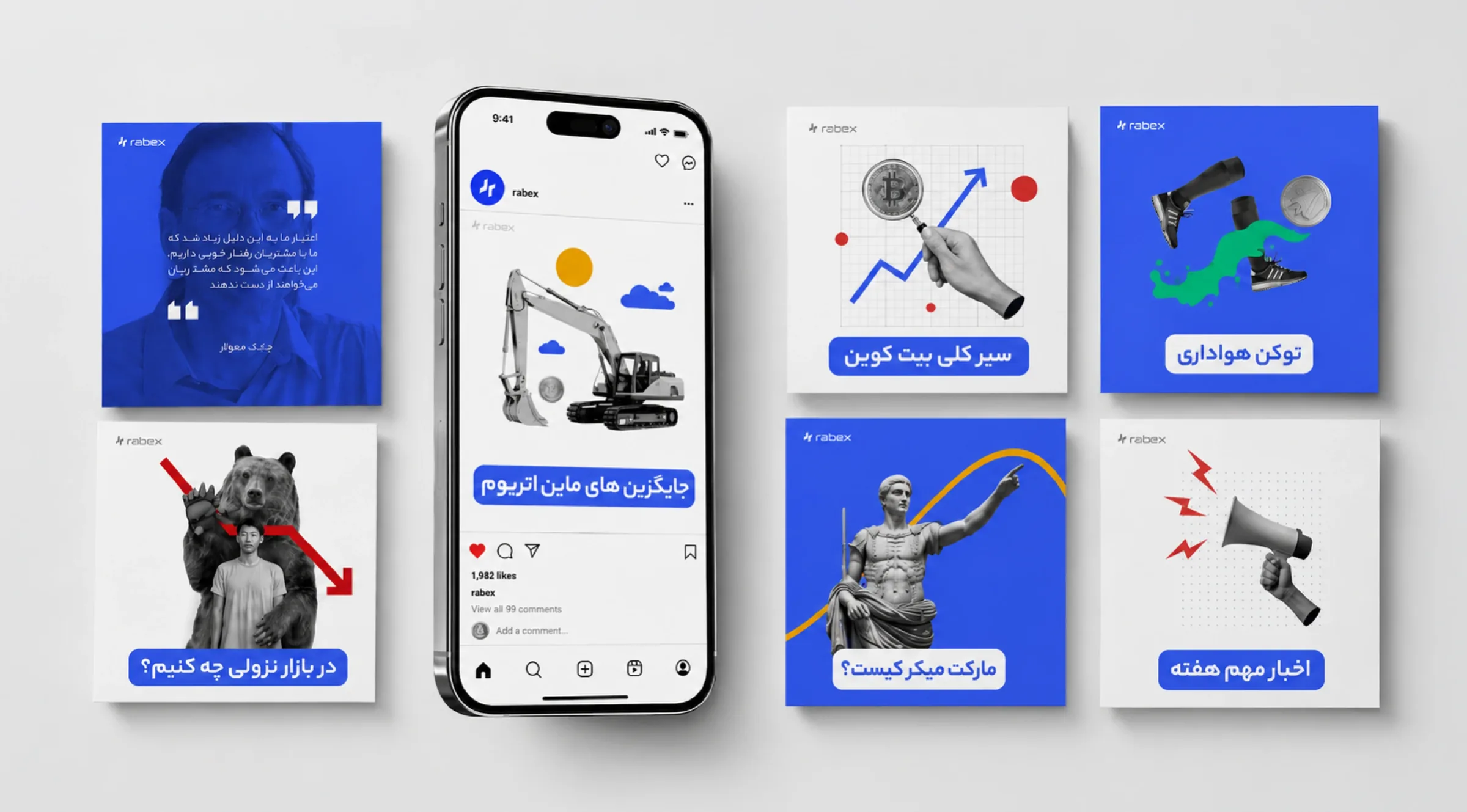
A communication system built for daily use.

Social media became one of the most active parts of the Rabex identity. The brand needed to publish market updates, educational posts, platform announcements, and campaign messages without looking fragmented.

I created rules for layouts, imagery, illustration, headline placement, and recurring graphic details so each post could serve a different purpose while still belonging to the same system.

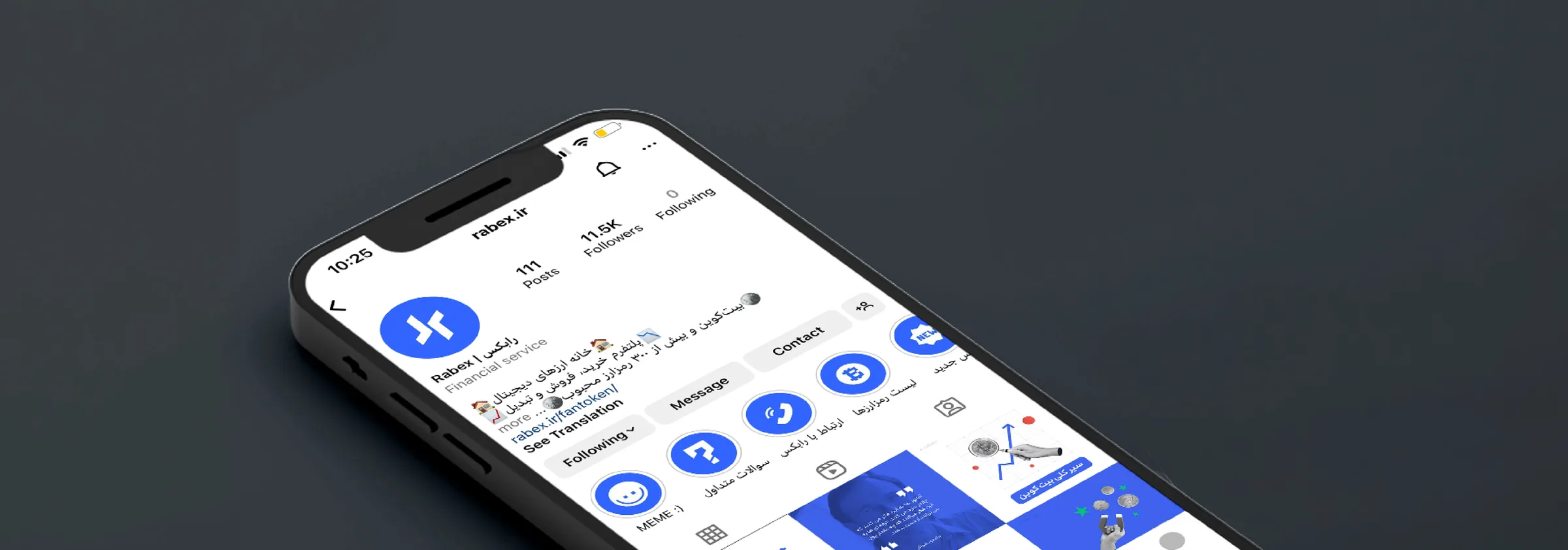
Rabex Instagram profile mockup showing highlights and branded social feed
Rabex mobile social story mockup with branded phone and post frame
Rabex social media post system arranged around a phone mockup

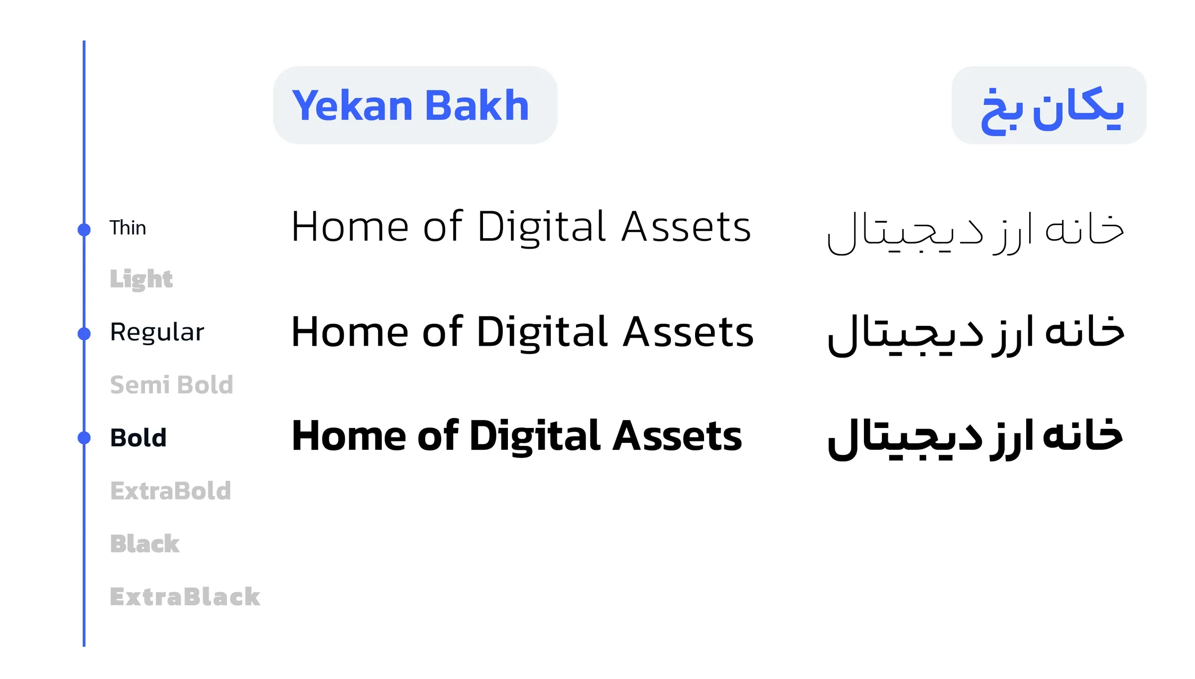
Typography as a working tool.

Typography was treated as a functional part of the identity. Because Rabex communicates in Persian and English, the type system had to support clarity, hierarchy, and readability across both languages.

I used type as a tool for structure: direct enough for quick announcements, flexible enough for dense educational posts, and consistent enough to hold together product, content, and campaign communication.

Rabex bilingual typography specimen showing Yekan Bakh in Persian and English weights
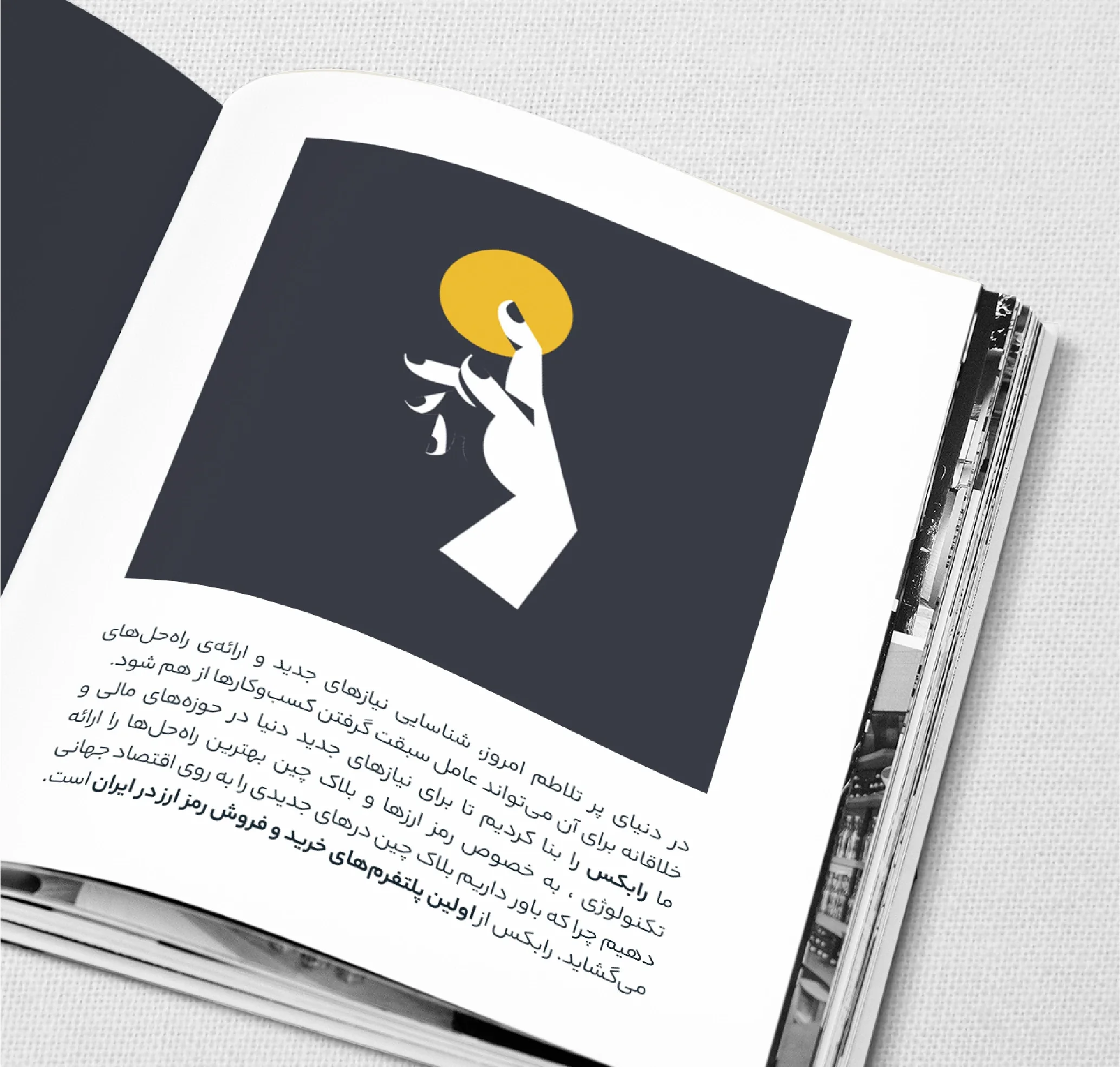
Rabex editorial typography application with Persian copy and brand illustration

Designed for movement, not one moment.

Working on Rabex over a long period meant the identity had to keep evolving. New formats, content needs, product messages, and communication goals appeared over time.

The system was designed to keep moving: corporate, educational, promotional, or product-focused, while still feeling unmistakably Rabex.

Rabex avatar illustration system with twelve blue profile icons

Brand rules that could live everywhere.

The refined mark was tested beyond screen contexts so it could hold its clarity across print, packaging, merchandise, social media, web assets, presentation materials, motion, and product-related communication.

Rabex was not a static brand. It needed a visual foundation that could adapt to daily needs, scale into new formats, and stay recognizable without relying on the same composition every time.

Designed for movement, not one moment.

Rabex became a system that could move across screens, posts, illustrations, merchandise, motion, and interface moments without losing recognition.

The final identity keeps the strength of the original mark while giving the brand a more mature, flexible, and future-facing visual language.

Thesis Project · PHI Studio Partnership · 2026

BLUR

A mixed-reality theatre collaboration exploring cloning, perception, and the unstable edges of identity.

Project Context

From thesis research to a real mixed-reality world.

Co-developed with PHI STUDIO, BLUR: The Boundaries of Identity is an immersive project exploring identity, transformation, and the ethical implications of genetic engineering.

Set in a near future where cloning and de-extinction have become reality, BLUR places the audience inside a world where the boundaries between real and virtual, fear and desire, fact and fiction begin to dissolve.

This work was the culmination of a Major Research Project for the Master of Digital Media program at Toronto Metropolitan University, created in collaboration with Samuel Dias and Haomin Wang through an industry partnership with PHI Studio in Montréal.

The onboarding experience bridges physical and virtual space through a semi-transparent hallway, surreal sound, and fragmented visuals that prepare audiences for questions of grief, identity, science, and technological desire.

At its core, BLUR asks: what would you do if you could defeat death?

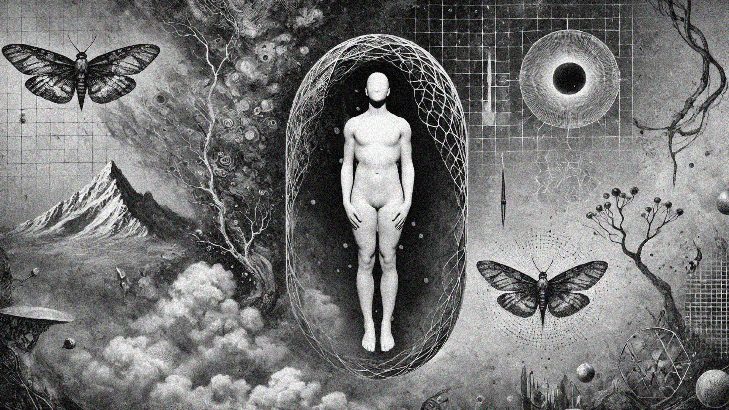
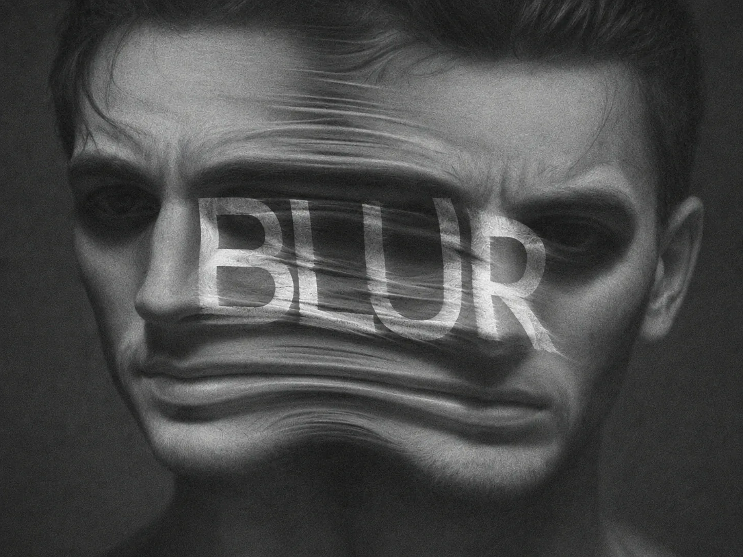
BLUR conceptual identity collage with faceless body and suspended form

Designing for the moment before the spectacle.

The project asked how an audience could be prepared for a story about identity before the main mixed-reality layer began. We approached the threshold as part of the experience itself, not as a lobby, instruction screen, or technical preface.

We developed an experiential direction where ambiguity, reflection, biological cues, and fragmented recognition could guide participants into the emotional logic of BLUR before the technology became visible.

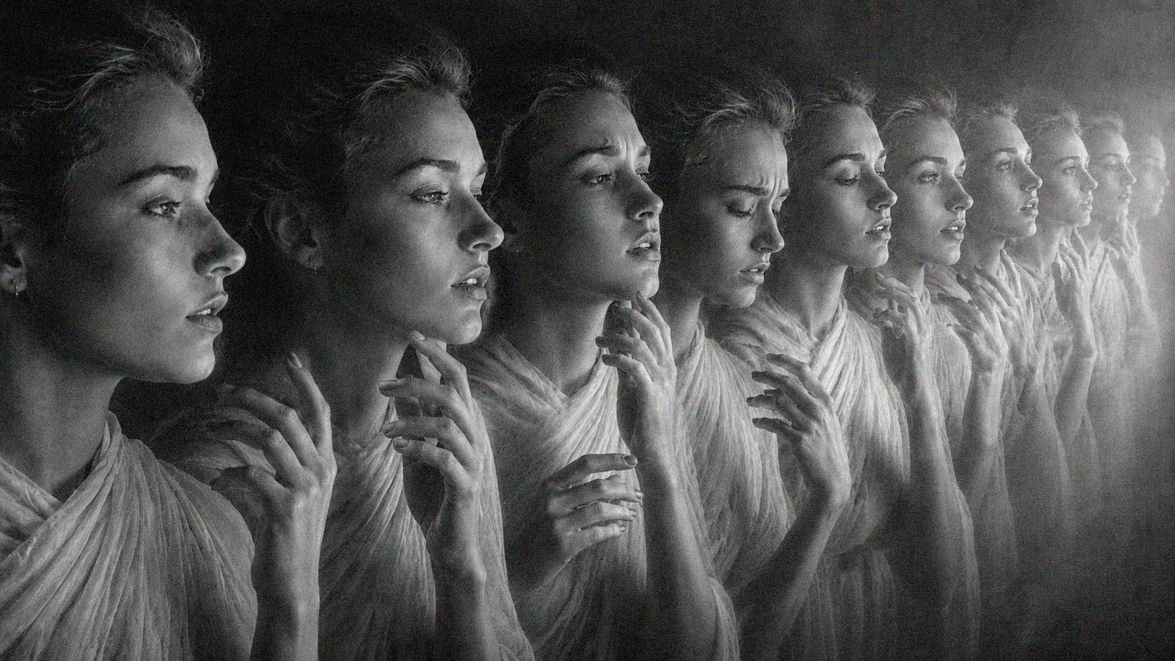
BLUR repeated profile figures suggesting fractured identity and transition

Research, concept, prototype, refinement.

The process moved from thesis research and industry context into concept development, spatial journey mapping, prototype studies, and iterative refinement with the larger mixed-reality experience in mind.

01

Research the experience context

Study immersive theatre, mixed-reality onboarding, identity narratives, and the audience conditions around PHI Studio's larger BLUR world.

02

Frame the identity question

Use cloning, self-recognition, and perception as anchors for a journey that begins with "Who am I?" rather than with interface instruction.

03

Translate story into touchpoints

Create interaction ideas around mirrors, shadows, faceless guides, genetic traces, sound, and shifting visual atmosphere.

04

Prototype spatial behavior

Explore how material, scale, projection, movement, and sensory pacing could support the participant's transition into the mixed-reality space.

05

Evaluate and refine

Use feedback to clarify emotional intent, navigation, accessibility, technical limits, and the relationship between physical and virtual layers.

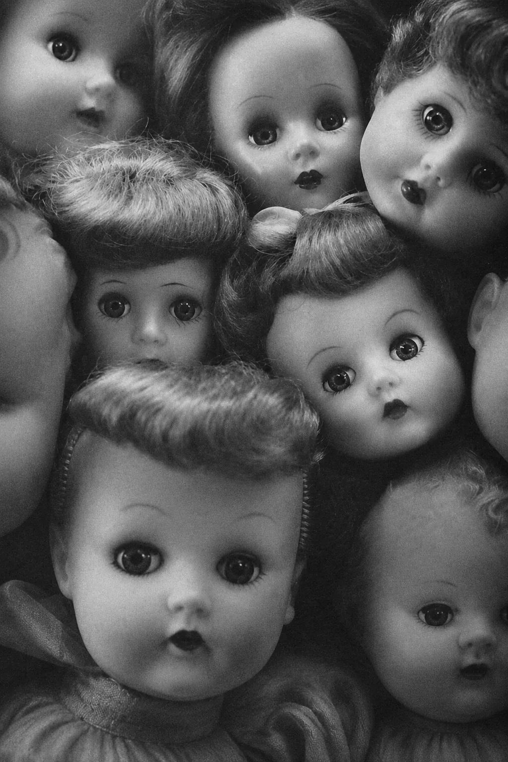
Cluster of vintage doll faces used as a BLUR identity and recognition cue
Audience Journey

From arrival to identity question.

The experience direction treated arrival as the first narrative act. Before participants entered the main world, the threshold needed to establish curiosity, unease, and a sense that identity was becoming unstable.

We mapped the journey as a slow shift from familiar orientation into psychological preparation, using spatial cues, sensory pacing, and story fragments to make the transition feel intentional.

Concept direction: Unveiling Identity.

The concept explored the moment when identity becomes less certain. We translated that uncertainty into a system of spatial and sensory cues that could support the larger mixed-reality theatre experience.

Living shadows

Moving silhouettes and translucent surfaces create the feeling of bodies appearing before they fully become recognizable.

Multiplicity mirrors

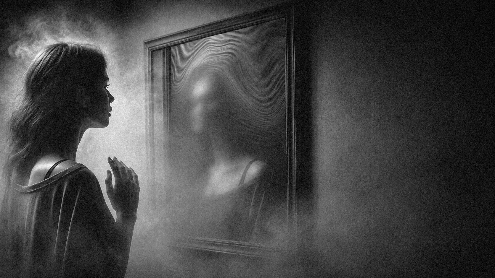
Reflection becomes a narrative device, asking participants to confront versions of themselves that feel familiar and unfamiliar at once.

Ritual keepsakes

Objects, fragments, and memory cues suggest that identity can be carried, copied, interrupted, and reconstructed.

Spatial Experience

A path built from uncertainty.

The introduction hallway used shadows, translucent surfaces, and layered movement to create a sense of unstable identity. The space was imagined as a psychological filter before the participant reached the main experience.

Every touchpoint had a role: mirrors asked participants to look at themselves, guides moved them forward, whispers introduced unease, and the pathway blurred the boundary between body, memory, and environment.

BLUR veiled figure form expressing uncertainty and unstable identity
Team Contribution

Experience design as narrative structure.

We contributed to the project as a collaborative design team, focusing on how the audience would understand the world before, during, and around the mixed-reality encounter.

01

Concept development

Developed the Unveiling Identity direction and connected the project's themes to tangible spatial moments.

02

Journey thinking

Mapped how participants could move from orientation into uncertainty, reflection, and immersive engagement.

03

Visual / immersive direction

Built a language of shadows, blur, mirrors, biological traces, sound cues, and faceless bodies.

The project was connected to PHI Studio's BLUR experience in Montreal, which launched publicly in February 2026. Our thesis work contributed to the conceptual and experiential thinking around part of that larger world.

BLUR tunnel threshold with a figure walking through fabric-like rings
BLUR mirror scene with a silhouetted visitor and distorted reflection
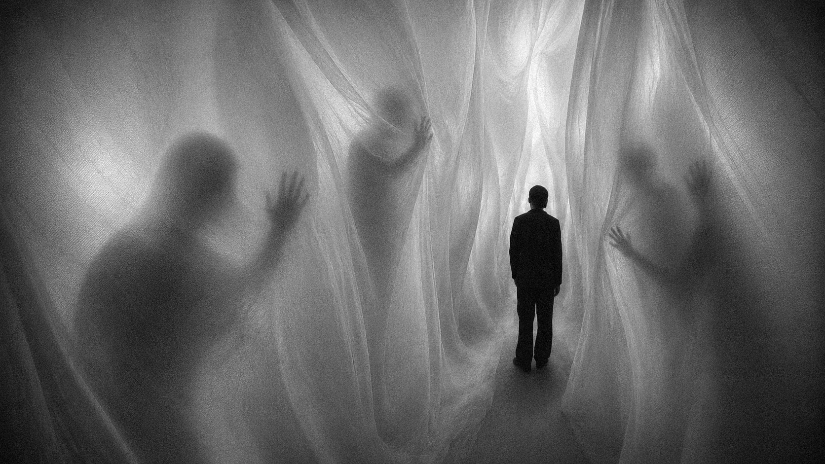
BLUR translucent curtain passage with figures behind fabric
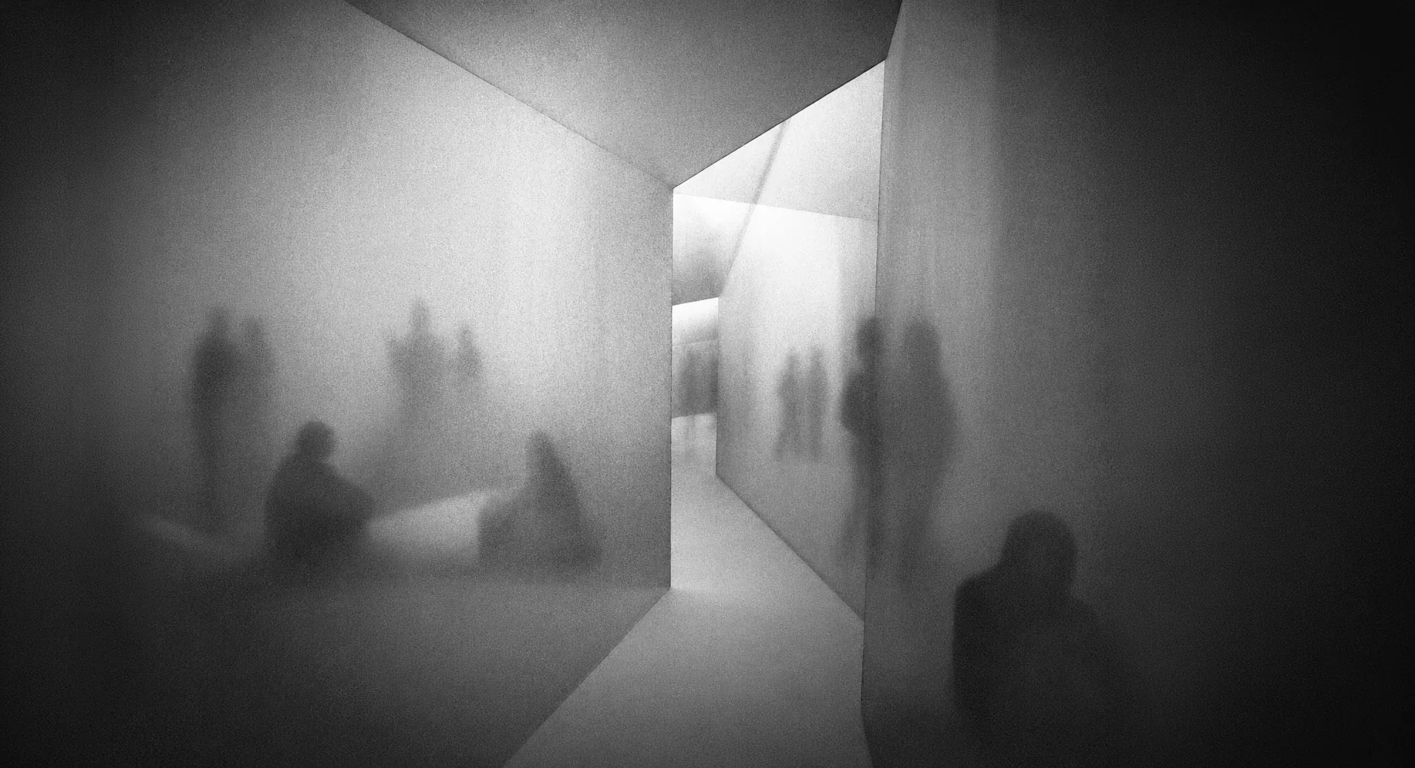
BLUR shadow hallway with blurred figures in a transitional space
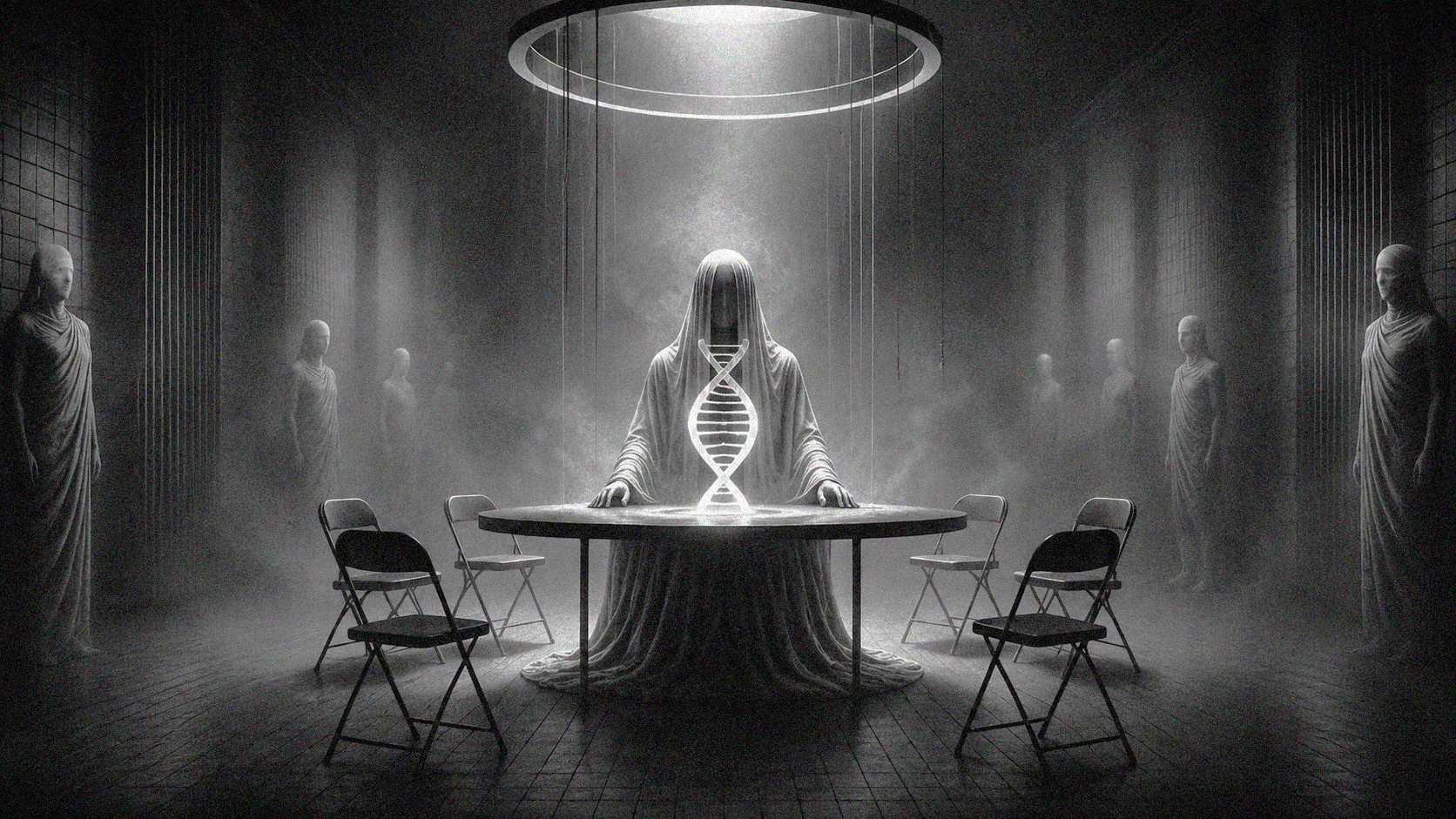
BLUR ritual table scene with glowing DNA form and seated chairs
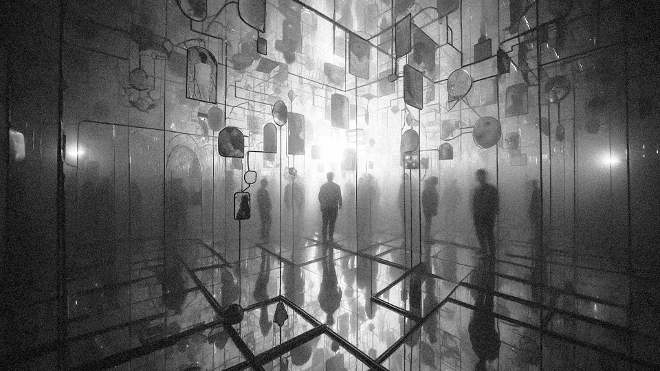
BLUR mirrored installation with suspended reflective forms and figures

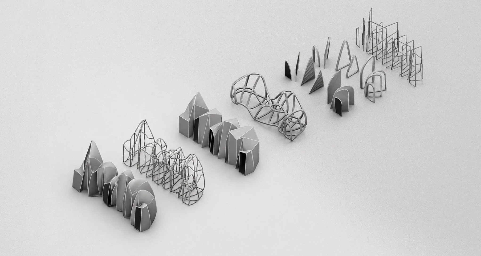
Prototyping the transition.

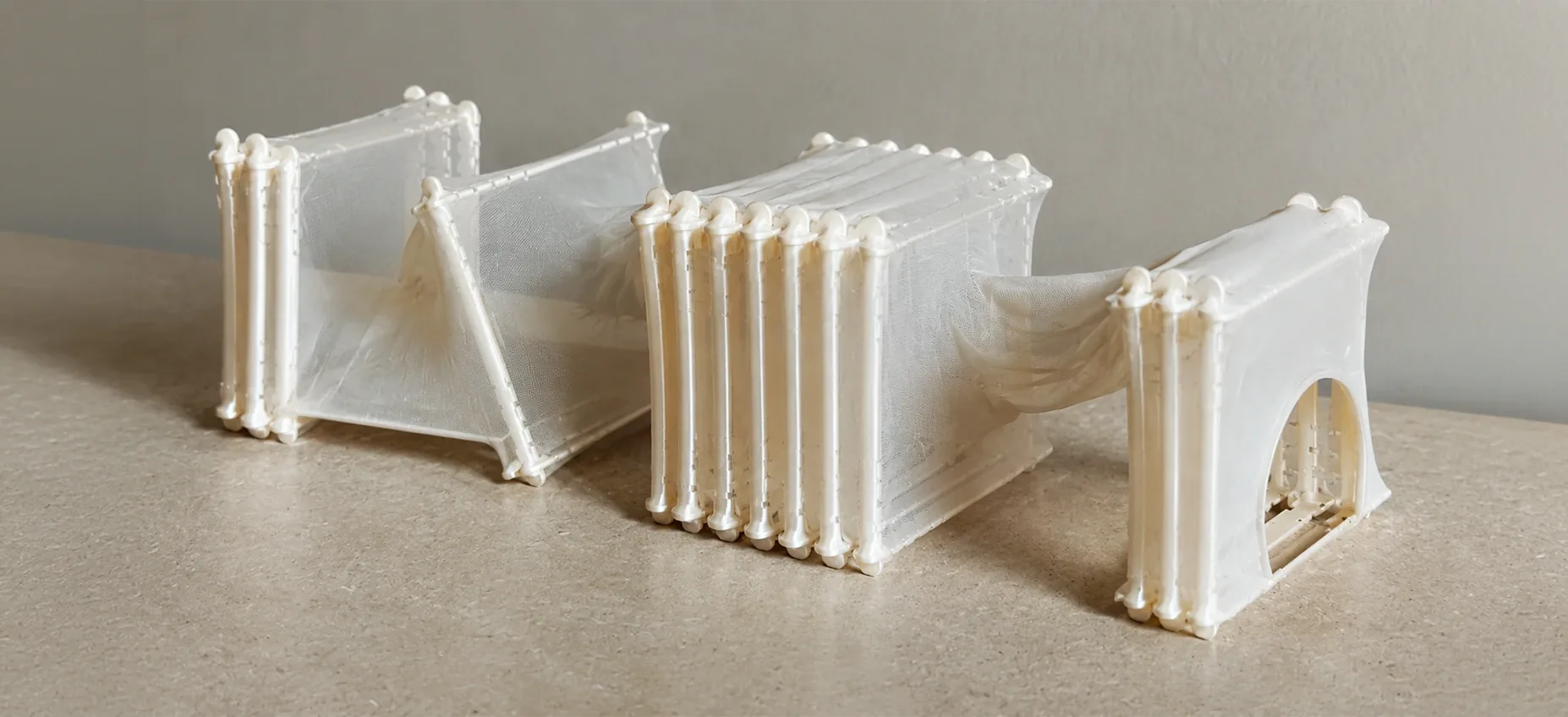
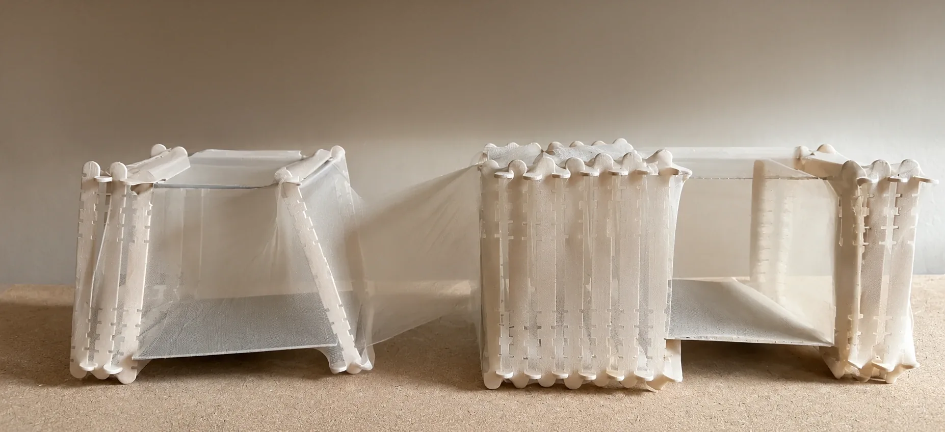
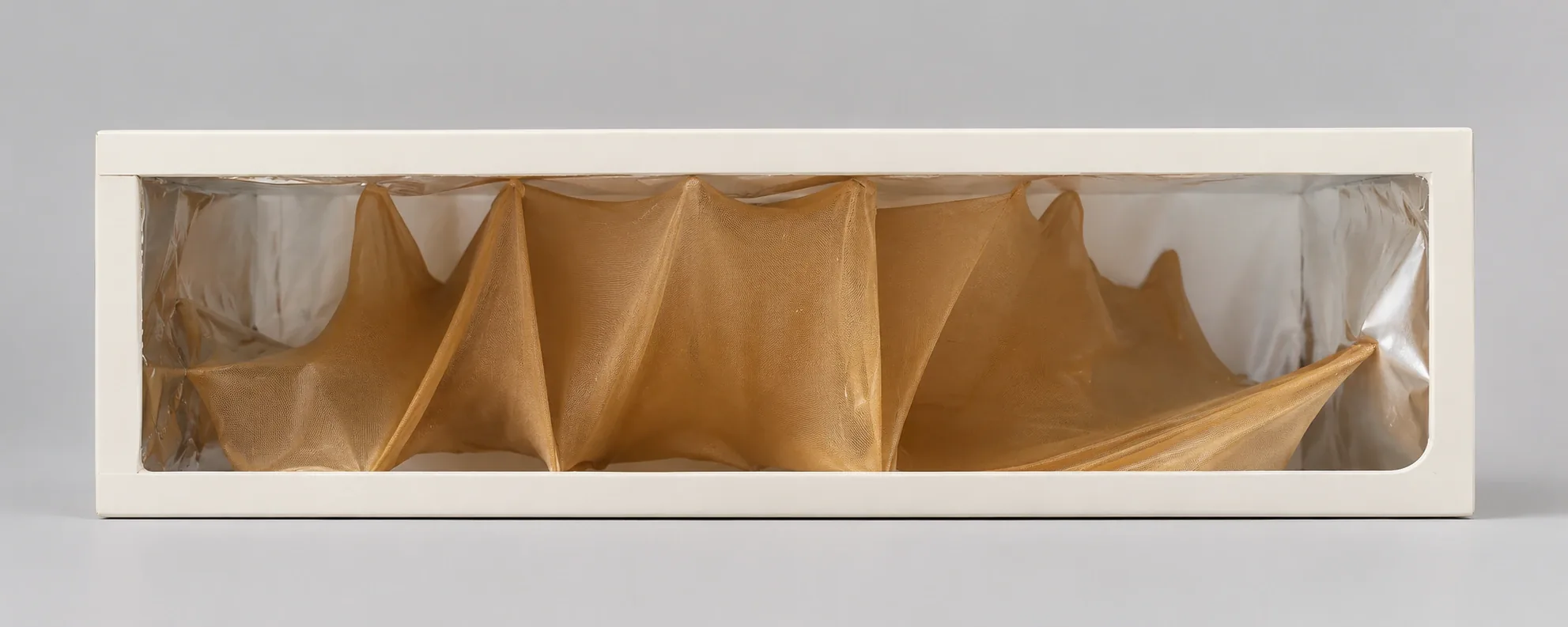
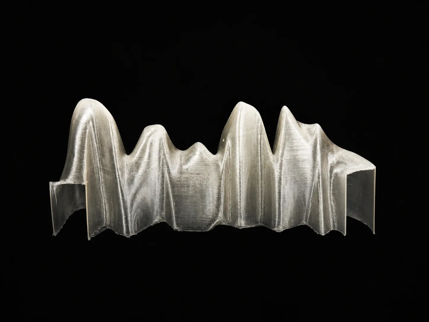
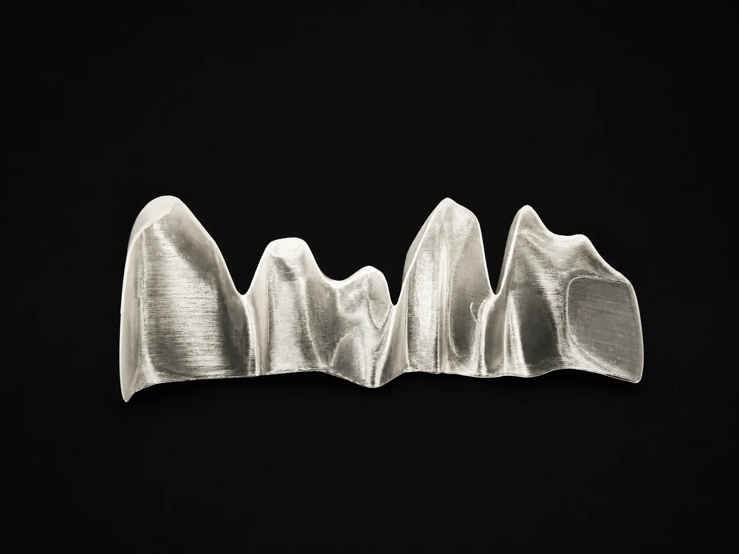
The physical direction developed through material studies, structural tests, workshop feedback, and full-scale thinking. Prototyping helped evaluate not only form, but also how participants might move, pause, and emotionally register the threshold.

01

Material feasibility

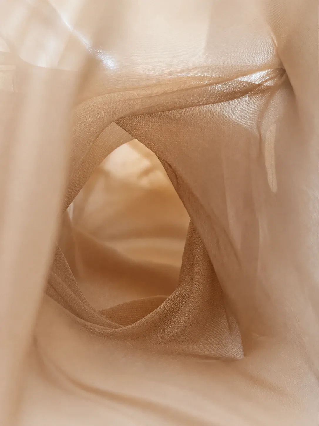
Testing reflective, translucent, and fabric-based surfaces for atmosphere, visibility, and movement.

02

Structure and skin

Exploring how a built form could hold a soft, unstable feeling without becoming visually confusing.

03

Spatial scale

Evaluating proportion, pace, and the feeling of entering a compressed psychological passage.

04

Sensory testing

Connecting projection, sound, shadow, and physical flow into one coherent pre-show layer.

Sensory Direction

Building atmosphere through image and sound.

The sensory system introduced BLUR's themes indirectly. Instead of explaining the narrative, the visual language used symbolic motifs: fog, rain, sheep, womb imagery, blurred movement, and biological transformation.

Sound created a second layer of presence. Heartbeats, distant trains, rain, sheep, and background tones helped make the transition feel emotional before it became technical.

BLUR spatial world studies arranged as a sequence of structural forms
Mixed-Reality Thinking

Extending the world beyond one medium.

The virtual component expanded the project into a more immersive environment, where participants could continue the identity journey after the physical onboarding sequence.

This made the transition between installation and virtual space more important: the physical threshold had to prepare participants for a different kind of body, movement, and perception.

Process Thinking

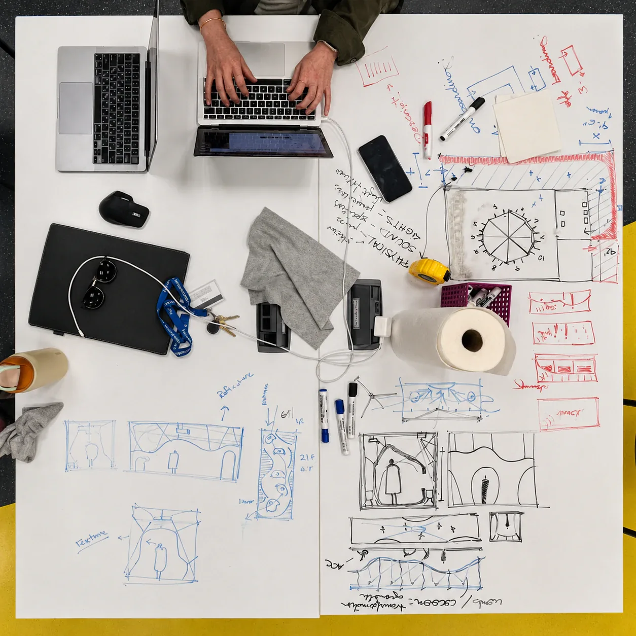
Turning sketches into an experience system.

This working table captures the project at the point where abstract ideas became spatial decisions. Notes, measurements, diagrams, material tests, and interface sketches were used together to understand how the threshold could guide movement, sound, projection, and emotional pacing.

The process was not linear. We moved between concept drawings, physical constraints, audience flow, and technical questions until the onboarding layer started to feel like a designed encounter rather than a supporting corridor.

BLUR process table with sketches, notes, laptops, and spatial planning diagrams

Testing and refinement.

Feedback helped clarify which parts of the experience carried emotional weight and where the system needed clearer navigation, sensory balance, or technical refinement.

Sound created presence.

Layered sound made the installation feel more alive and helped participants connect emotionally.

Motifs needed clarity.

Abstract visuals worked best when connected to recognizable symbols such as fog, sheep, rain, and heartbeat.

Navigation mattered.

The onboarding sequence needed clear enough cues to support movement without breaking atmosphere.

VR needed comfort.

The virtual extension added depth, but accessibility, motion comfort, and hardware limits required refinement.

Montreal Prototype

Testing the threshold at PHI Studio.

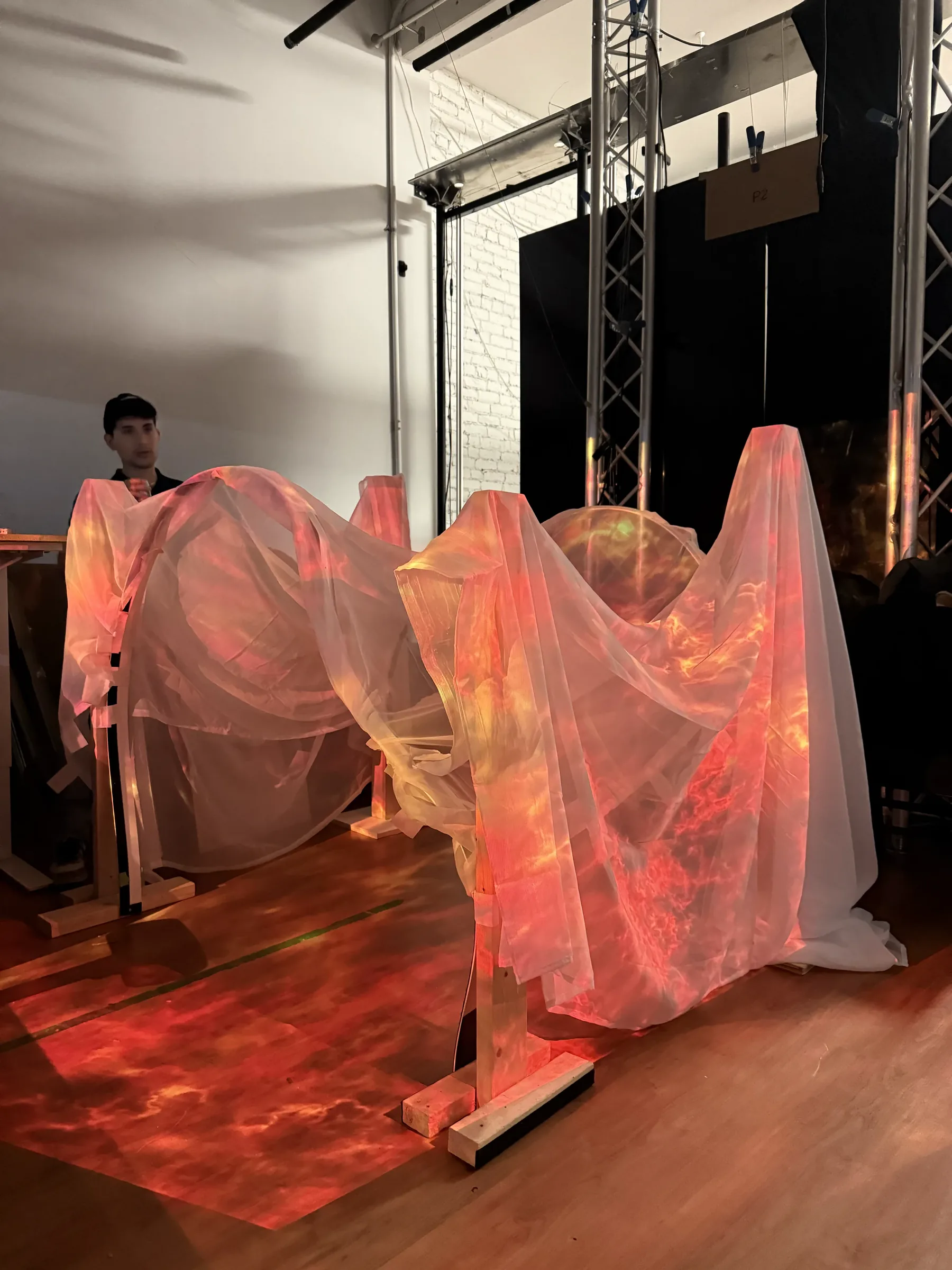
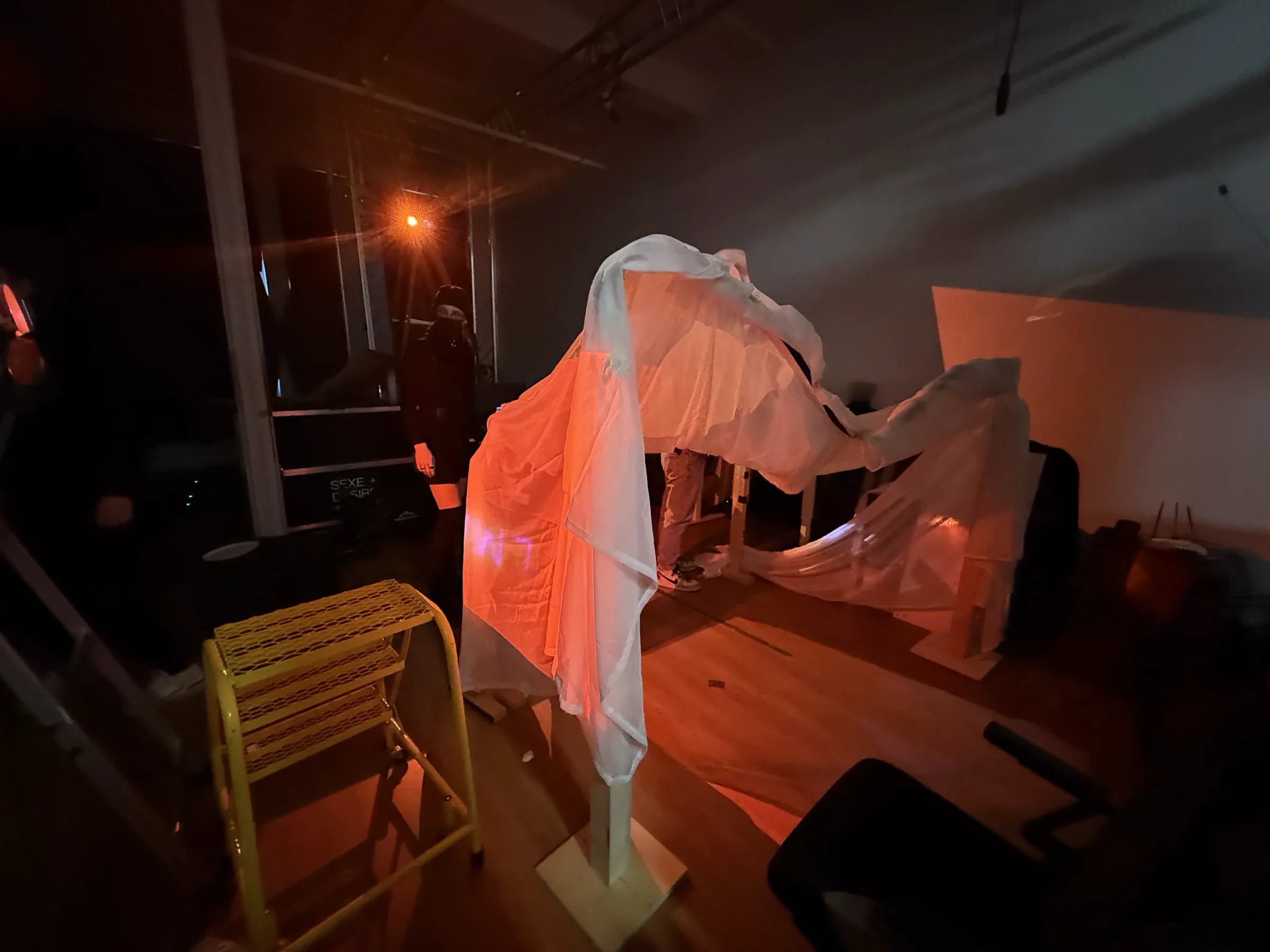
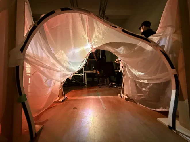
During the Montreal experiment, the concept moved from drawings and scale models into a physical prototype. We tested fabric, projection, red light, shadow, and the feeling of bodies moving through a semi-transparent passage.

The goal was to understand whether the threshold could hold ambiguity in real space: soft enough to feel emotional, clear enough to guide movement, and atmospheric enough to prepare visitors for the mixed-reality world.

BLUR Montreal physical prototype with translucent fabric and red light
BLUR Montreal prototype installation view in studio lighting
BLUR Montreal prototype passage view with fabric arch and warm projection
BLUR translucent sculptural prototype on black background
BLUR translucent structural prototype alternate view
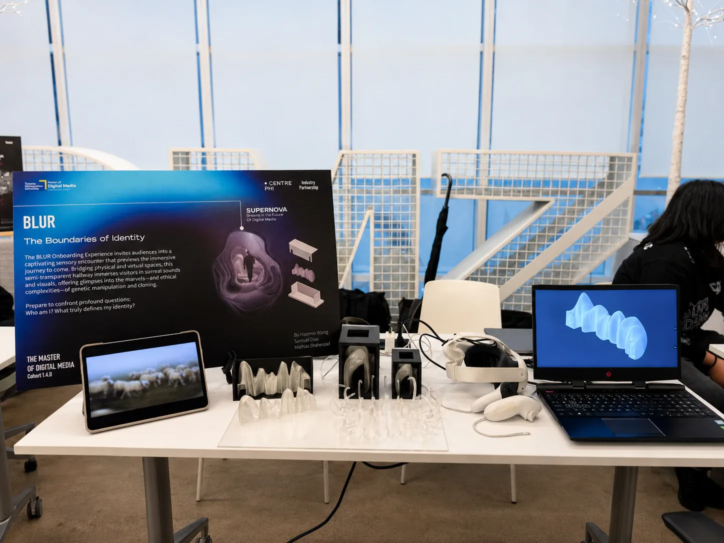
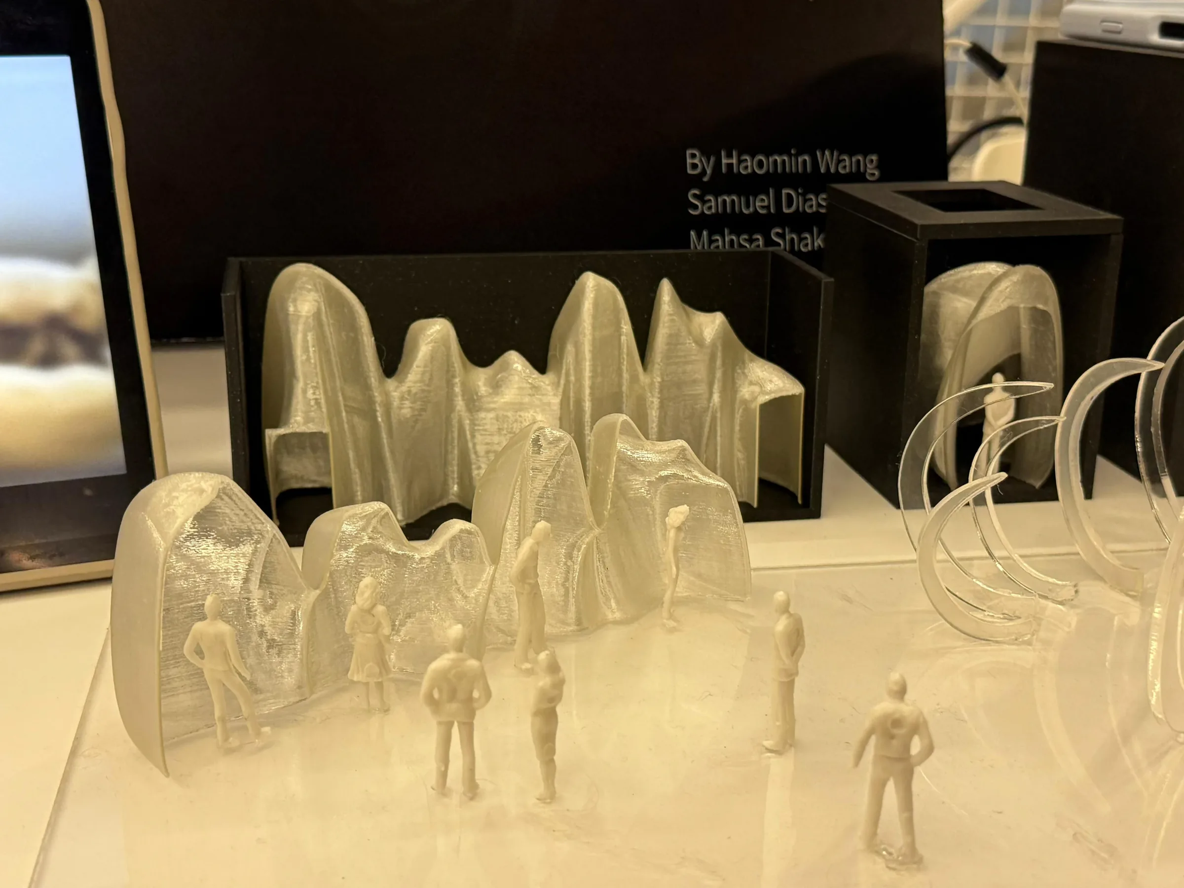
BLUR final presentation table with prototypes and VR material
BLUR close view of physical prototypes and small figures

Identity as an experience, not a fixed image.

BLUR became a study in how an abstract idea can become an experience system. The project began with questions about cloning, perception, and self-recognition, then expanded into spatial touchpoints, physical prototypes, sensory direction, and mixed-reality storytelling.

Our contribution was to help shape the emotional and conceptual threshold: the part of the experience where the audience begins to question what is familiar before entering the larger mixed-reality world.